Trahearne & Malyck Practice Animation | October 23, 2025

For additional animation practices on this blog arranged chronologically, browse the “2D Animation” category here.
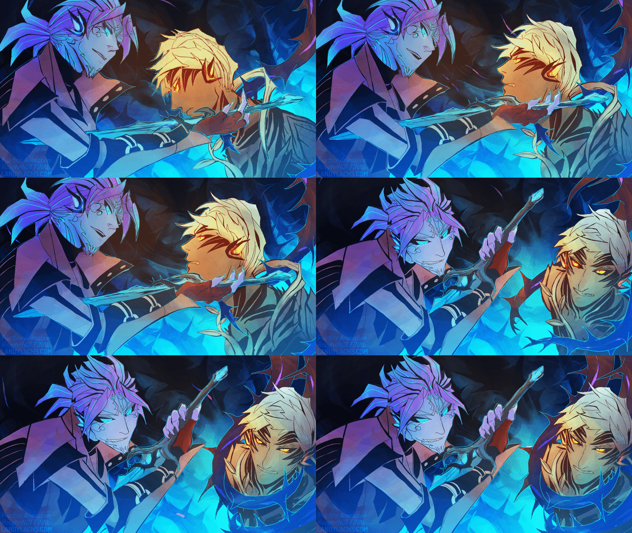
Practice rough animation | Colors added

Over the summer, I started doing some small practice 2d animation tests for fun. I ended up really enjoying these, which was a bit surprising, because I’ve always been a bit rubbish with 2d animation. I always found it frustrating. Once it became around September or so, I wished to continue practicing, but knew I had to set the time I was spending animating for the comic. At least, if I wanted Chapter 3 to be ready on schedule. I had the idea that maybe I could set aside an hour of the day to practice animating – only, I wanted these practices to be for the same animation. Perhaps, over time, practicing on one project might add into something more than just a scribbled, animated mess (which is what my first attempts resembled). 

I had a few ideas started for which to choose, and decided to go with this one with Trahearne and Malyck. The aim was to try an animation test in the style of lineart I was using for The Harbinger’s Path comic. 
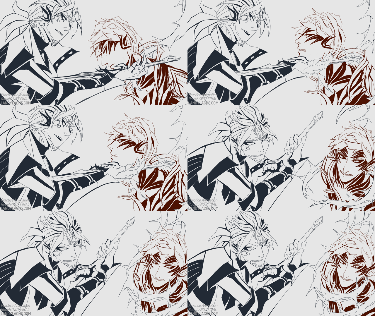
Practice rough animation | Lines only

The bulk of this was (messily) drawn over those summer sessions (and into part of September). They admittedly sometimes strayed past the 1-hour mark, because the drawing process of doing 2d animation became quite absorbing. I’ve never enjoyed trying 2d animation so much before. I’ve always really liked hand-drawn animation, but I didn’t think I had the patience nor skill for it. I mentioned to friends that what seemed to help this time around, was having onion skinning off most of the time. Something about onion skinning makes it seem so much more complex to me. I think I’m just visually overwhelmed when I see all the drawings at once. :p 2d animating seemed to feel more natural for the first time, when I just flipped between frames for much of it, instead of trying to work with onion skinning. 

Learning about different types of In-between frames

What I did find onion skinning most helpful for, was later on during the animating process. Specifically, when I added the “breakdown” and “in-between” frames. I was never aware previously that there were different types of in-between frames (for any animators who may stumble across this, please forgive my ignorance). Learning this was a bit of a revelation to me! Another reason I have never been able to do 2d animation before this year, is because the sheer workload seemed so daunting. This was probably the main factor for why my previous attempts never went anywhere. 

After learning about breakdown and in-between frames, though, I think this was a turning point for me during this animation. I first sketched the bare-bones keyframes on August 14, 2025: 
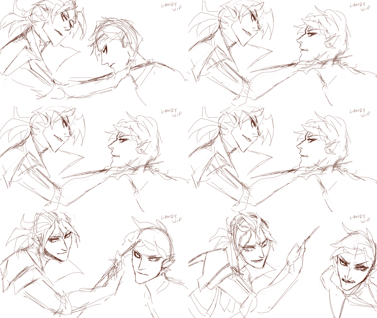
 

“Keyframe” Draft | Draft 01, according to the file name! | Drawn August 14, 2025

Then I started cleaning up these frames. At this point, I didn’t know how far I wanted to take this practice study. I think relegating this practice as something I could do in small intervals over time (the aim for 1 hr minimum every weekday, with the aim of progressing a little of it each time. It didn’t matter how much, or how little, I did any specific day – it just had to be something) also helped make it less psychologically daunting. 

But! Once I learned the difference between breakdown and in-between frames, this enormously helped me wrap my mind around the workload. 

“Breakdown” and “In-between” frames
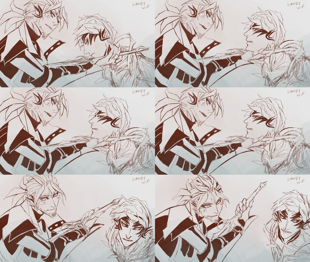
One of the earlier drafts | Also drawn the same day (Aug 14) 

For those who haven’t come across this term before, this is my understanding of the differences (and take it with a grain of salt, I could be misunderstanding parts about it – when looking this up, it seems like there might also be different terms describing the same parts of animating, or different people/studios have different definitions of the same terms) (please feel free to correct me): 

  • Breakdown frame – the frames between your keyframes. They help describe the motion between your keyframes. They tend to not be equal in distance between your keyframes. 
  • In-between frame – the frames between your keyframes and breakdown frames. This is the bulk of the labor! 

My understanding is the presence of these frames can also be tied to different steps of the 2d-animation process. Specifically: 

  • “Keyframe” animation – the initial draft with only the keyframes (see “Draft 01” clip above). In looking things up for this post, I have also learned this is sometimes called the “roughs” or “rough animation.” Which also means I have been using this term incorrectly – I apologize!
  • “Tie-down” animation – the first pass of blocking out the major forms from the keyframe draft. I’m guessing the clip right above is a partial part from this process? 
  • “Cleanup” animation – the part of the process where frames are further cleaned-up from the tie-down, but the in-between frames are not yet added. I’m not entirely sure about this, though, as I’ve seen some definitions equate both “tie-down” and “cleanup.” I’m still unclear about this, haha. 

Current animation stage

Anyway, this is a very rough test – keyframes are prioritized, and in-betweens are extremely rough in places. Once the 10-year anniversary for Heart of Thorns approached, I thought it’d be a fitting opportunity to try and clean the animation up a bit, and see if I could make it more presentable. 

And that is the result you see at the top of this post! I want to say I spent 2-3 days in October cleaning up what I had done in August/September. I tried to do as much as I could before the anniversary today. A few specific features I added in October are animating the vine glows in the background (which is directly inspired from an earlier Trahearne animation test I drew in August – which I’m realizing now I never posted to this blog, I’ll post it at the end of this post), and then the day before I added Malyck’s little stamen antennae, lengthened his “Crying Thorn” dagger in an earlier frame (think I may have overdone this a bit), and added more rim lighting that was only in a partially drafted state (this helped the vines wrapping Trahearne read much more clearly, in particular). I also did various clean-up to the colors, mostly for Malyck’s early frames, and the glows on the vines wrapping around Trahearne. 

While the version I have now is not what I would call anywhere close to finalized or polished, I hope the idea is more or less clear! And that some might enjoy it for the practice test that it is! 

The first two clips in this post are 24 frames per second, while the third and fourth ones afterward were sketched at 12 fps. The timing was adjusted multiple times since the 12 fps clips, which I have learned from first-hand experience I should have settled on sooner. ;p 

Edit: Added more expanded thoughts to this post the next day. 
This animation on:  Tumblr | Bluesky

Trahearne & Malyck Sketch | October 17, 2025

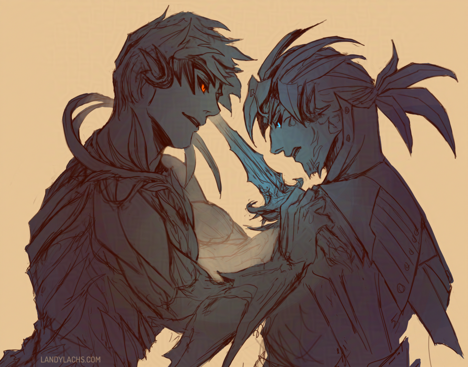
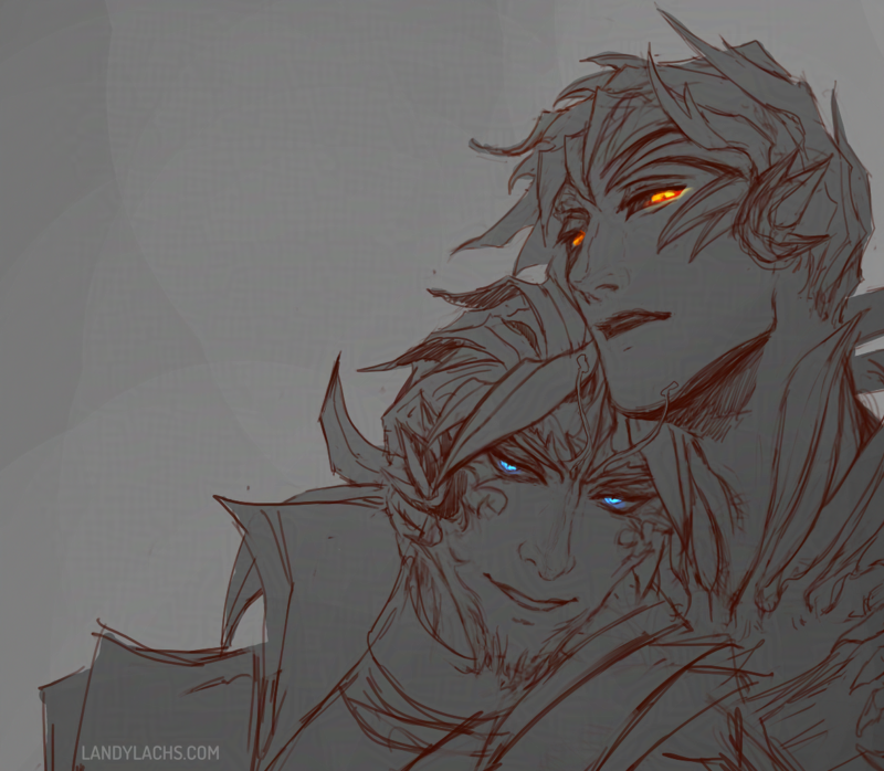
Monochromatic drawing with Trahearne and Malyck from Guild Wars 2. Accent colors for both characters' eyes - glowing orange for Trahearne, glowing cyan for Malyck. Malyck leans against Trahearne's shoulder. Sketched them again yesterday in-between waiting for commission feedback! I’m so happy I started drawing with lines again this year. I have to admit that before this year, most of the time I found line drawing one of the less enjoyable parts for me. Which is a bit peculiar, as I loved drawing when I first started art – pencil drawing was my favorite for many years. 

This year has felt like rediscovering all those aspects about drawing which made me fall in love with art in the first place. I haven’t spent time enjoying drawing lines for so long – before now, it was a necessary step, not my favorite one. Which is why I was very surprised when I recently realized the line step has become my favorite part about drawing comic pages. 

I think part of it was also doing those occasional pencil drawings this year. I truly forgot how pleasurable it is to use a mechanical pencil for more than jotting down loose concepts. Before February, I can’t even recall the last time I sat down and tried making a pencil drawing look presentable. I’d been so separate from physical media for so long, that I marveled at the control of the graphite, the texture of the paper, dealing with brushing away those eraser bits without smudging the drawing. All those parts about drawing which sound pretentious to describe, but which are difficult to explain its appeal otherwise. 

Slightly wider crop of the previous drawing, where we can see both characters' fingers are intertwined. Anyway, that is to say, both this drawing and the previous one are results from using an opacity brush to sketch with again (meaning a brush with pressure sensitivity). I haven’t used one for doing line sketches/drawing for a few months. Before now, it tended to be a crutch for me – it made me take too long with squirrelly, indecisive lines I was never satisfied with. That’s partially why I switched to sketching with a hard brush for the past few months (meaning a brush without pressure sensitivity), both in the comic pages and in sketches. It’s probably easiest seen in the Diarmid drawing from August. That line drawing, in particular – even though the line portion is only a rough sketch – it turned out much stronger than my line drawings or sketches usually do. The idea is described more clearly, because having that hard brush forces me to make a decision with where to place the line. It prevents me from endlessly deliberating, as I tended to do when using brushes with pressure sensitivity. 

I’m essentially describing the advantages many artists have described in advocating for sketching with ink versus pencil in physical media. (Though of course, digital has the significant difference of being able to easily erase – even when you “ink,”) 

I’ve briefly tried ink sketching before in physical media – it’s very enjoyable, but my results were always mixed. Which made me unable to overcome the sense that I was just wasting paper. This is the main reason I didn’t persist with it. 

This is becoming more rambling than I intended – the point I meant to jot down here is, I began sketching with an opacity brush again because I was trying to recreate the feeling I enjoyed so much when doing the Trahearne pencil drawing from the other day. I really loved the process of drawing that one. The strange thing about using opacity brushes digitally is, that “squirreliness” which always plagued me in digital line drawings – it wasn’t happening in these pencil drawings (or, it was at least happening less). I’m not sure why. I suspect it’s a combination of physical having more “permanence,” which perhaps forces me to be more decisive. Practicing sketching with the hard brush over the past few months likely also helped. 

After using the hard brush to sketch, sketching with an opacity brush again felt so strange! In a good way. This time, it seems easier to be more decisive. And I think I am better avoiding that “squirreliness,” while also adding the benefits you gain from having pressure sensitivity available to you. 

I’ll have to continue doing experiments with both types of sketching! 

Trahearne Pencil Sketch | October 14, 2025

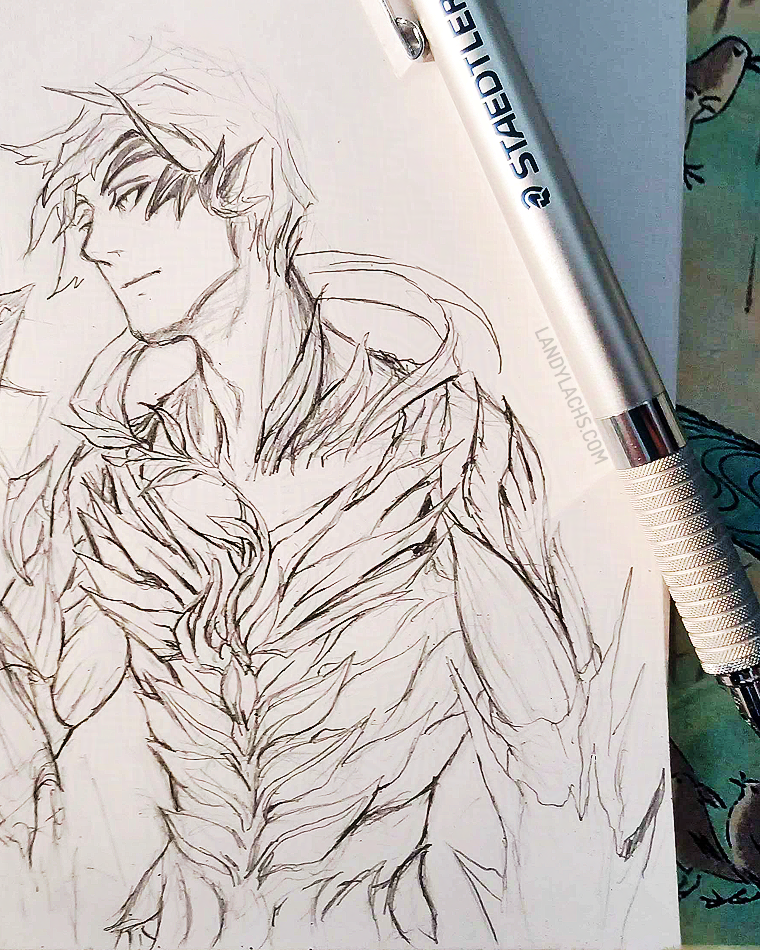
Paper sketch of Trahearne from Guild Wars 2. Drawn with a mechanical pencil. He looks pensively off-camera. Half-body cropping.
Trahearne Pencil Sketch | Drawn with a 0.3 mm Staedtler mechanical drafting pencil

Sketched Trahearne the other day when Krita froze, and I decided waiting in vain even though that only seems to work 10% of the time (this was not one of those times). Fortunately, I didn’t lose anything substantial since my last save. 

The full sketch has Malyck in it, but I don’t think he turned out as well. Might still post the full version later in this post at some point. The photo above is also an earlier version, and I slightly prefer this version – I think I overworked parts of it later on. Ah well, learning! Remembering how to draw with pencil again! 

My installation of Krita has been acting a little oddly, which I suspect might be because I have it installed in a portable installation on an external, and I think it is copied over from the previous external I was using. I’m not sure if that should affect anything or not, but I finally installed the latest version of Krita onto it. It immediately loads much more quickly now – hopefully there’ll be no more freezing, too! 

Also! You can see I did end up eventually acquiring the Hobonichi pencil board I semi-joked about way back in February! :D It was a bit of a splurge purchase when I made an order to JetPens earlier this year for some notebooks. It ended up being very practical, though – sometimes I want to jot down a note right after doing something in the kitchen that requires me to wash my hands, and before the pencil board, I always had to wait a few minutes for them to completely dry, otherwise any residual moisture crinkled the paper. But now, with the pencil board, I can just jot down a note right away without needing to wait those moments. It also is very useful as a bookmark (it has currently been living on page 178, which is a chart I made during chapter 2 to plot every page’s progress for the entirety of the comic!). 

The last thing I use it for is as a smudge guard for pencil drawings, like this one, though I feel I did something wrong because it ended up smudging the drawing lol, that I later had to fix with some pinpointed erasing. And I don’t ever use it for its “intended” purpose, which is to put behind the current page, to draw over a flatter/smoother surface. But it is so useful in these other ways, that I don’t mind this. And the pattern is too appealing! Tiny birds! 

Page Thoughts – The Harbinger’s Path: Ch3, page 5 | October 13, 2025

Chapter 3, page 5 from "The Harbinger's Path" GW2 fan comic.
The Harbinger’s Path | Chapter 3, page 5

This post is adapted from what I originally wrote in the email update for Chapter 3, page 5 of The Harbinger’s Path. I ended up having more thoughts about this page than I expected, and wanted to jot them down somewhere that can be referenced more easily than email. 

I’ve also expanded it in some areas, since I feel less annoying doing that on my blog here – I try not to overly ramble in email updates. ;D 

“Headcanon” Background Info

This page has one of the clearest reminders this is a headcanon story. Malyck’s choice of using “Nightmare Commanders” is an intentional callback to the concept art Carlyn Lim did for three “Nightmare Court Commanders” during Heart of Thorns’ pre-launch development. (You can see her brilliant concept artworks for them here.)

In her concept art for these three, she labels each as:

“Nightmare Commander – Duel Wielder”
“Nightmare Court Commander – Executioner”
“Nightmare Court Commander – Seer”

These, of course, later became the Mordrem Guard Commanders in the expansion’s live release, and canon story. The characters of Blademaster Diarmid, Axemaster Hareth, and Stavemaster Adryn we all know and love.

“Nightmare Court Commanders” 

But how those original descriptions on Carlyn’s concepts stir the imagination! They conjure endless story possibilities. What potential narratives might a “Nightmare Court Commander” have been considered in, during those early Heart of Thorns writing sessions? 

What if Diarmid, Hareth, and Adryn had been part of the Nightmare Court – leaders, even! – instead of a faction entirely separate from it, as they are in the canon story?

What might they have been like, what might their stories have been? I haven’t even touched on what a “Nightmare Court Seer“ might have implied! Was Adryn possible some type of “Seer of Mordremoth” in his early incarnations? 

How would this have changed their relation to Mordremoth? To the Nightmare Court?

To Faolain? 

It is far too easy to pleasantly ruminate on this!

Page Layout Process

Chapter 3, page 5 is one of the earlier pages I drafted for The Harbinger’s Path. A version of this page has existed, in some form, as early as Chapter 1 of the comic. 

As such, to me, this page’s layout is not as strong as I think I could do now. I’ve hopefully learned some things since Chapter 1, page 1! If I were to do this page again now, I would do several things differently – but I decided to keep the page’s panel compositions relatively the same. For a few reasons – the main one being, when I began this comic, my aim was for this to be practice and a learning experience. It is very easy for me to end up not finishing what I start in my personal art. It is something I have to consciously choose not to do. It is why I have many “works-in-progress” – something I suspect many artists can relate to. 

Additionally, I’ve never managed to draw a “finished” a graphic novel page – not a single one – before starting The Harbinger’s Path. Much less an entire chapter! My initial aim with this project was to finish one, completed chapter. Just one. I did not know if I could do it.

Comic panel crop of Malyck from Guild Wars 2. Portrait crop. As he smirks toward Trahearne off-camera, text reads: "....Have you wondered-" "-why I remain in this form?"
The Harbinger’s Path | Chapter 3, page 5, panel crop

Chapter 3 Layouts

And here we now are on Chapter 3! Much to my amazement and surprise. I am not sure how that happened, but one of the things that helped me enormously was setting personal deadlines. This helps me to continually move forward, and not become too “stuck” on something. Such as continuously redoing an early page (which did happen to some of those pages in chapter 1 – especially earlier on). One of the things I had to practice was being okay with calling a page “finished,” even if it was not what I would consider truly “finished” – which became easier over time. The more pages I complete, the better I understand that comics, more than illustrations, are sums of the whole instead of their parts. Small quibbles on individual pages are not as substantial, if sequences of pages work coherently together – as an interconnected, narrative whole. 

This is an arguably convoluted way of explaining why I did not redo more of chapter 3, page 5’s layout. I could have either done this – which might have made this page stronger, even though it is (hopefully) currently in a presentable state – or I could have dedicated this time to furthering future pages in chapter 3, which were (at the time) not yet drafted. 

I ended up doing the latter, which is partially how chapter 3 gained a few more pages than I had initially planned. i think this time was worth it, and benefits the chapter and overall comic. And, on a personal level, I like seeing the progress of these earlier drafted pages, in comparison to the ones I drafted later – though I do question a bit whether this might be jarring to a reader, who hasn’t seen which pages were drafter more recently, versus earlier. 

Of course, you can be the judge when you see the rest of the chapter. ;D