Lorcan Loose Ref – Nightmare’s Embrace | June 11, 2026

Loose drawing of a blue-toned sylvari ranger.

I’m at the point while drawing “Nightmare’s Embrace” (which I’m realizing as I’m typing this I should create a webpage I can link to, so I don’t have to explain what it is each time) where I can’t rely on my haphazard mix of different ref screens and drawings of my characters – at least, not if I want them to maintain a minimum semblance of design consistency. 

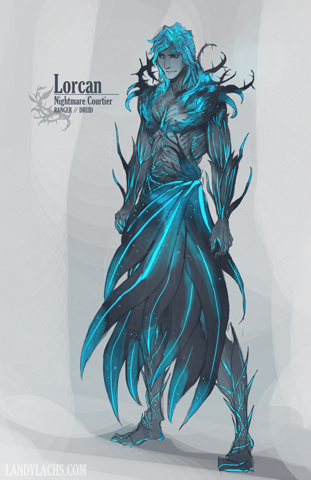
I didn’t have a solid design for Lorcan’s outfit until now, because every time I’ve drawn him I’ve done so slightly differently. Which is acceptable for paintings, not as much for comic pages. This is a loose drawing tonight to figure out which design I want to use for him in the mini-comic. 

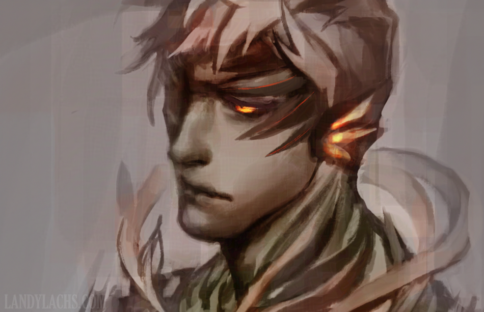
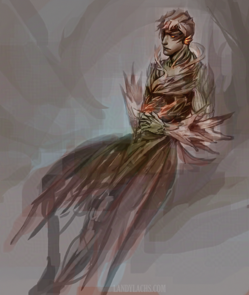
I’ve been able to get away with loosely defining everyone’s outfits so far, because the main features I’m up to for most of the pages is still the general poses/panel clarity. And aside from screenshots, this older painting from 2024 has been my main outfit inspiration for “Lorcan,” a Nightmare Courtier from the mini-comic: 

Cropped painting of a Guild Wars 2 sylvari with a cool-toned color scheme.
Lorcan WIP | Painting Crop | 2024

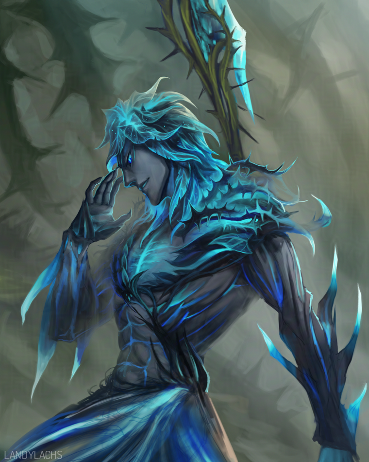
This is a cropped WIP for a Lorcan painting I don’t think I’ve posted anywhere yet, mainly because there are issues with it I’d ideally like to fix first. But this painting is the closest to what I’ve been thinking about for his armor. 

His armor itself is most heavily based on the “Nightmare Court Guise,” from the medium Twilight Arbor armor set. Of course, I did some modifications, mostly for my personal enjoyment (haha). 

My only potential reservation with his outfit at the top of this post is – during the main part of the mini-comic, Lorcan is a “recently-turned” Nightmare Courtier. He might look slightly too fancy, for being “recently-turned.” I think I can remedy this fairly easily by shortening some of the features of his outfit (mainly the waist skirts and forearm thorns/branches).

But I’ll try this version out first in the mini-comic drafts, and see how they look. 

I also started the ref by drawing Lorcan’s underlying anatomy first – I’ll add it in the full post below: 

Continue Reading

Duskbirds Diorama Illustration (WIP) | March 7, 2026

Illustration of a "duskbirds" structure drawn in a diorama-like style.
Duskbirds Illustration | Work-in-progress

I was chatting about PLCAF with my friend, and remarking about how my table is likely going to be more bare than the average. She then suggested I bring a few prints, which I hadn’t considered. I’d only been thinking about potential books/mini-zines I could bring, since this is an indie comics convention. 

I then went looking in my files for potential considerations, and remembered I have this Duskbirds-related illustration I’d started a while back. It’s about 90% finished. I could likely take it to a polished state this weekend if I carve out the time for it. 

I also realized among the many Duskbirds comics I have noted down in sketch form, I had started 2 a while back that are about 70% of the way there. Contemplating finishing these for the mini-zine – as I tried out using color for these two, and I think they went in an interesting direction for the comic. But I also have to by wary lest my ambition reach further than the reality of my capabilities (or of logistical time constraints). 

Anyway! Need to format the books first – that’s the main priority. Aiming to submit the print order this weekend! 

Duskbirds Volume 2: Cover Layout | March 6, 2026


I recently learned I will be at another convention next month! (Early April) This one is smaller than Manga Ichiba at Fanime. In my focus with getting The Harbinger’s Path ready for Manga Ichiba, I forgot that I applied to this second convention. Similar with Manga Ichiba, I applied to this one at the suggestion of my indie comics friend. It’s very likely I wouldn’t have applied to either if it wasn’t for her encouragement. Many thanks again to Theresa! :D (Who recently finished her successfully-funded Kickstarter for her comic memoir – which I think you can still support as a late backer!) 

For this second convention, I was surprised last month when I learned I was accepted. I had a brief few days where I was scrambling to see if I could finish the print version for The Harbinger’s Path in time for this early-April convention. After looking into logistics, I decided I did not want to rush Harbinger. I planned Harbinger’s print schedule around Fanime’s timeline. That’s in late May, compared to the second convention in early April – nearly a two-month difference in time. 

Elsium the "duskbird" running to the left.
Elsium the “duskbird.”

After mentioning my concerns to my friend, she mentioned Duskbirds might be a better fit for for this convention. This is specifically a small, indie comics con, compared to Fanime, which has a much stronger emphasis on fanworks. While learning this was a relief – in that I could continue with my original timeline for Harbinger – it created the new situation where I now had to format an entirely new comic I hadn’t been planning to. ‘

I started layouts last month, but finally had a chance to really dig into it today. I was surprised how many comics I had to sort through – I have 42 finished comics for Duskbirds. I culled most of the early ones – many were too messy for what i want to show – but even after doing this, a single document ran up to around 40-45 pages. About 5 of these were due to a “bonus illustration” section I was considering adding. 

This was too unwieldy for what I essentially want to print as a small “zine.” Today, I decided to try splitting these comics into 2 volumes – one for the more “lighthearted” comics, and the other for the more “slightly more serious” comics. The latter which I’m currently referring to “introspective” comics. This is similar to how I categorize them – I have a notebook full of Duskbirds ideas which are separated into “fun ideas” and “serious ideas.” 

It gives me a good excuse to use this artwork of Elsium as the cover for the second volume, as I’ve always been bemused by how distressed he looks in this image, haha. I’m also amused by how retro this font looks with this cover. It’s the same font I use for The Harbinger’s Path cover, which doesn’t give me this feeling at all. I’m guessing it’s the combination of the dark background and larger font size. 

So, which convention is this second con? 

It’s the Peninsula Libraries Comic Arts Fest (PLCAF) this April 4th! If you’re in the area, please feel free to stop by and say hello. 

Okay, now back to book layouting for me!