Edit August 13, 2025: Added the fullbody WIP composition!
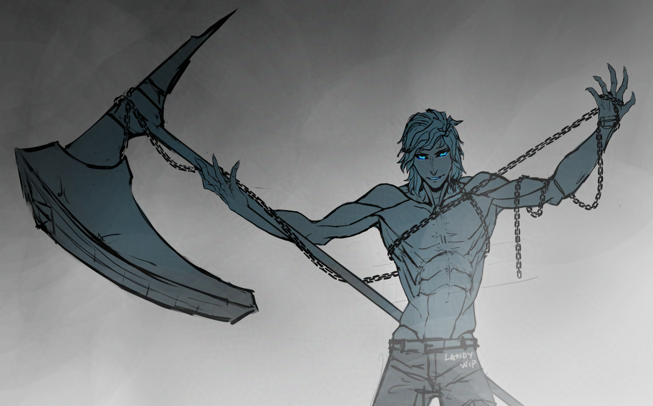
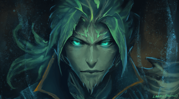
Anatomy practice! I’ve been practicing drawing anatomy construction from imagination this year, and this is one of those practices. So, please forgive me for any anatomical inaccuracies, as these are for practicing this type of anatomy construction drawing from imagination.
I’ve been having fun running around in the “Untamed” build for my ranger, which I never knew how fun a spec it is to play (mainly because of the amazing vocal lines Brandon Bales recorded for it, haha – but also the main “unleashed” hammer skill is so fun and satisfying!). It gives me an excuse to finally use my favorite hammer skin – “Onus” – which I’ve never used before because I haven’t enjoyed hammer skills on any character prior. I believe it is also a Halloween skin – so perhaps hopefully I can finish this drawing by this Halloween!
Here’s the full composition:

I also figured out a better way to draw chains with this drawing – when I’ve drawn chains for commissions before, I made a chain brush. I was too lazy to find or recreate that brush again for this drawing, and this time I just drew them manually – but surprisingly, this ended up being both quicker than when I used to use that brush, and I also like the visual result more. I remember the chain brush I made always had this uncanny “too even” appearance, which I then had to spend time making the links look more organic.
With just drawing them with a regular round brush now, it naturally lends itself to an organic feel. (Of course, perhaps now it might be not even enough. Though between the two, my personal preference is a little too organic versus too inorganic or stiff).
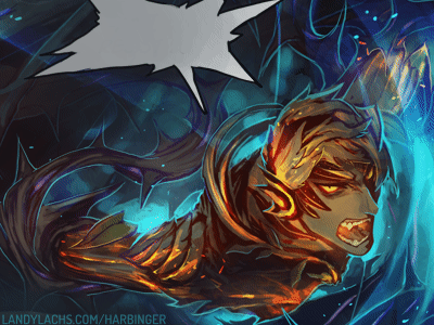
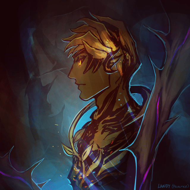
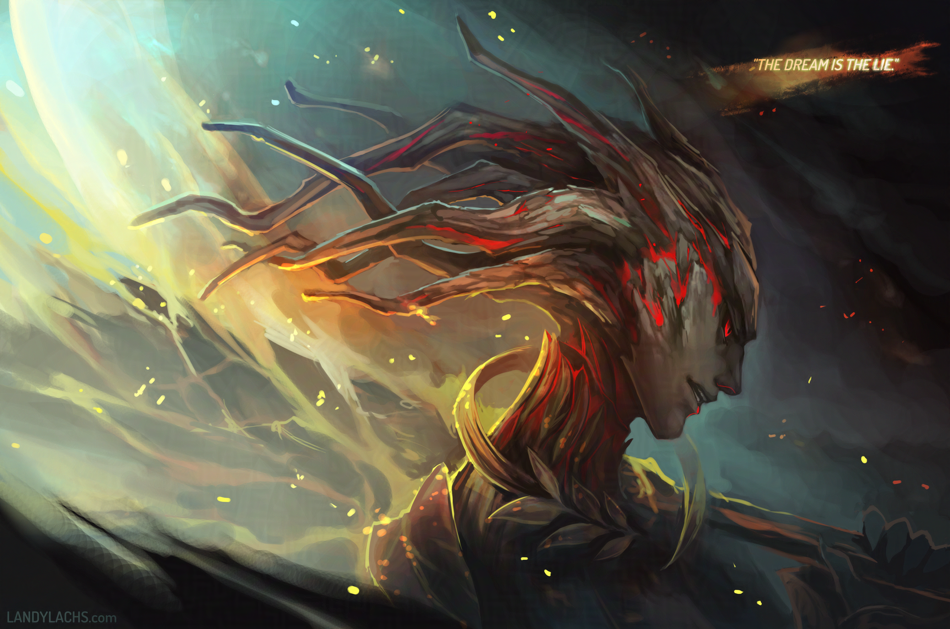
And a few extra/earlier versions in the rest of the post below: