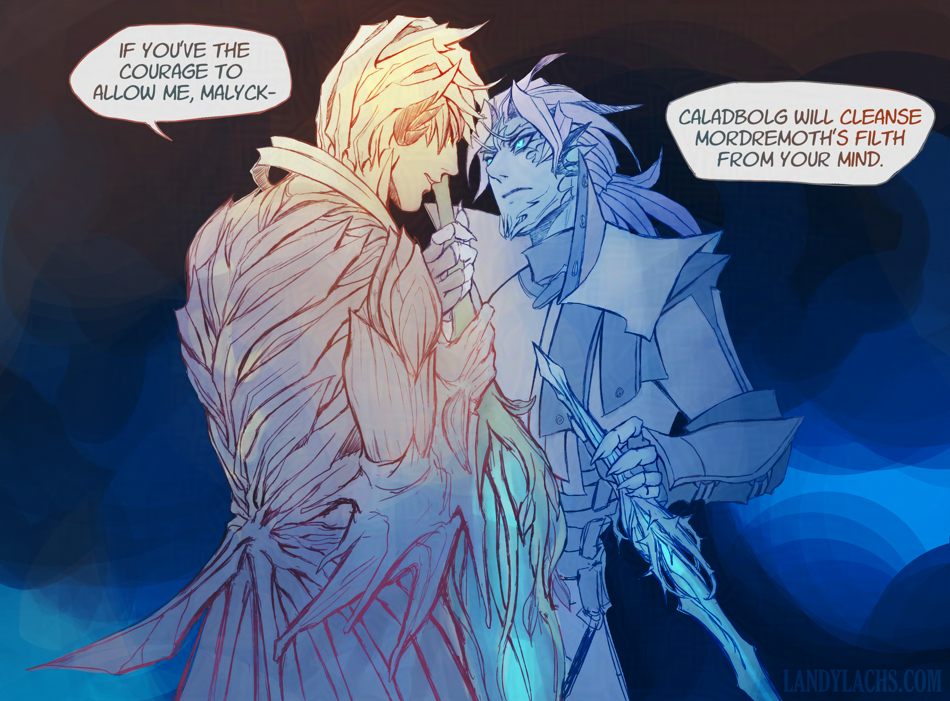
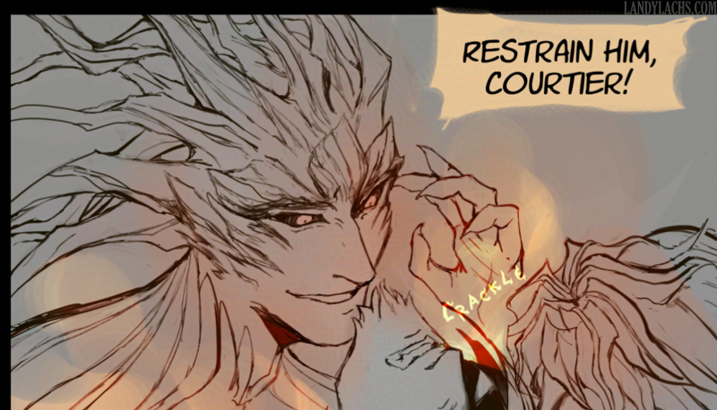
Silly sketch to warm up my drawing hand.
Edit June 3, 2026: Messing around with a few different versions. Added one of them below – a couple more, plus an earlier version of the sketch, in the full post afterward.
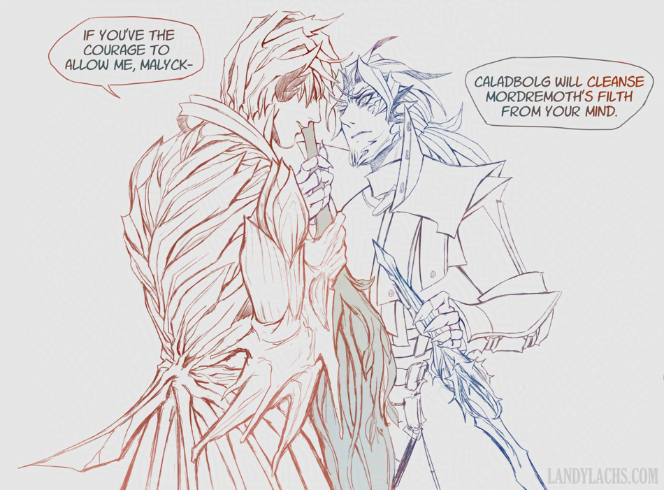
Silly sketch to warm up my drawing hand.
Edit June 3, 2026: Messing around with a few different versions. Added one of them below – a couple more, plus an earlier version of the sketch, in the full post afterward.
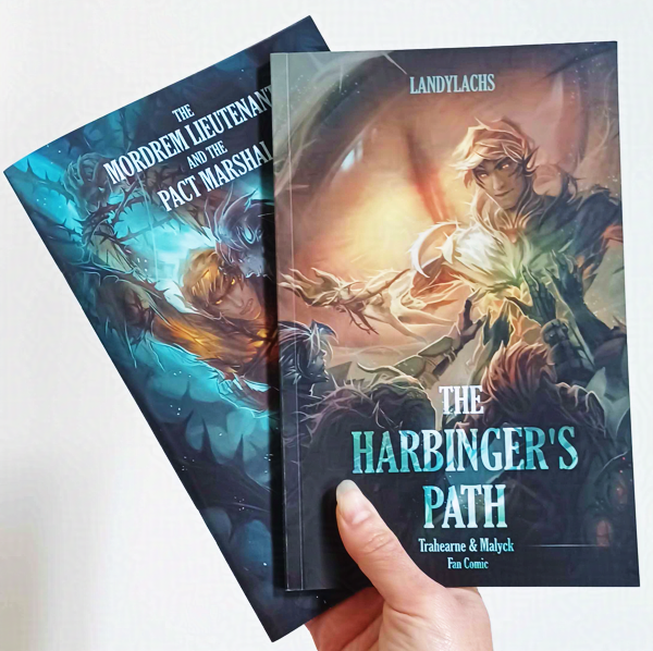
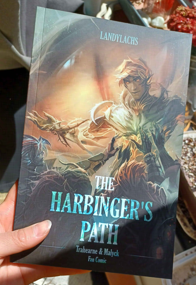
The Harbinger’s Path Trahearne & Malyck fan comic debuted in print at Manga Ichiba during Fanime last week! Thank you so much for your interest and patience waiting for these books, and thank you again if you could visit! It was incredible meeting Trahearne fans in-person. I’ll never forget the experience!
I’ll do a proper write-up about the convention another time, but because I did say I would have information about these books after the convention, I wanted to put this post up first.
More in the full post!
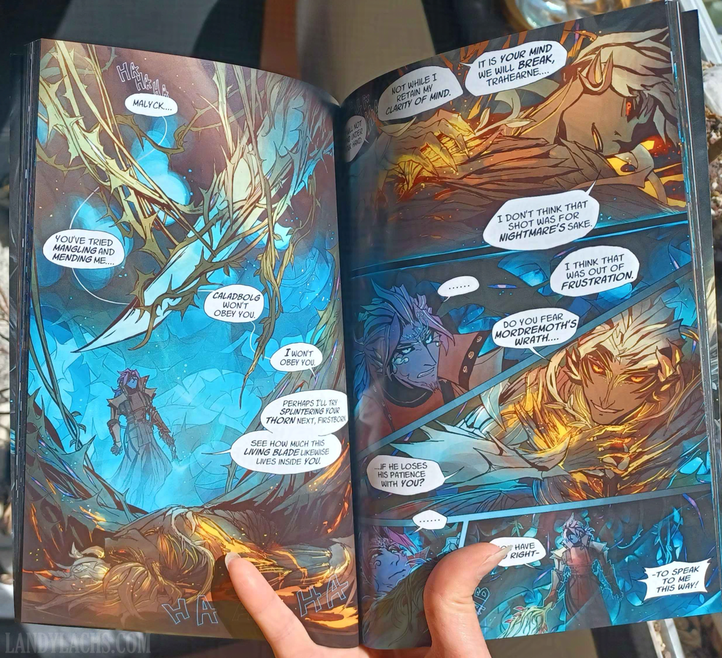
Updated the most recent print update post (Print Update #3) with additional photos from the main book (as well as the bonus booklet)!
May 28, 2026: Updated with book specs.
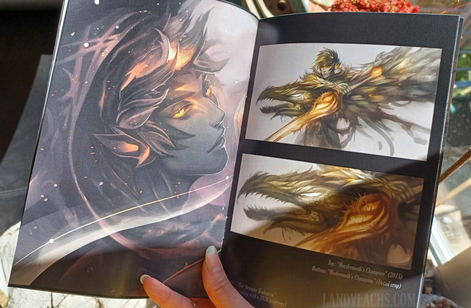
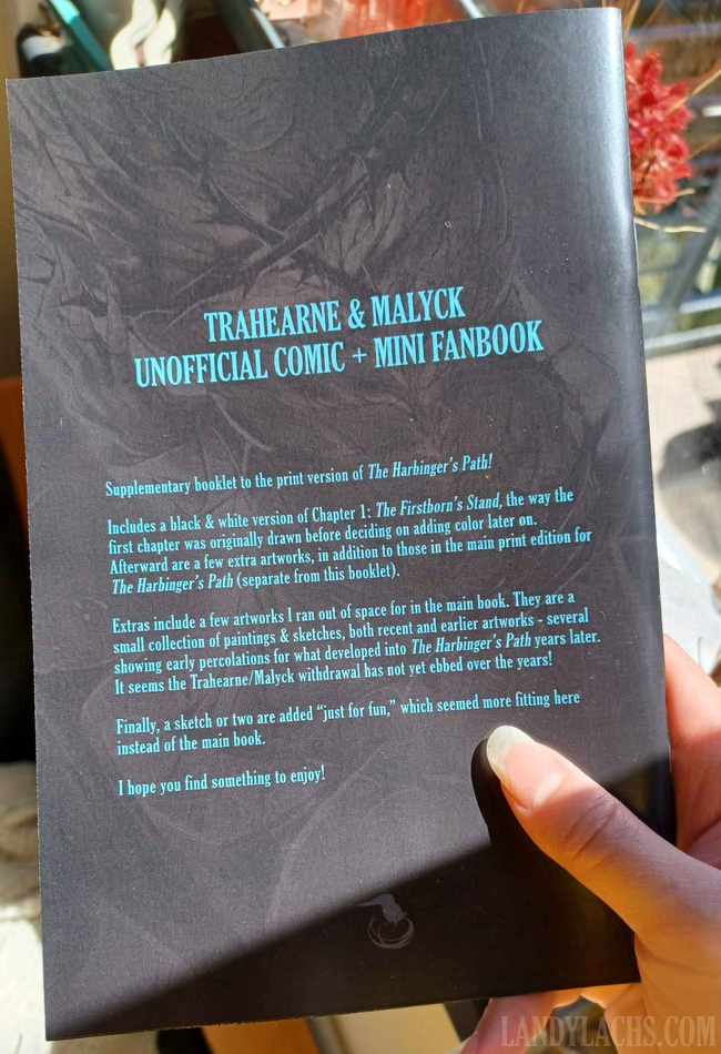
Earlier this month, after finalizing the main print book for The Harbinger’s Path, I was contemplating whether it was possible to put together a “bonus booklet” with some extra material I ran out of space for in the main print volume.
I thought it was a low possibility, because ~1 month before the convention was a little too close scheduling-wise for my taste. However, thanks to fellow artists also tabling at Manga Ichiba later this month, I learned about a new printing company, MCE Printing. Like my main printer I used for the The Harbinger’s Path (Fireball Printing, located in Philadelphia, Pennsylvania), MCE is also a domestic, NA-based print shop.
MCE prints from Kirkland, Washington, and they have a specific focus on NA-made doujinshi! How cool is that!
To my amazement, they were able to both print and ship my “bonus booklets” in record time. Even better, I am so pleased with their print quality. Thank you so much again to Mike for shipping my booklets out in record time, and with such beautiful print quality! I am beyond pleased with their print quality, especially as this was the first time printing with them, and there wasn’t time for me to check a physical proof before having them printed.
Above are two preview photos!
More photos (including the front cover) + info added to the full post for the interest-check group from earlier this month! (Scroll down to the new “Bonus Booklet” section.)
May 28, 2026: Added booklet specifications.
Felt like sharing a small in-progress preview of a panel I’m refining today. It’s Caydren!