Detail crop from the final page of Chapter 1 from The Harbinger’s Path | Retouched Version
Detail crop of Trahearne from the finale page for Chapter 1 of The Harbinger’s Path. Always meant to post this at some point, and why not today!
It’s curious for me looking at this again. At the time of this page’s completion, I was quite pleased with this portion of the page, in particular. Though they’re very loose, it was much more line-focused than I’d done before attempting chapter 1, and this panel was probably the most heavily line-focused drawing in the entire chapter. (And if it is not, it felt this way to me.)
Before this chapter, I was never very happy with my line drawings – it’s why I almost always added color to drawings before showing them. I didn’t think they looked presentable on their own without some color or value to back up the lines. This drawing was the first one I made in years where I thought it turned out decent even without color or value – I didn’t have to shade this one as much as I normally would for the drawings I was doing at the time.
Even so, as it tends to happen when doing a longer project like a comic, I can see the way I draw Trahearne now is a little different compared to how I was drawing him in Chapter 1. I’ve been aware that the style in the comic shifts a bit – mostly from chapter to chapter, but even within pages of the same chapter. Some if it is intentional experimentation (I’ve been drawing several expressions for Trahearne on page 15 this week, where he looks a little more “seinen” or older – and I might need to tone this down to not make him look too different from earlier pages), while other times it’s been a natural progression from how I’ve grown to enjoy drawing him.
But there are a few different stylistic ways I like to draw him – mostly between a little more youthful or “bishounen” and slightly more mature or more “seinen,” let’s be honest, haha. I enjoy drawing him both ways, but I hope it doesn’t look too inconsistent in the comic. At least, not in a way that is distracting while reading.
Oddly, I think I am more consistent when it comes to Malyck – but I haven’t done a full read-through of the entire comic from page 1 to the current page in a while. I might change my mind if I give that a go sometime.
Edit: Ironically (or predictably?), right after making this post, it made me want to retouch this drawing. I’ve done so above (and to the live page) – the original will be below in the full post, preserved for comparison!
In addition to the Trahearne and Malyck practice animation I made for Heart of Thorns’ 10th anniversary last month, a much smaller thing I also finished by that day was adding a bit of animation to chapter 2’s finale page. This version of the page has been live since the, and you can view it here!
It’s likely obvious, but this page was not drawn with the intention of animating it from the start. I tend to save several steps of the process in the comic page files, as I have the habit of duplicating layers and working on the duplicate when I want to make a larger change or know I will be progressing the page more. This makes my file files larger than they need to be, but on the plus side, I like being able to go back into the file and see how the page progressed over time.
My first attempt to animate this page was all the way back in August – which I just remembered, I even posted that test panel here. This test is what lead to the practice animation from last month. Even though this page’s animation is both much simpler and rougher than last month’s animation, I still have a little sentimental feelings over it, since dabbling with this page was what really lead to all the animation practices afterward (and I have more I want to do in the future!).
So! That’s why I wanted to have a version of this page up, even if it is rough around the edges. It is cleaned up from the August test – the page now is rebuilt completely from scratch from the August version, using 3 layers from the comic file itself. While it is not intended to be super-smooth (which I hope is clear – it is keyframed and not tweened), I hope the cadence feels intentional.
Does it add a little flavor to the page, or does it distract? Feel free to let me know anywhere, as I’m biased toward it, but I would definitely like to know if anyone preferred the previous static page instead of this animated version!
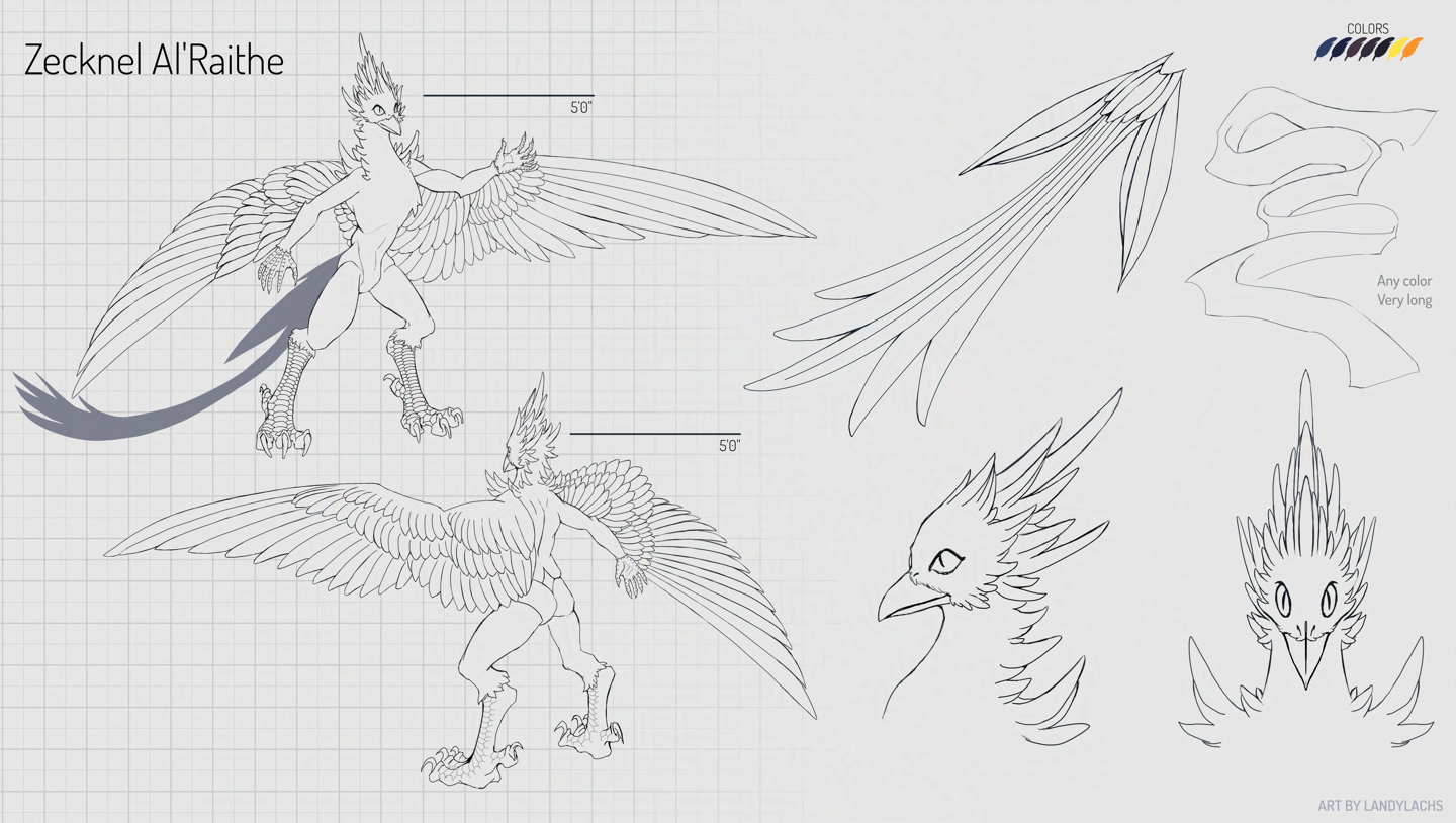
Recently finished ref sheet commission! I’m so humbled when I’m asked to do a ref sheet commission, because it isn’t something I formally list anywhere that I do, but the ones I’ve done have been very enjoyable. Many thanks to Zecknel for this one, in particular, because when first asked to do this, I let Zecknel know that I would use a looser line style. I say this for all the ref sheets I’ve done, because before this year, I wouldn’t say I work with clean lines.
Serendipitously, between the time Zecknel approached me with this project (an updated ref sheet for his character, the original itself a ref sheet I made for them a few years back) and the project’s start date, I began drawing more with line as I drew The Harbinger’s Path webcomic. By the time the start date for this commission approached, I was fairly confident I could do this reference sheet with cleaner lines than for any ref sheet I’ve drawn before. I would still consider these lines more on the looser side, and not “true” lineart – but they’re much cleaner than “lines” I’ve drawn before this year – especially on commission.
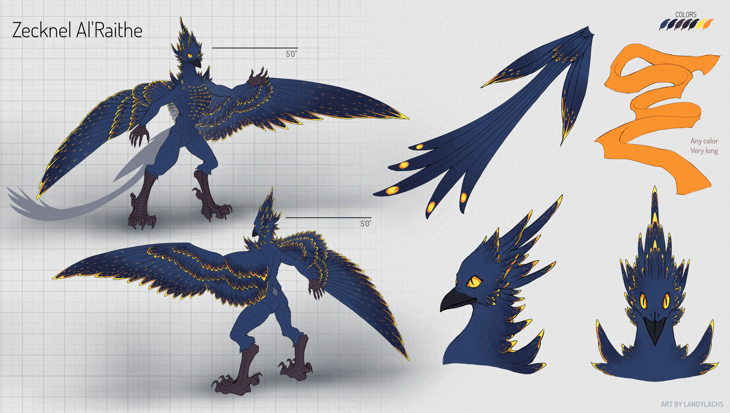
Reference sheet commission; with color.
Zecknel has such a cool concept for their character, especially once you add color. The vibrancy of their character’s feather patterns have a visual spark, I think! I’m also excited about this ref sheet, because it will be used to create a costume (or “fursuit”) Zecknel is commissioning from a specialized crafter. I’ve known Zecknel’s character for a few years now, and I’m really looking forward to seeing a physical manifestation of their character! I’ve always had a lot of admiration for the craftsmanship behind fursuit crafters – the technical skill to bring these imagination creations into physical form is this wonderful representation of passion and creativity. I’ve seen some truly incredible instances of artisan craftsmanship that rival what you see on stage or in films. I just love seeing people expressing what they love, especially the more indie types!
Crop | I especially loved drawing the scales and feathers!
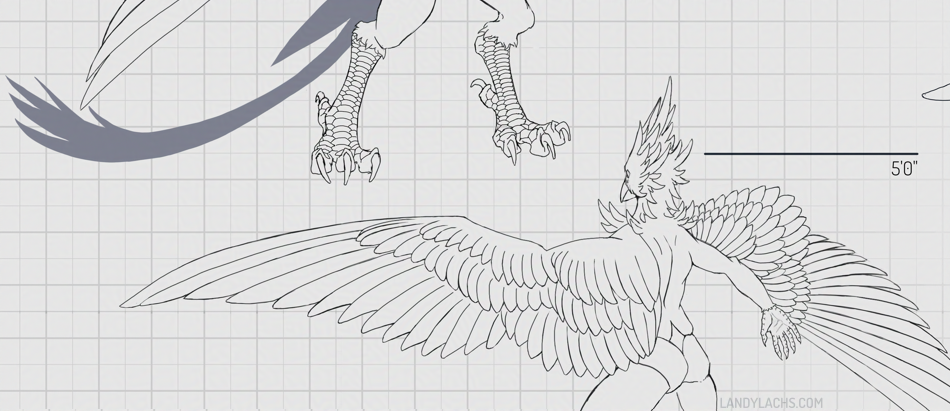
Edit Nov 5, 2025: I don’t know what it is about posting that makes my eye notice things, but I noticed the angle for the far wing was inaccurate! I’ve revised the above refs, and the earlier versions are in the full post below:
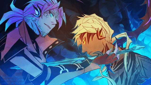
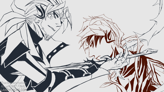
Over the summer, I started doing some small practice 2d animation tests for fun. I ended up really enjoying these, which was a bit surprising, because I’ve always been a bit rubbish with 2d animation. I always found it frustrating. Once it became around September or so, I wished to continue practicing, but knew I had to set the time I was spending animating for the comic. At least, if I wanted Chapter 3 to be ready on schedule. I had the idea that maybe I could set aside an hour of the day to practice animating – only, I wanted these practices to be for the same animation. Perhaps, over time, practicing on one project might add into something more than just a scribbled, animated mess (which is what my first attempts resembled).
I had a few ideas started for which to choose, and decided to go with this one with Trahearne and Malyck. The aim was to try an animation test in the style of lineart I was using for The Harbinger’s Path comic.
Practice rough animation | Lines only
The bulk of this was (messily) drawn over those summer sessions (and into part of September). They admittedly sometimes strayed past the 1-hour mark, because the drawing process of doing 2d animation became quite absorbing. I’ve never enjoyed trying 2d animation so much before. I’ve always really liked hand-drawn animation, but I didn’t think I had the patience nor skill for it. I mentioned to friends that what seemed to help this time around, was having onion skinning off most of the time. Something about onion skinning makes it seem so much more complex to me. I think I’m just visually overwhelmed when I see all the drawings at once. :p 2d animating seemed to feel more natural for the first time, when I just flipped between frames for much of it, instead of trying to work with onion skinning.
Learning about different types of In-between frames
What I did find onion skinning most helpful for, was later on during the animating process. Specifically, when I added the “breakdown” and “in-between” frames. I was never aware previously that there were different types of in-between frames (for any animators who may stumble across this, please forgive my ignorance). Learning this was a bit of a revelation to me! Another reason I have never been able to do 2d animation before this year, is because the sheer workload seemed so daunting. This was probably the main factor for why my previous attempts never went anywhere.
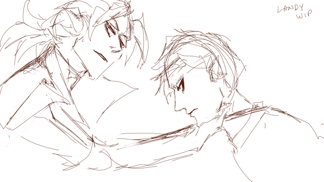
After learning about breakdown and in-between frames, though, I think this was a turning point for me during this animation. I first sketched the bare-bones keyframes on August 14, 2025:
“Keyframe” Draft | Draft 01, according to the file name! | Drawn August 14, 2025
Then I started cleaning up these frames. At this point, I didn’t know how far I wanted to take this practice study. I think relegating this practice as something I could do in small intervals over time (the aim for 1 hr minimum every weekday, with the aim of progressing a little of it each time. It didn’t matter how much, or how little, I did any specific day – it just had to be something) also helped make it less psychologically daunting.
But! Once I learned the difference between breakdown and in-between frames, this enormously helped me wrap my mind around the workload.
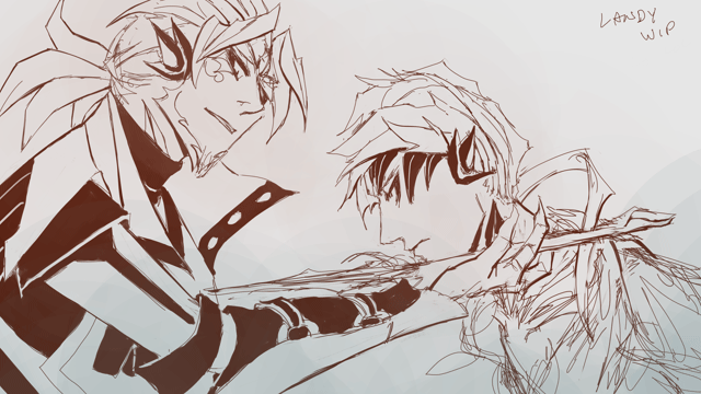
“Breakdown” and “In-between” frames
One of the earlier drafts | Also drawn the same day (Aug 14)
For those who haven’t come across this term before, this is my understanding of the differences (and take it with a grain of salt, I could be misunderstanding parts about it – when looking this up, it seems like there might also be different terms describing the same parts of animating, or different people/studios have different definitions of the same terms) (please feel free to correct me):
Breakdown frame – the frames between your keyframes. They help describe the motion between your keyframes. They tend to not be equal in distance between your keyframes.
In-between frame – the frames between your keyframes and breakdown frames. This is the bulk of the labor!
My understanding is the presence of these frames can also be tied to different steps of the 2d-animation process. Specifically:
“Keyframe” animation – the initial draft with only the keyframes (see “Draft 01” clip above). In looking things up for this post, I have also learned this is sometimes called the “roughs” or “rough animation.” Which also means I have been using this term incorrectly – I apologize!
“Tie-down” animation – the first pass of blocking out the major forms from the keyframe draft. I’m guessing the clip right above is a partial part from this process?
“Cleanup” animation – the part of the process where frames are further cleaned-up from the tie-down, but the in-between frames are not yet added. I’m not entirely sure about this, though, as I’ve seen some definitions equate both “tie-down” and “cleanup.” I’m still unclear about this, haha.
Current animation stage
Anyway, this is a very rough test – keyframes are prioritized, and in-betweens are extremely rough in places. Once the 10-year anniversary for Heart of Thorns approached, I thought it’d be a fitting opportunity to try and clean the animation up a bit, and see if I could make it more presentable.
And that is the result you see at the top of this post! I want to say I spent 2-3 days in October cleaning up what I had done in August/September. I tried to do as much as I could before the anniversary today. A few specific features I added in October are animating the vine glows in the background (which is directly inspired from an earlier Trahearne animation test I drew in August – which I’m realizing now I never posted to this blog, I’ll post it at the end of this post), and then the day before I added Malyck’s little stamen antennae, lengthened his “Crying Thorn” dagger in an earlier frame (think I may have overdone this a bit), and added more rim lighting that was only in a partially drafted state (this helped the vines wrapping Trahearne read much more clearly, in particular). I also did various clean-up to the colors, mostly for Malyck’s early frames, and the glows on the vines wrapping around Trahearne.
While the version I have now is not what I would call anywhere close to finalized or polished, I hope the idea is more or less clear! And that some might enjoy it for the practice test that it is!
The first two clips in this post are 24 frames per second, while the third and fourth ones afterward were sketched at 12 fps. The timing was adjusted multiple times since the 12 fps clips, which I have learned from first-hand experience I should have settled on sooner. ;p
Edit: Added more expanded thoughts to this post the next day.