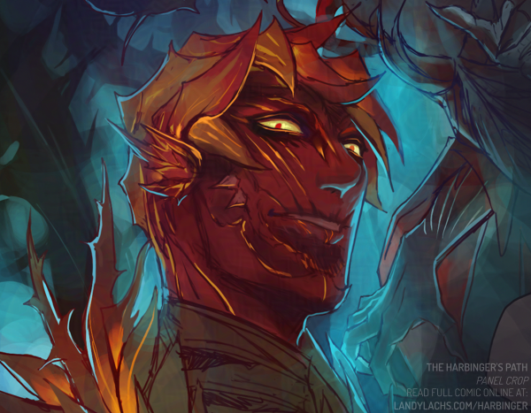
I love Stardew Valley and have played it on-and-off for several years now, yet curiously I still have not married anyone in my multiple save files, haha. I can’t choose! I love many of the NPC’s for different reasons. I still plan to, eventually. But anyway! Seeing Sebastian in his winter outfit portrait inspired me at the time to try painting him, based on that teaser image. The full image is about 3/4 body, but I was never happy with this painting, so here in the lead-up to 1.7’s launch, I was once again inspired to try painting Sebastian again – this time, with a paintover of that original painting from 2023.
I don’t know if I’ll finish this one (but I’d like to!), so here is just a small crop from the image for fun! I also don’t know if I’ll show the original 2023 version, because I was never very pleased with it, and the errors bother my eye. Because this was also drawn only from that portrait teaser (I hadn’t seen the sprite model), the outfit is also likely not accurate to how it is in-game.
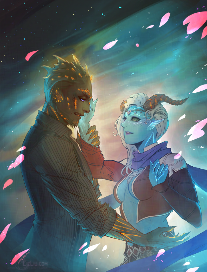
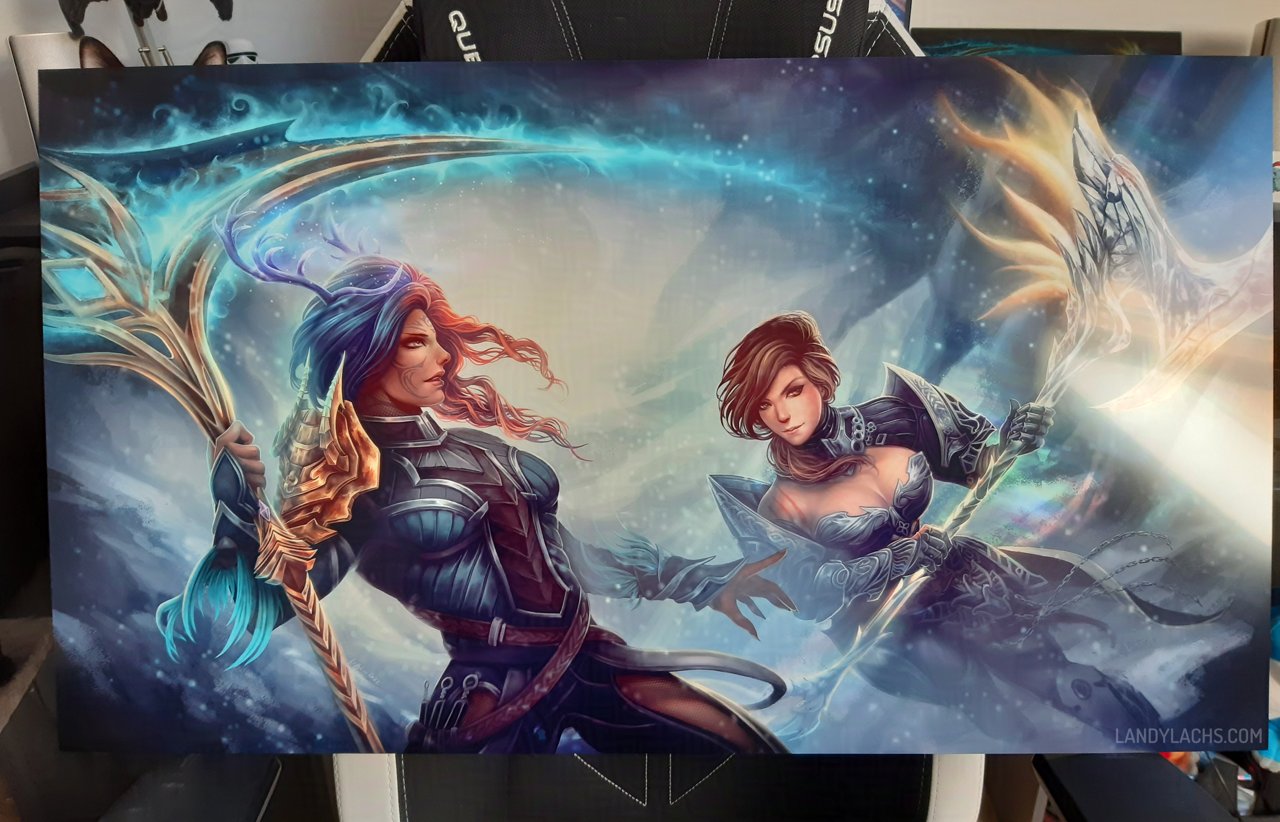
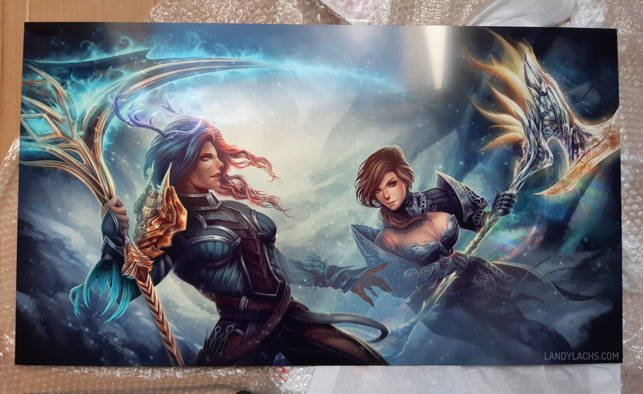
“Canach and Akoni” | GW2 “comics-style” commission
A Guild Wars 2commission for Kyris finished earlier this month! This was an especially fun one, as Kyris asked me to try a commission in the style I’ve been drawing for The Harbinger’s Path webcomic. I’ve grown to love drawing in this style over this past year, but hadn’t thought too much about potentially doing it on commission. I’m grateful to Kyris for suggesting it, as I’m pretty pleased with how this style turned out in her drawing!
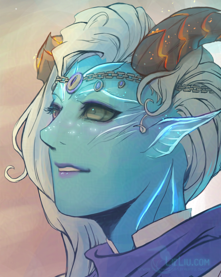
“Akoni Wolfsbane” | Detail close-up
I’m especially happy with how Akoni’s face turned out. I think it is one of my favorite feminine faces I’ve ever drawn!
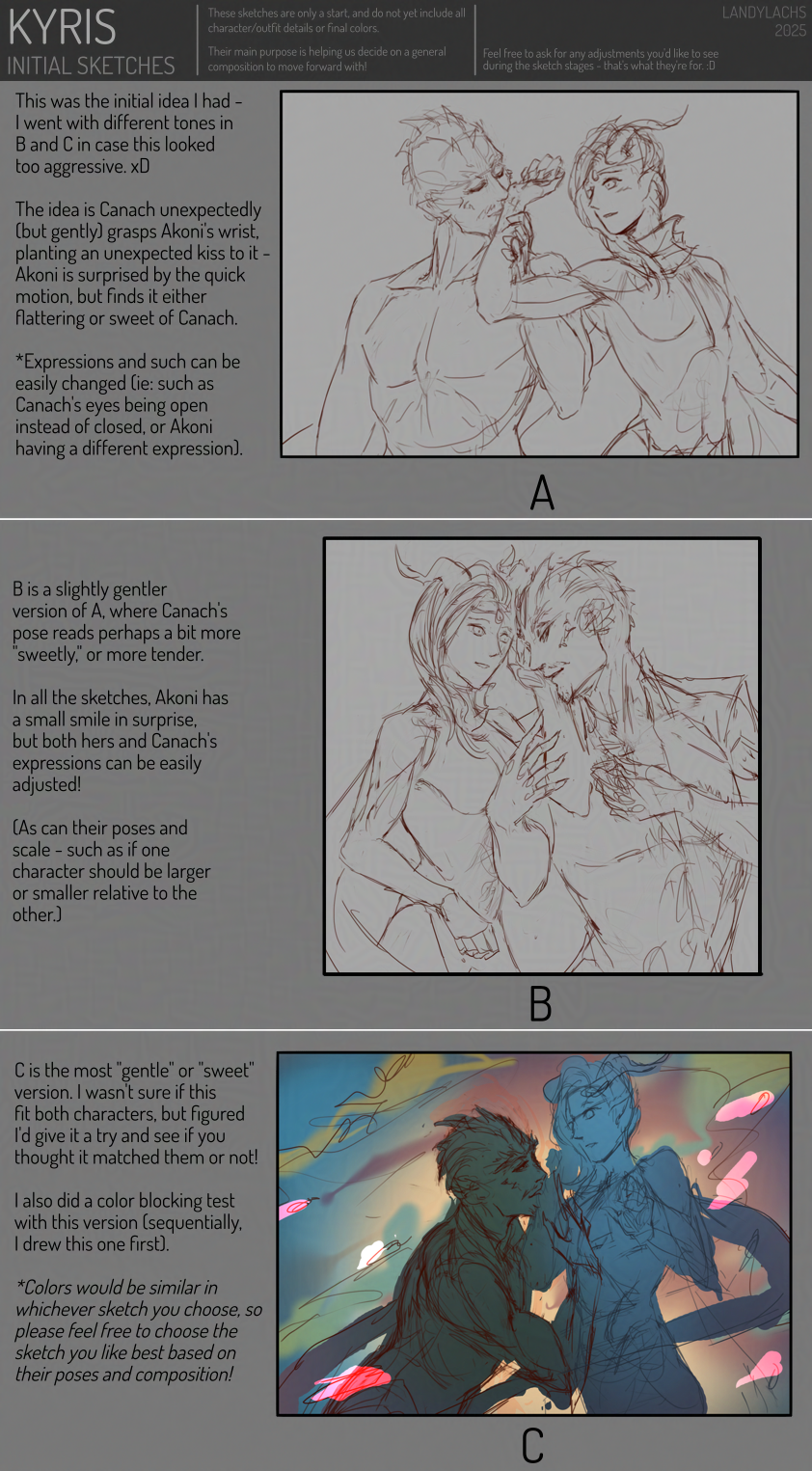
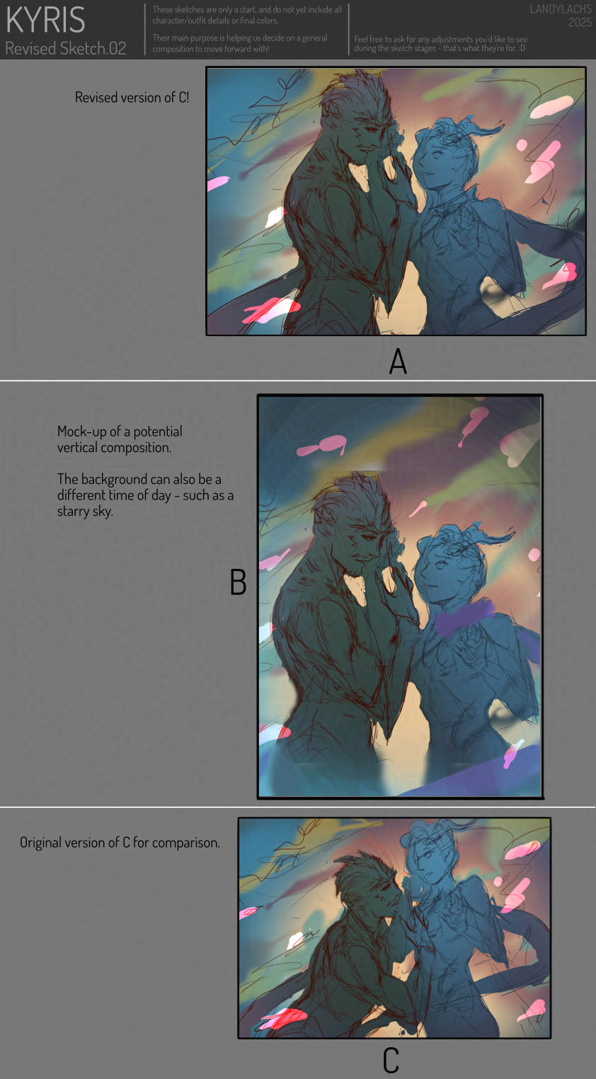
A few process images below:
Initial sketches.One of the sketch rounds with revisions after feedback!Work-in-progress lineart after the composition was decided on through the sketch revisions.The final piece once more!
Spurred from a conversation with Jasmine on bluesky yesterday where she said, “trahearne is back and he’s santa– 🧑🎄” – which gave me a variety of amusing mental images I immediately wished to draw.
This is a warm-up sketch that I might finish another time.
This is 3/4-body in the full composition – putting it in the full post, because I think the shoulder is a little off (this is another anatomy construction practice from imagination drawing). Edit: Updated the 3/4 version it slightly; I guess I’ll leave it without a readmore now, though there are still off things about it – still a sketch/potential WIP).
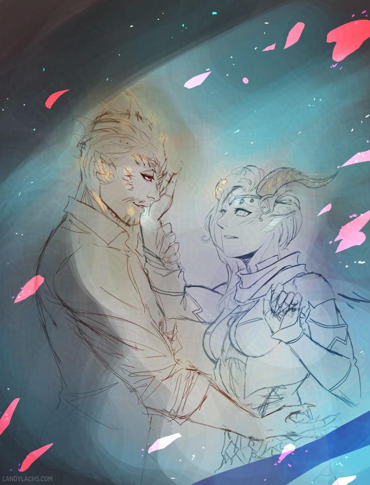
Ah! The dreaded hiatus! I was hoping I’d be able to continue The Harbinger’s Path update schedule until Chapter 3’s conclusion. When I originally planned the page schedule, I had more time during November & December than what ended up happening. There was a point in November where I thought I’d have to put the comic on hiatus for about a week and a half due to learning I’d be out of town for a bit, but I scrambled to finish a few pages early, and was able to keep the schedule last month without interruption.
While I’m pleased I kept a consistent 2-pages/wk update post schedule since Chapter 3’s launch on September 29 through December 8 today – I think that isn’t too shabby considering this was my first time trying a webcomic update schedule! – I unfortunately don’t think I can do what I did in November again this month. Between deadlines and holiday obligations, December is turning out even busier than November. Most importantly, these next few pages are more complex for me to draw than the pages in November. I mentioned the possibility of a hiatus in last week’s post, but didn’t link it anywhere because I was hoping I’d be able to avoid one.
As mentioned in that post, my main concern is I don’t want the quality of the pages to suffer due to lack of time. Or even fatigue, as I’ve been sacrificing a bit more sleep than I really should for the most recent pages. I felt it beginning with today’s page 21, as it is not as refined as I would like. I plan to touch it up this month during the hiatus.
So, the hiatus! What does this mean? This is a hiatus for the comic’s page updates, but not the comic’s progress. I will be drawing the remaining pages during this hiatus, and using this additional time to try and make them a little extra special!
I’m very sorry to interrupt the comic’s update schedule, as I fully intended to continue with regular page updates until Chapter 3’s conclusion. It seems a bit silly in hindsight, but I didn’t account enough time for the unforeseen circumstances that inevitably crop up this time of year (Nov & Dec specifically). Back in September/October, my schedule for Nov/Dec looked so much more open than they ended up being. In the future, I would plan for more of a page buffer during busier times of the year like now.
I promise I will work very hard to make Chapter 3’s conclusion worth the wait, and I’m confident this is the best decision for the comic to maintain its quality. And, hopefully, your enjoyment of it!
New pages will tentatively be posted on January 19, but I’ll confirm this as we approach closer to this date.
Thank you for reading this year!
Thank you so much again for reading The Harbinger’s Path this year! Truly, it means the world to me. I’m still amazed there are people who enjoy reading my comics. It’s been a pleasure drawing this story for you, and especially reading your reactions and thoughts. I can’t wait to finalize this chapter, as well as look forward to drawing new comics and new stories in 2026!
In the meantime, enjoy your holidays! And, please look forward to January 2026 to find out what happens next with Trahearne and Malyck!
“Bou and Dali” Print, Photo 01 Photo credit to the commissioner; shared here with permission. Sketchblog post for this artwork here.
Ever wondered where those gorgeous prints you see in artist alley conventions are printed? Or do you have commissioned artwork you’d like printed for your personal use, but wondered where to print them? I was always curious about this – and a few years ago, I learned a little more about it!
These are adapted from two email replies I wrote a while ago for previous commissioners, who wished to print the art I painted for them afterward. I’d been considered formatting those emails into a post for this blog, because I found the info helpful both for myself, and to to share when occasionally people ask printing-related questions. Now’s as good a time as ever!
As I wrote these both over a year ago now, if you notice any out-of-date info, please feel free to comment or let me know somewhere. I’d be more than happy to keep this post updated!
Printers in the US
For the US, I recommend these two printers. :D To my understanding, these are among the most popular used by artists for artist alley conventions.
I’ve used this printer before. Their quality is excellent. Their prints are archival quality (they should not fade or yellow over time).’
Only note is, factor in the lighting for where you plan to display your print. Their prints have lovely depth and richness of color, but they might need proper lighting to show their full vibrancy. In dimmer lighting conditions, the print might appear too dark.
Their extensive options can be a little confusing:
Posters & Brochures is the most likely option you’d want to use for your print , as they offer a range of standard sizes.
If you wanted a larger size not mentioned in those options, then you’d want to go with Large Format.
Their biggest downside is their standard art prints are not archival quality (they might fade or yellow over time).
They do also offer archival-quality options, but they might only be for larger prints. They classify them as Posters.
I haven’t used this printer, but I’ve heard many good things about them. People seem happy to print with them.
They offer free hard copy proofs, which lets you see how your print looks before committing to the final print. This might be a good option to consider, especially if your painting has some darker tones in the background. Being able to preview a physical proof, before ordering the final print, may provide peace-of-mind it won’t print too dark (and gives you the option of adjusting the file before printing the final).
The original for this section was written July 10, 2024, and I did some formatting for the blog here today. I checked that links still work, but keep the date in mind for when this was written, compared to when you’re reading this. It’s possible some of what I wrote here is out-of-date, since it’s a year later now. On the other hand, I’ve known these two printers have been among the most popular ones used for artist alley conventions for years, and my impression is they are fairly stable platforms given their longevity.
“Bou and Dali” Print, Photo 02 Photo credit to the commissioner; shared here with permission. Sketchblog post for this artwork here.
Printers in the EU
For the EU, I asked a few people, and was recommended these two printers!
The person who recommended them to me has used them in the past, and was happy with them. They said to feel free to reach out to the website’s support team if you need help or questions about their prints.
Update 12/4/2025: I’ve heard Mixam’s quality has become a little less reliable in recent years, compared to the stellar quality they were previously known for. People advise planning ample shipping time to review proofs or additional orders, as their defective rate seems to have increased.
Mixam also has a US site, but because of the previous bullet about wavering print quality, the two in the “Printers in the US” section might be better, depending on your location.
This print shop is located in Paris. I am unsure if they are a retail store only, or if they also have an online store. You will probably be able tell more easily than I can, because it looks like their site might be French-only. :p (This was originally written for a French-speaking commissioner.)
The person who recommended this printer to me said they are very high quality, but implied they might be more expensive.
The original for this section was written July 25, 2022, with some formatting edits today. Again, keep in mind the date the info here was written compared to when you are reading this, in case anything has become out-of-date.
Local Printers (Any Region)
If you have access to a local printer, this is always a recommended option!
Local means you have the added benefit of being able to receive customer support in-person. You can also immediately see the proof quality, and speak directly with someone who will help you with any adjustments needed for your print.
In the US, a few local printers I’ve heard people use are:
FedEx Office Stores
Office Depot
The main issue I hear about stores like FedEx/Office Depot is the quality can sometimes vary significantly – even at the same store – depending on who is working on a particular day. I’ve heard experiences ranging from surprisingly wonderful to shockingly disappointing. I would guess the quality, on average, is generally satisfactory. But, it might depend on your use-case scenario.
Michaels (the craft store!)
I only recently learned Michael’s does prints! I haven’t used them personally, but the person who mentioned them to me was very pleased with their print quality. And that the cost was reasonable, though not inexpensive.
With Michael’s, you also have the added benefit of having their framing department in-store. Frames can be essential depending on how you wish to display your print – don’t overlook them!
It’s possible my info is out-of-date, but I always heard praise for their framing departments (I’m not sure how much this might vary from store-to-store).
I’m unfortunately unfamiliar with specific local EU printers – check your area, or if you know one, let me know and I’ll add them here!
That’s the summary! I hope it might be helpful to someone. If you have feedback or suggestions for this post (or questions about printing), again feel free to comment or let me know wherever you see me active. Happy to keep it updated!
A hearty thanks to Bou & Dali for taking these wonderful photographs, and for their permission to share them here with you!
Close-up photo from the commissioner showing print quality details.
Updated December 5, 2025: Added the “Local Printers” section after receiving helpful feedback!
 Eric Barone’s (“ConcernedApe”) announcement today of a new, upcoming major Stardew Valley update (v 1.7) reminded me of a painting I started during the last major update, the 1.6 update when winter outfits were added. Before the patch went live, ConcernedApe teased two portraits for the winter outfits – one which showed Sebastian!