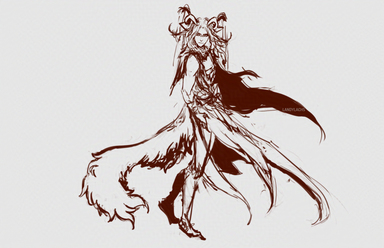
Anatomy construction practice from imagination. It’s Corveil! Cropped because I probably won’t work on this more, it’s mainly a mental drawing exercise I wanted to try.
Anatomy construction practice from imagination. It’s Corveil! Cropped because I probably won’t work on this more, it’s mainly a mental drawing exercise I wanted to try.
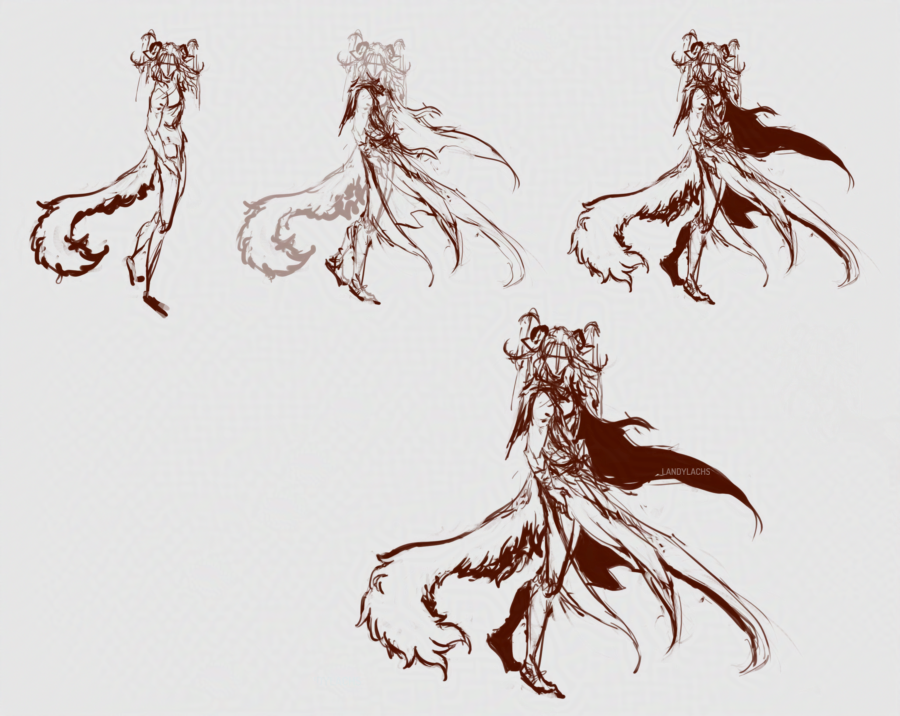
Edit August 13, 2025: Added the fullbody WIP composition!
Anatomy practice! I’ve been practicing drawing anatomy construction from imagination this year, and this is one of those practices. So, please forgive me for any anatomical inaccuracies, as these are for practicing this type of anatomy construction drawing from imagination.
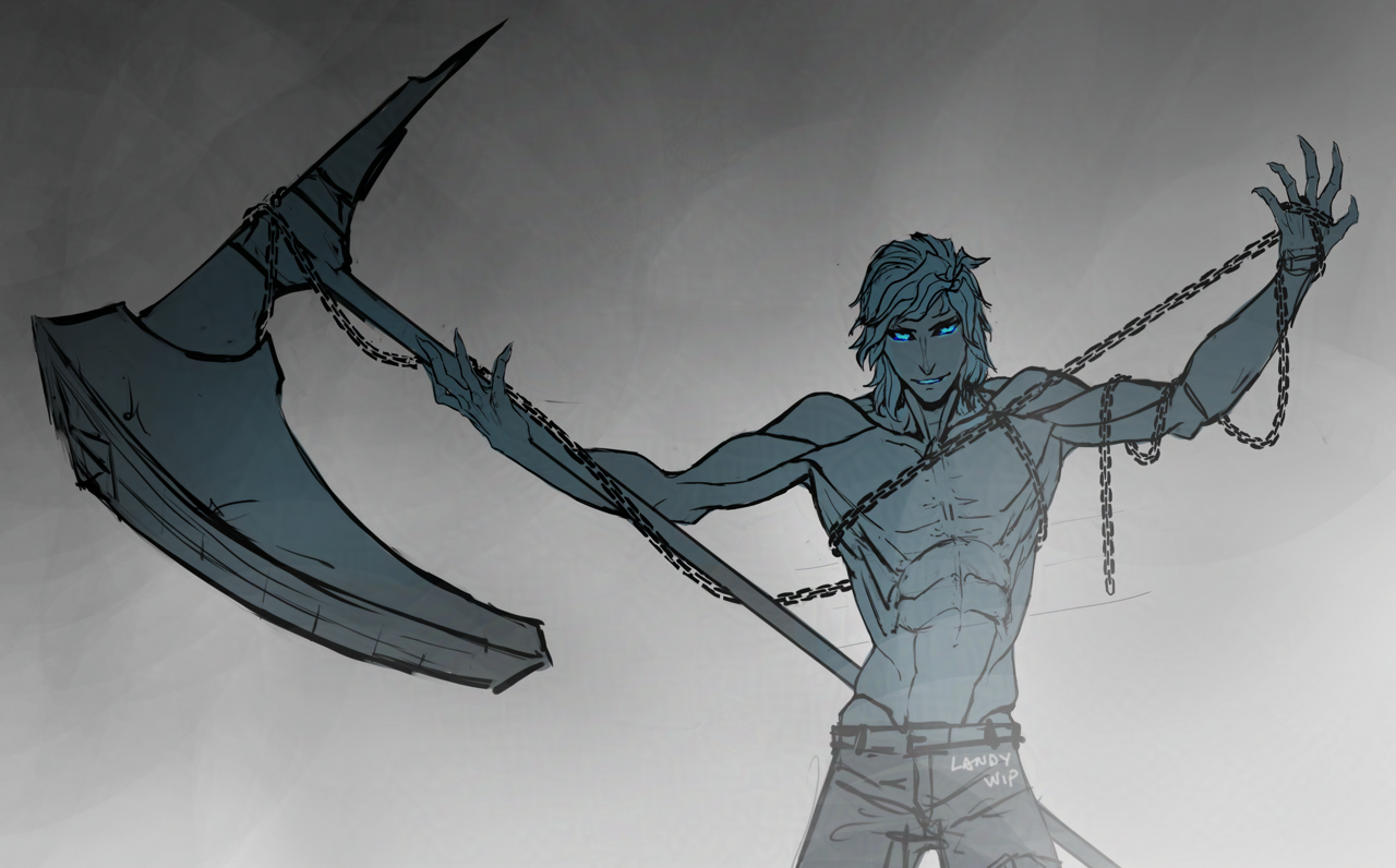
I’ve been having fun running around in the “Untamed” build for my ranger, which I never knew how fun a spec it is to play (mainly because of the amazing vocal lines Brandon Bales recorded for it, haha – but also the main “unleashed” hammer skill is so fun and satisfying!). It gives me an excuse to finally use my favorite hammer skin – “Onus” – which I’ve never used before because I haven’t enjoyed hammer skills on any character prior. I believe it is also a Halloween skin – so perhaps hopefully I can finish this drawing by this Halloween!
Here’s the full composition:

I also figured out a better way to draw chains with this drawing – when I’ve drawn chains for commissions before, I made a chain brush. I was too lazy to find or recreate that brush again for this drawing, and this time I just drew them manually – but surprisingly, this ended up being both quicker than when I used to use that brush, and I also like the visual result more. I remember the chain brush I made always had this uncanny “too even” appearance, which I then had to spend time making the links look more organic.
With just drawing them with a regular round brush now, it naturally lends itself to an organic feel. (Of course, perhaps now it might be not even enough. Though between the two, my personal preference is a little too organic versus too inorganic or stiff).
And a few extra/earlier versions in the rest of the post below:
Update: May 22, 2025

I think I figured out what I found displeasing about the original “finished” version of this drawing (the version right below this text), and why I preferred the earlier sketch – it’s likely because I didn’t darken the tops of his eye socks/below his brows, to match the contrast that was in the earlier sketch. I think it gave him the appearance of not having eyebrows, or having too-light eyebrows, which lessened the contrast I liked in that early sketch version.
Changed the date on the drawing to today’s, since it’s a different enough change to me now. Oh! I also meant to mention how the lighting conditions varied a bit through the photos (I’m next to a window) – I tried to adjust the photos to match the drawing as closely as I could to how it is on the paper, and hopefully the lighting doesn’t look too inconsistent.
Original post below:

Malyck warm-up drawing from yesterday when my hand was feeling stiff. Also, I’ve been practicing my letterforms recently – how does it look? Is it too ostentatious? Haha.
I’ve never been fond of how cursive “L” looks when I write it, which has been a small annoyance throughout the years as both my name and pseudonym begin with the letter. I also have always had messy handwriting, and earlier this year when I started using physical notebooks again, it inspired me to try practicing my handwriting to see if I could improve it.


To my mild horror, I realized so much time had passed since the last time I wrote cursive by hand, I had to look up how to write some letterforms again! This shocked me, because I grew up writing almost exclusively cursive. I remember enjoying writing in it over print/block letters, by a substantial amount. How could I have forgotten?
Anyway, in my search for a sheet showing basic cursive to remind myself, it lead me to become interested in “scripts” – not programming scripts or screenplays, haha – but styles of calligraphic writing which have been popular in the past (and present!).
I became partial to a script called “Old English Copperplate,” which is a type of handwriting which seemed most popular during the 18th century/1700’s in the west. It has flourishes and embellishments I find aesthetically pleasing, and I also thought they might be useful practice for improving my hand control. As I’ve never been confident in my writing abilities (or fond of how much hand writing looks). Oh! Though, I should mention that while I follow some of the script’s letterform’s, I don’t follow it precisely. The – I think they’re called “descenders?” – but tlike what you see in the lowercase “g” and “y” in “Malyck” and “Landy” written beside the artwork – those aren’t aren’t accurate to the script. They’re fun to write the loops this way!
And, as a bonus, I think it has been improving my drawings when using digital!

I like this drawing more as a sketch (the image captioned “Drawing work-in-progress” above) than how it looked in its original final version, seen above. I tried some small refinements this morning (the top image of this post), which I think helps a bit. But I still prefer how it looked in that earlier sketch version.

A friend is interested in doing a practice run of her own DnD campaign, and asked if I wanted to join. I haven’t done something like that before, but I said sure! She said think about which character and class I wanted to play as. I said I’ll get back to you!
After paging through the very long play handbook she said to use as a guide (I believe it’s the “2014 5e” version), I suspect it’s the hipster class, but I decided Tiefling looked the most fun visually to me. I’m still undecided on class, and tried sketching him to see if it might help me decided. Though the fireball there is mainly to signify that I think I want him to be a spellcaster, and not necessarily a fire-wielder. He’s also very loosely based on one of my existing characters, though I don’t think I have a post of him here on the sketchblog.
Anyway, for his DnD version, I’m leaning toward either Wizard (maybe “Enchanter,” “Illusionist,” or “Necromancer”) or Warlock (“Fiend” patron), and to a lesser extent, Sorcerer (though I don’t think I like the randomness of this class, from what my friend told me about it).
My being still undecided on class is why my tiefling there is still without an outfit – though I guess I could have put him in some type of cloth garb since I know I want him to be a light-armor/magic class. Well, I also won’t say no to practicing drawing male anatomy, haha.

Close-up of the sketch.
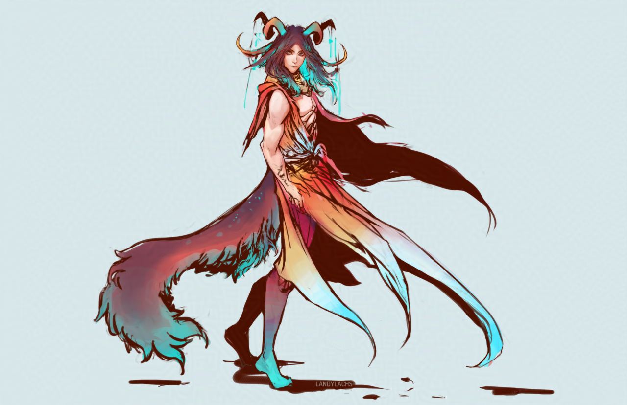
I’ve been meaning to try some different designs for Geissler for a while – here’s a recent attempt! I’m not sure if I’ll finish this one, but it felt good to draw him again. The “in-progress” of the title refers to the design – he’s meant to have an accessory by his wrist, and probably sandals with some sort of leg wraps. But, since I’m not certain whether I’ll finish this drawing or do another one with the design, I wanted to post it as-is for now!
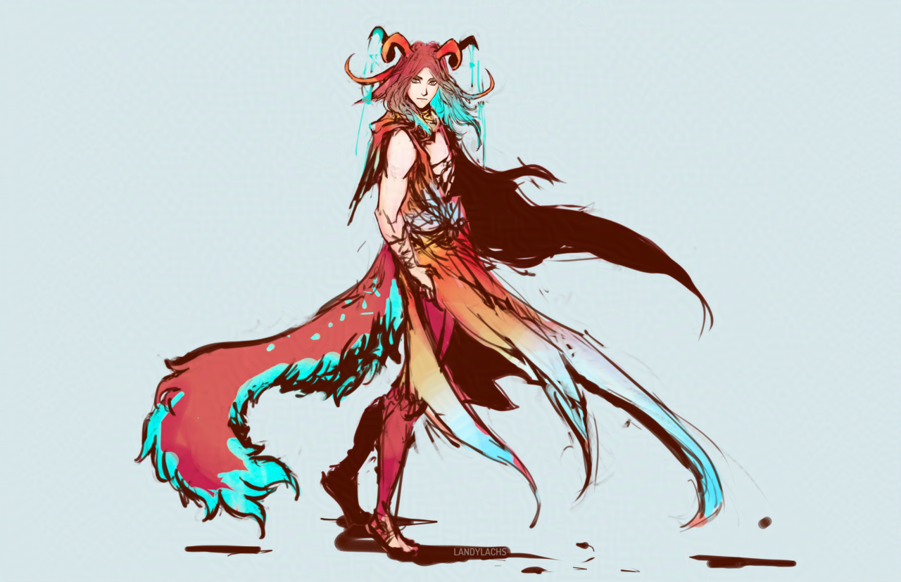
Geissler’s previous design was much more monochrome – essentially dark hair, dark or gray eyes, pale skin. I have a lot of characters with darker-toned hair – including the character Geissler is meant to foil – which is another reason why I wanted to explore a potential redesign. So, here I tried adding more color to him. In the image at the top of the post, I brought back some of that monochrome aspect, by darkening his hair and subduing the color contrast – which I’m not sure whether I like yet or not. Hopefully seeing it here on the blog will help me with deciding which fits him best!
Looking at him now, I sort of lean toward going with the lighter/redder tones.