For site updates, I think I’ll make at most one post per month, and continuously add any additional updates during the month to this monthly post. This way, I am not clogging the blog with posts about web maintenance, haha.
Only works for the sites above – does not work with the portfolio site ( LizLiu.com ). That will be a future update. :)
Image previews should now show when sharing any page from this sketchblog (as well as Duskbirds and the G Gundam translation site) on platforms that support it! I’ve tested it with Discord and BlueSky so far, which seem to work as intended.
Adjusted link text
Bolded links for improved legibility
Duskbirds: Fixed site title from being bolded unintentionally
I guess I’ll add the Duskbird updates here for now, too, as I don’t have a place for it on that site (and I’m not convinced it’s worth it to have a separate updates page for the comic site. Thinking I’ll use my sketchblog as my “catch-all” site for miscellaneous odds and ends, in addition to the art or written posts).
July 18, 2025
Adding to this page, as I don’t feel like making an entirely new updates post for small site maintenance like these:
Did several miscellaneous updates to the backend of the site.
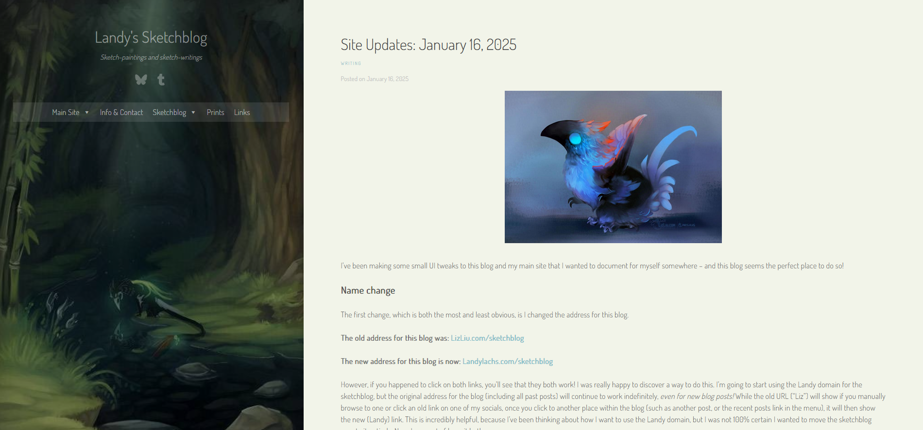
I’ve been making some small UI tweaks to this blog and my main site that I wanted to document for myself somewhere – and this blog seems the perfect place to do so!
Name change
The first change, which is both the most and least obvious, is I changed the address for this blog.
However, if you happened to click on both links, you’ll see that they both work! I was really happy to discover a way to do this. I’m going to start using the Landy domain for the sketchblog, but the original address for the blog (including all past posts) will continue to work indefinitely, even for new blog posts! While the old URL (“Liz”) will show if you manually browse to one or click an old link on one of my socials, once you click to another place within the blog (such as another post, or the recent posts link in the menu), it will then show the new (Landy) link. This is incredibly helpful, because I’ve been thinking about how I want to use the Landy domain, but I was not 100% certain I wanted to move the sketchblog over to it entirely. Now, I can sort of have it both ways.
I’ve actually had the Landy domain for several years, mainly for identity reasons, but I never got around to using it for anything (other than the base URL – without the “sketchblog” part – redirecting to my portfolio site). The base domain still redirects to my portfolio site as of this post, but I have plans for it soon for it to become its own thing, separate from my portfolio.
Along these lines, I also changed the blog’s name to “Landy’s Sketchblog,” whereas before it was “Liz’s Sketchblog.”
I’ll go into why I wanted to consider this change later on in the post, after showing the layout changes. But I wanted to note down this name change at the top, because it is an important change for the clarity of this blog.
Layout Changes
While looking through my files, I unfortunately realized I didn’t save as many screenshots of the layout changes as I thought I had. But that’s okay, I’ll just post what I do have.
Desktop Layout (Sketchblog)
Let’s start with the changes to this blog! Here’s how it looks now:
Current sketchblog layout, main page with off-white background. Link color also adjusted to slightly more green.
The latest change I made was switching the background color for the main content area from white to an off-white – I’m not sure this will be the final color, but I’ve been leaning toward using more of a variety of colors for my Landy/non-“Liz” pages recently. It’s more fun!
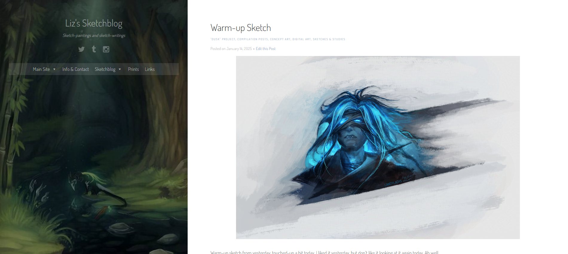
Here’s how it looked before deciding to change the content area background color:
Sketchblog layout, main page with white background.
Here’s how it looked before I decided to change the blog’s name (also apologies for the misalignment of these screenshots, they were taken on-the-fly while making the site updates):
Slightly before the current layout, main page.
In the above, the main change with the current layout is decreasing the size of the blog title and description, as well as lowering the opacity for both, as well as the nav links and social icons. This is to emphasize what should be the main draw for this blog – the content of the posts themselves.
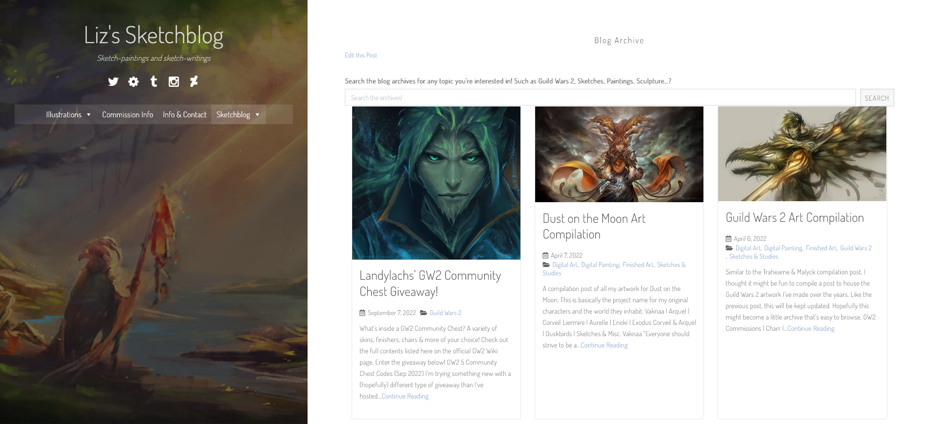
And here’s how it looked before I made the small tweaks earlier this week (showing the archive page, though without the categories I added later – this screenshot is from a while back):
Before the main changes from earlier this week, blog archive (without categories showing).
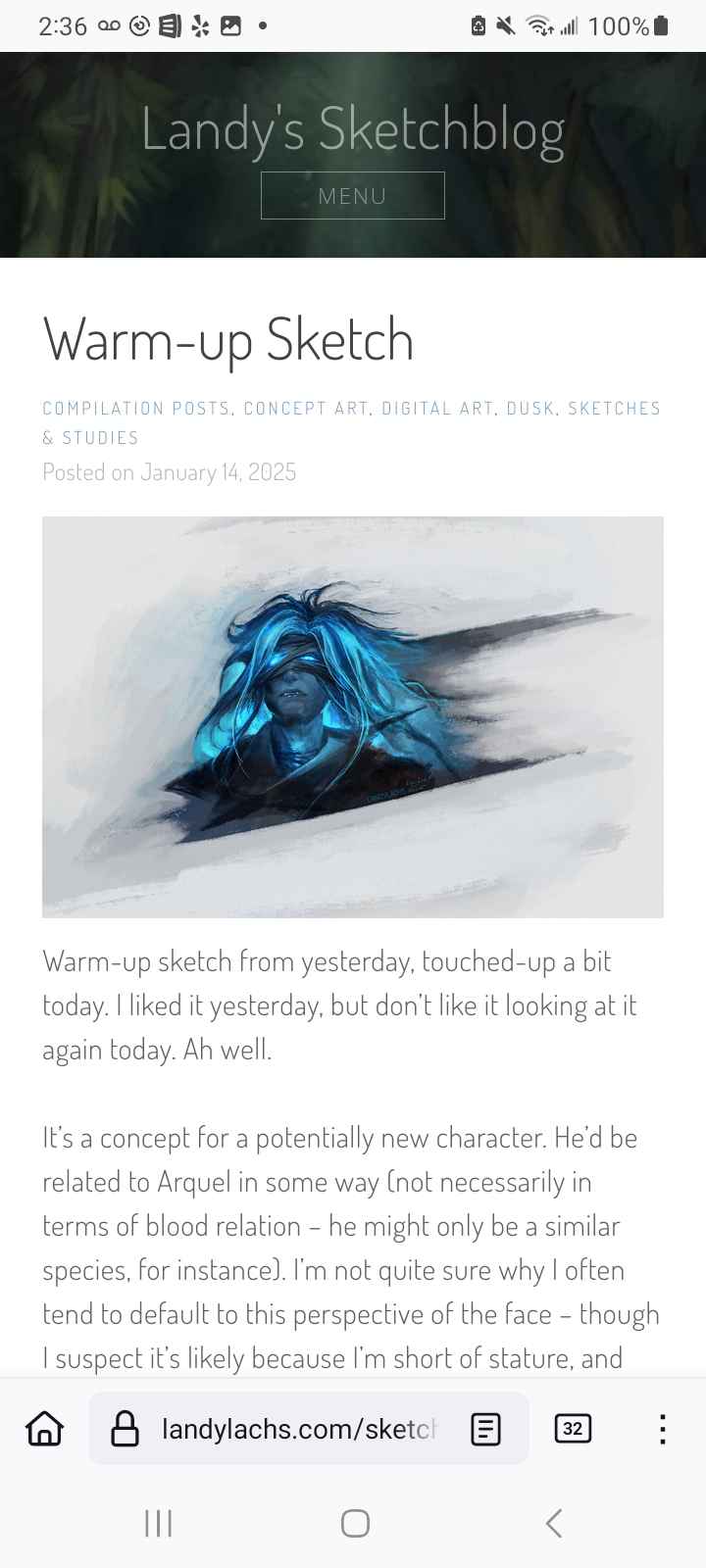
Mobile Layout (Sketchblog)
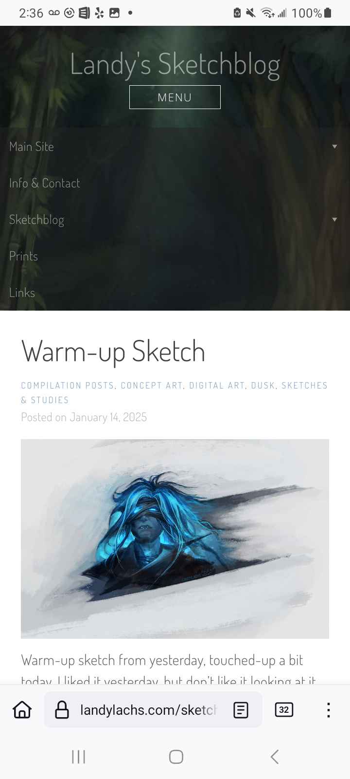
Mobile version of the sketchblog upon open.
When the “menu” button is pressed.
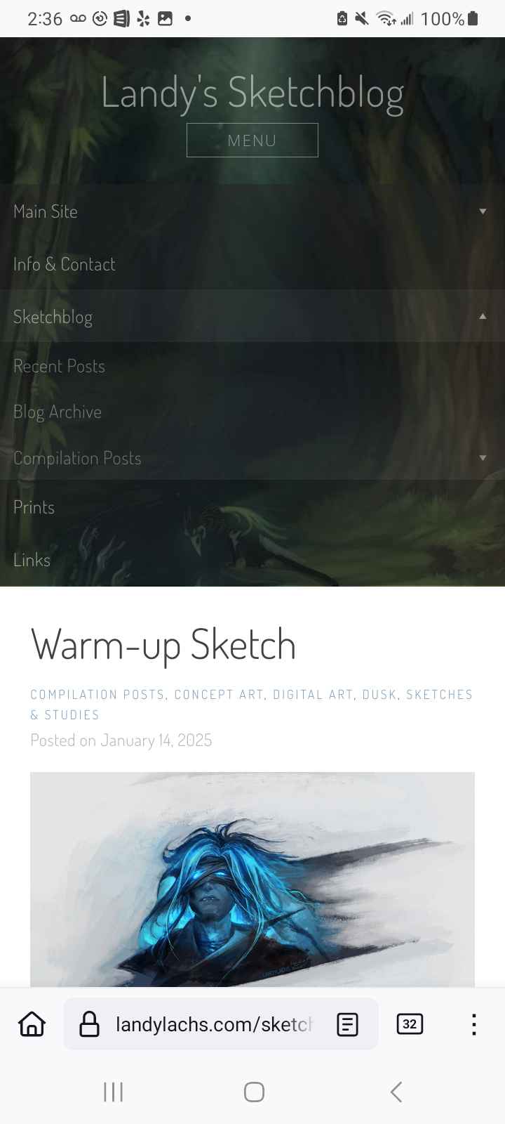
Menu expands when a category with sub-items is clicked and expands,
Here’s how the sketchblog should now look on mobile – before, the top bar was much wider by default. It still isn’t as small as I’d like (the leftmost image), but it should be a much better viewing experience now compared to before. The menu also expands, and reveals the sidebar image when the nested items are expanded. This isn’t fully to my preference (see below), but I am okay with it for now.
Mobile Layout (Portfolio Site)
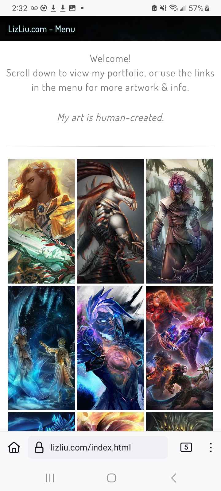
I also wanted to jot down a change I did last year – I finally created a mobile-friendly layout for my main portfolio website. I know I took screenshots of how it looked before, but I couldn’t find it among the cacophony of photos on my phone – so I have only the current layout to show (I’ll edit the “before” screenshots in the future, if I end up finding them again):
Portfolio site, mobile layout, default view.
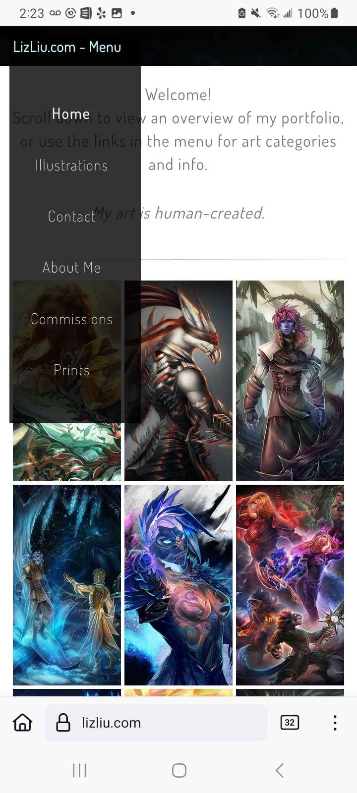
Menu expands upon clicking the topbar button.
For a sense of the previous layout, imagine that topbar covering about 30% of the screen (with an art graphic on it) with the navigation bar on it, instead of the thin bar that’s there now that appears when tapped.
With the sketchblog changes, I was actually trying to have it look closer to how I changed it for my portfolio site – but because I use WordPress for the sketchblog, I don’t have as much flexibility or control as I do for my portfolio site. I’m sure there is a way to have the topbar as slim as my portfolio site, but the time investment for me to figure that out doesn’t make it feasible, for now, as I’m not a web developer by trade. The sketchblog’s mobile layout should be functional, as well as a more pleasant browsing experience now, which was my aim.
I am pleased that I was able to figure out a way to have the menu bar on my portfolio site look more elegant than using a content managing system like WordPress! I always created the sketchblog with WordPress as a kind of “testing ground,” as I like using WordPress, but I also love the control manually writing your site gives you. I think both work well for different purposes – for something like a blog, it would probably be too inflexible if I tried to do that manually (as well as take up too much time, most likely, in terms of maintenance).
Why the changes?
So, why these updates? Well, the mobile changes are obvious – I’ve long preferred browsing via desktop over mobile. This caused me, probably unwisely, to prioritize the desktop experience over the mobile one for many years – long after mobile eclipsed desktop use. This was partially because I find the mobile browsing experience personally vaguely unpleasant – the physical act of looking down at this tiny screen has always been sort of uncomfortable or unpleasant. I think I became used to the sitting-up posture growing up with desktop computers. I never wanted to spend longer looking down at this ridiculously tiny phone screen longer than I had to.
But I understand that I am not the main demographic, and that the majority of the browsing experience nowadays is through mobile. I have to admit I partially was spurred to fix my layout after some friends mentioned they were looking at my portfolio website, which I assumed was through their phones, and was mildly horrified as I knew I had been neglecting the mobile layout. So I have them to thank for spurring me to improve it, which I should have done earlier than this/last year – but! Now it’s done (or functional).
Additional changes & thoughts
Another change I did spur-of-the-moment earlier this week, while working on the blog, was changing the title from “Liz’s Sketchblog” to “Landy’s Sketchblog,” A small change, but something I wanted to note down for myself here.
The reason is something I’ve been thinking about for a while, and that I’ve decided to begin implementing this year. I have always had a bit of a disconnect between my name and my art versus my pseudonym and my art. For a long time I only used my pseudonym (“Landylachs”), and avoided actively associating my name with my art. A few years ago, I decided to try using my name with my art, in addition to my alias, as it felt right at the time. I don’t think that was the “wrong” decision, but I do think it has created this underlying tension I always have between my work as “Liz” versus my work as “Landy.” I suspect this makes little difference outwardly, and it is likely entirely an internal perception thing I am overthinking. I’ve tried to ignore that discrepancy ever since, but it never truly went away.
The main cause of the tension in this discrepancy is I am always conflicted about how I wish to present myself under these names. I feel I should maintain a certain level of distance and professionalism with “Liz,” but there are times when I wish to be more of a hobbyist, more casual and whimsical (and, let’s be honest – feel allowed to show more excitement about whichever fandoms I’m into at the moment) – which I don’t feel comfortable doing when I am “Liz.” Because even though I do art professionally, at heart, one of my favorite things about art is how it helps you discover people who share genuine love over the things you’re passionate about too – whether that is fandom or original art and stories. Since I use both names interchangeably, I think my accounts have been trying to present both ways, and not fully succeeding at either.
So! This year, after thinking about it for too long (and a wholehearted thank-you-and-apologies to friends and fellow artists I’ve reached out to ramble about this and seek out their advice and opinions – which have all been incredibly helpful!) – after thinking about it, I’ve finally settled on what I want to do about this, I’ll continue calling it, “discrepancy.”
The portfolio site (“LizLiu.com”) won’t be going anywhere, but I’m going to start using it more for my more fully-polished art. For my more hobbyist art and personal projects, I’m going to start doing them under “Landylachs.com” – thought that leaves the question of my social accounts, which are all under the Landy identity. I’m not fully certain what, if anything, I’ll change with those – right now, I’m leaning toward slowly transitioning them to being more casual, maybe, and I might gradually move all the socials from my portfolio site to the future Landy site, and have the portfolio site exist as its own, mainly self-contained thing.
Part of the reason for using this blog again, is I think writing this out helps me decide what I want to do, so this is part of that process. I’m trying to implement more things this year, instead of overly ruminating or overthinking it to myself. I think the rapid pace of social media adds to this rumination, causing me to constantly second-guess whether I want to even share anything at all, and then I end up keeping everything I’m excited by offline and not sharing anything online at all. This blog has been helping me slow down a bit, and decide which things I do want to share, and which things need more time to percolate and keep to myself until they’re ready. I’m excited so far!
Add-on Update: January 29, 2025
Adjusted navigation menu. Reduced the number of links for conciseness. (In preparation for future links, hopefully soon :) )
Add-on Update: January 30, 2025
Adjusted caption text to improve legibility. (Decreased letter-spacing and line-height)
Changed the “Recent Posts” layout to a list-style one for improved legibility.
Changed “Recent Posts” and “Blog Archive” pagination style to be more consistent with the main blog’s pagination style. (Note: Hover text is still incorrect, showing the blue-green link color instead of #fff as intended. Aim for fix in the future.)
 For site updates, I think I’ll make at most one post per month, and continuously add any additional updates during the month to this monthly post. This way, I am not clogging the blog with posts about web maintenance, haha.