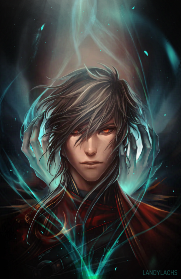
 Progress shot of Corveil from a longer painting. I have a few personal work paintings/illustrations that have been hovering at this ~90% progress state for a while. I keep telling myself I’ll finish them after I make some progress with the comic, but I’d like to try and figure out a way to work them alongside the comic, as I am becoming impatient with how long they’ve stayed in this not-quite-but-almost-finished state, haha.
Digital Painting
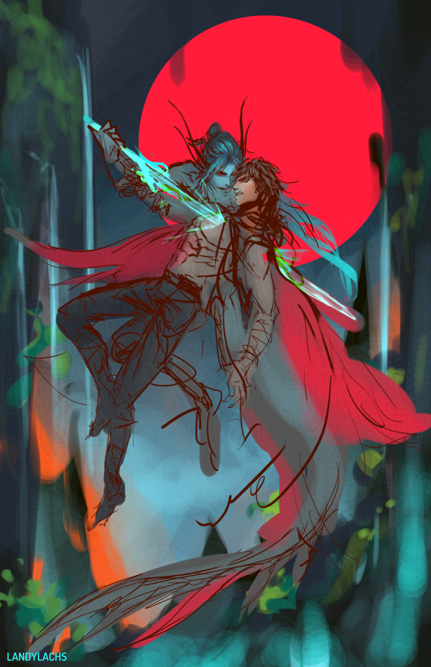
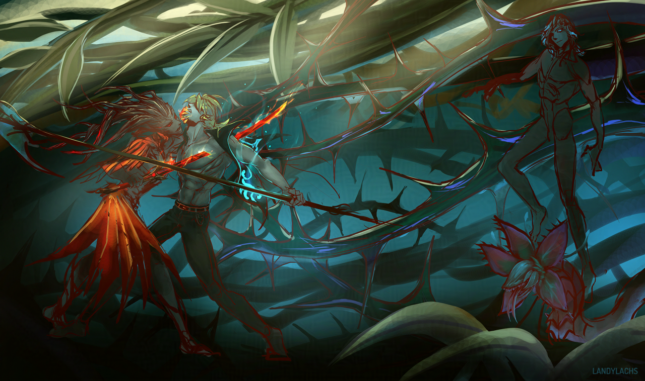
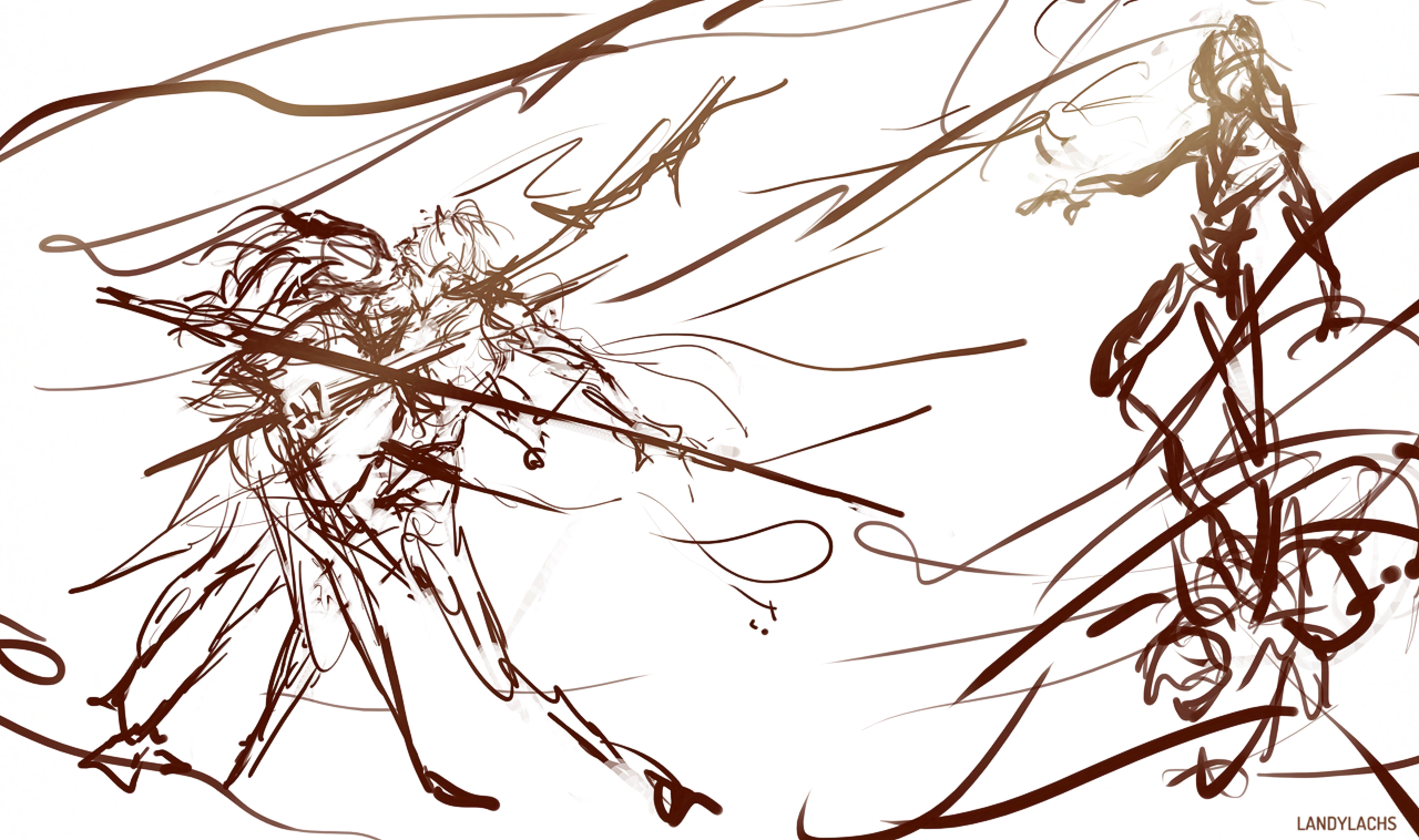
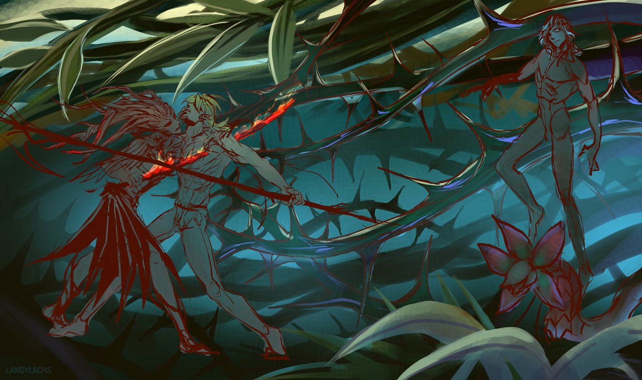
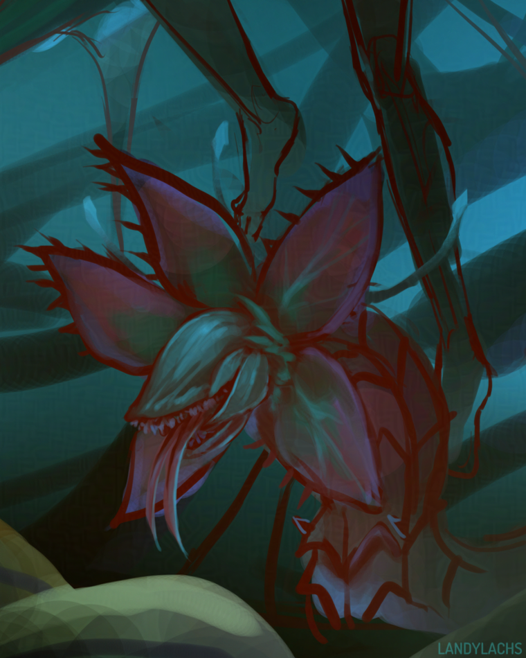
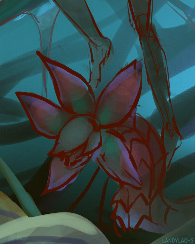
“Impale” Work-in-Progress | March 21, 2025
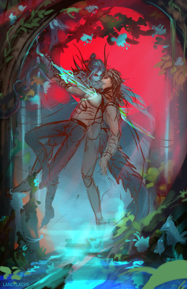
There seems to be a theme between this and the last post. Haha.
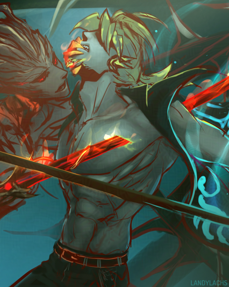
This was a sketch idea I wanted to jot down yesterday. I started trying out some vague decorative background ideas. Still deciding which way to take it. Other than the general pose, I didn’t plan the rest out. It felt nice to just scribble-wander for a bit. Backgrounds are secretly one of my favorite things to paint – but I oddly don’t end up showing too many here. Maybe that’ll change this year!
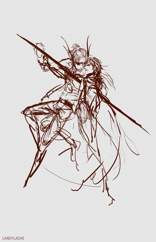
There are some things about the sketch I like better than the current version – mainly the angle of Arquel’s head. The way it was changed probably reads slightly more clearly – I think – though I like the intensity of the sketch. That might also just be by virtue of being a sketch, though. That sketchy energy! Why sketching is still probably my favorite part of the drawing process.
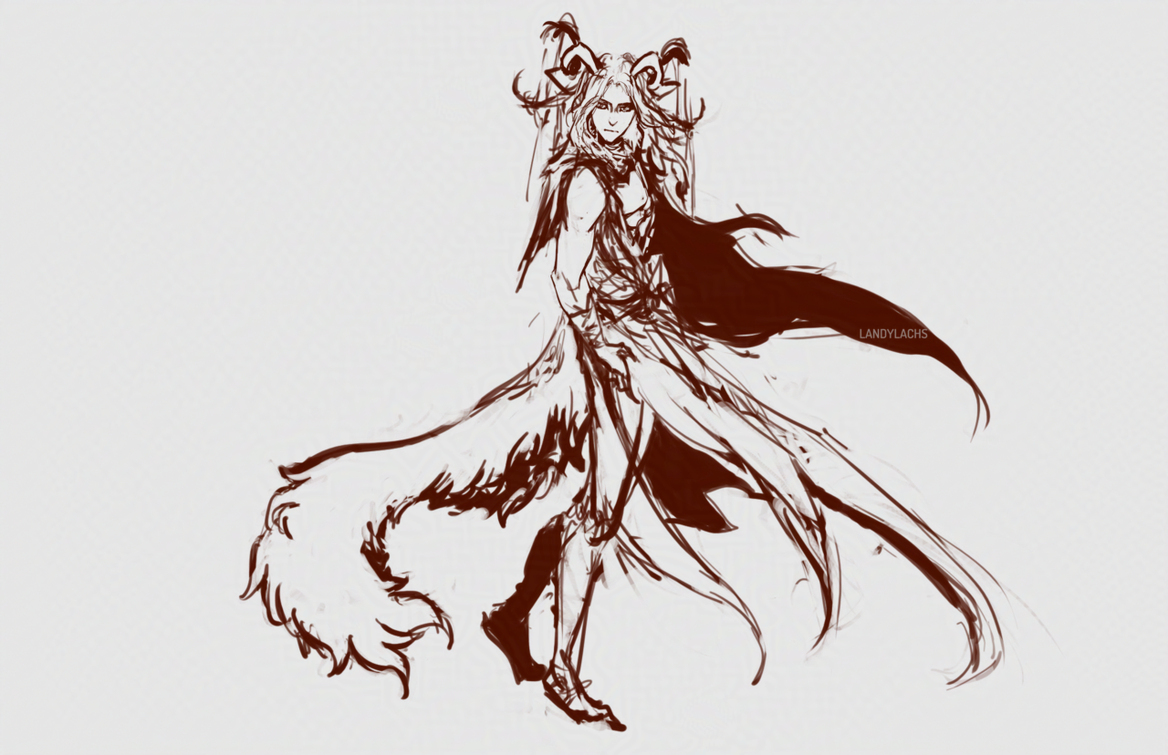
GW2 Illustration Work-in-Progress | March 19, 2025
Had an idea with my sylvari characters I wanted to jot down! It turned into a book cover composition, somehow. It’d be reversed if I used it as one – but I mainly wanted to sketch my three characters together, since I haven’t drawn them all together in an illustration in a while.
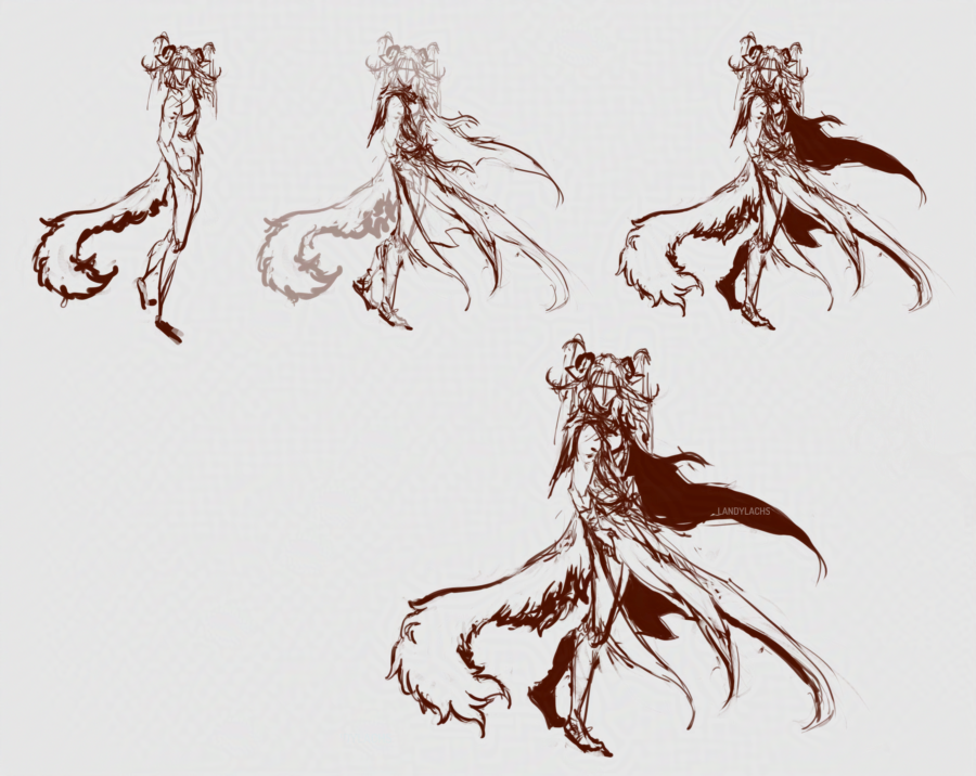
The left character is my Nightmare Court elementalist, Caydren; the middle character is my sylvari reaper/necromancer, Landis; and the right character is my Nightmare Courtier ranger/druid, Lorcan (who has yet to have his outfit added).
My Nightmare Courtier ranger/druid’s favorite pet Iboga, which he affectionately named “Mordremoth.”
Close-up of my necromancer before I begin adding sylvari features to his anatomy.
Geissler Concepts (In-progress) | March 11, 2025
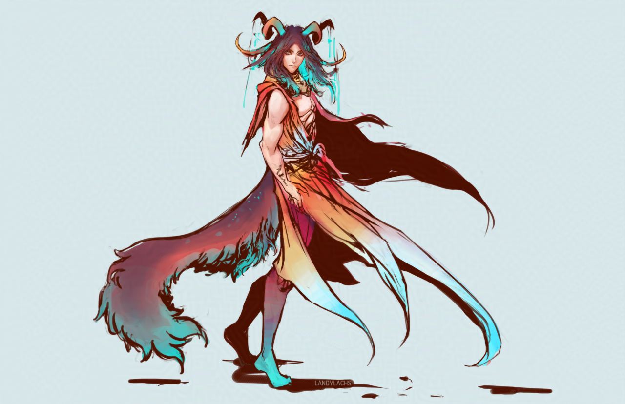
I’ve been meaning to try some different designs for Geissler for a while – here’s a recent attempt! I’m not sure if I’ll finish this one, but it felt good to draw him again. The “in-progress” of the title refers to the design – he’s meant to have an accessory by his wrist, and probably sandals with some sort of leg wraps. But, since I’m not certain whether I’ll finish this drawing or do another one with the design, I wanted to post it as-is for now!
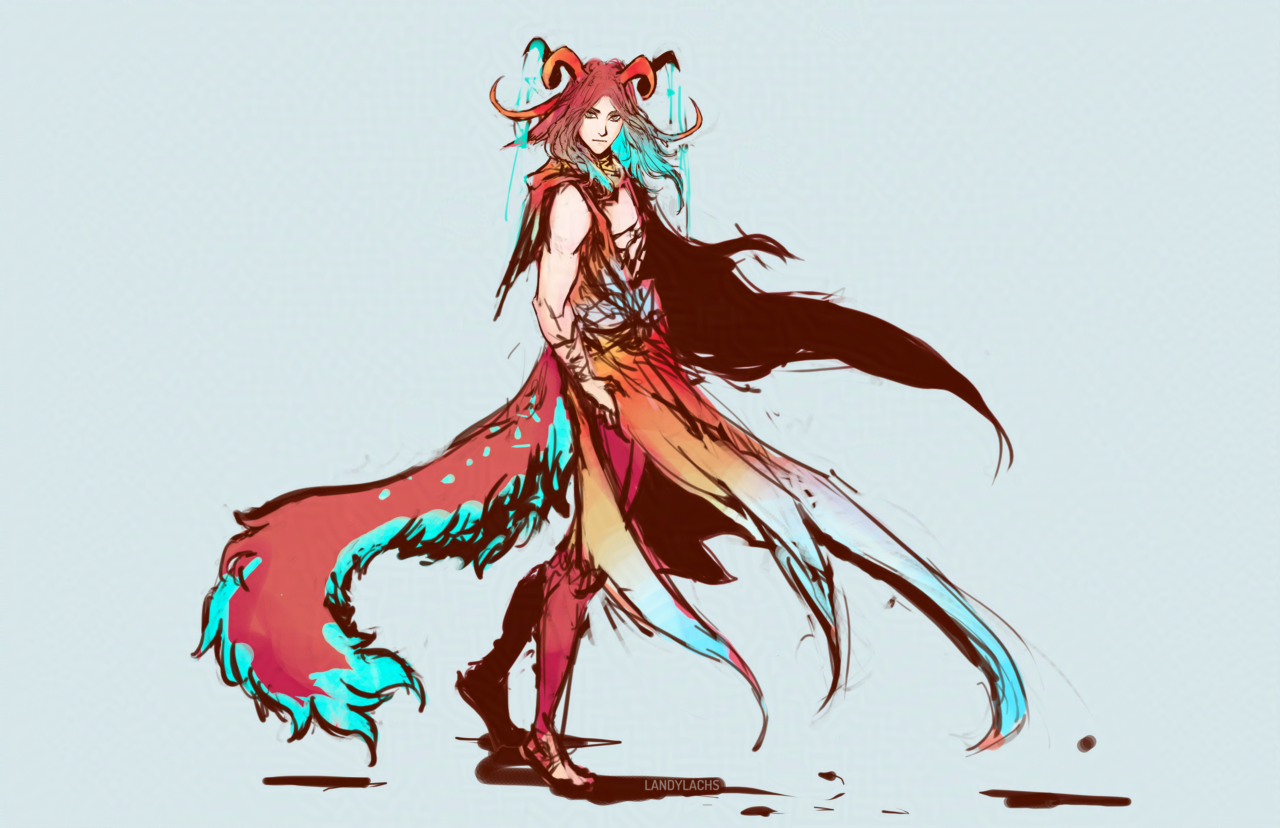
Geissler’s previous design was much more monochrome – essentially dark hair, dark or gray eyes, pale skin. I have a lot of characters with darker-toned hair – including the character Geissler is meant to foil – which is another reason why I wanted to explore a potential redesign. So, here I tried adding more color to him. In the image at the top of the post, I brought back some of that monochrome aspect, by darkening his hair and subduing the color contrast – which I’m not sure whether I like yet or not. Hopefully seeing it here on the blog will help me with deciding which fits him best!
Looking at him now, I sort of lean toward going with the lighter/redder tones.
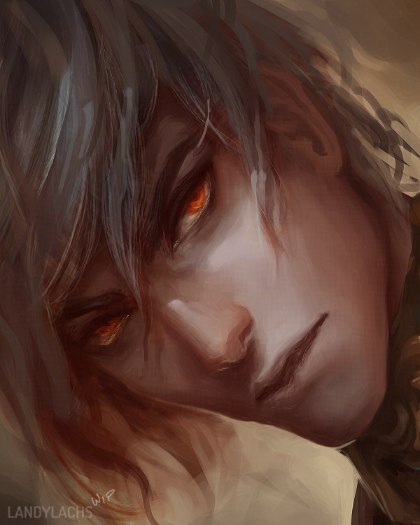
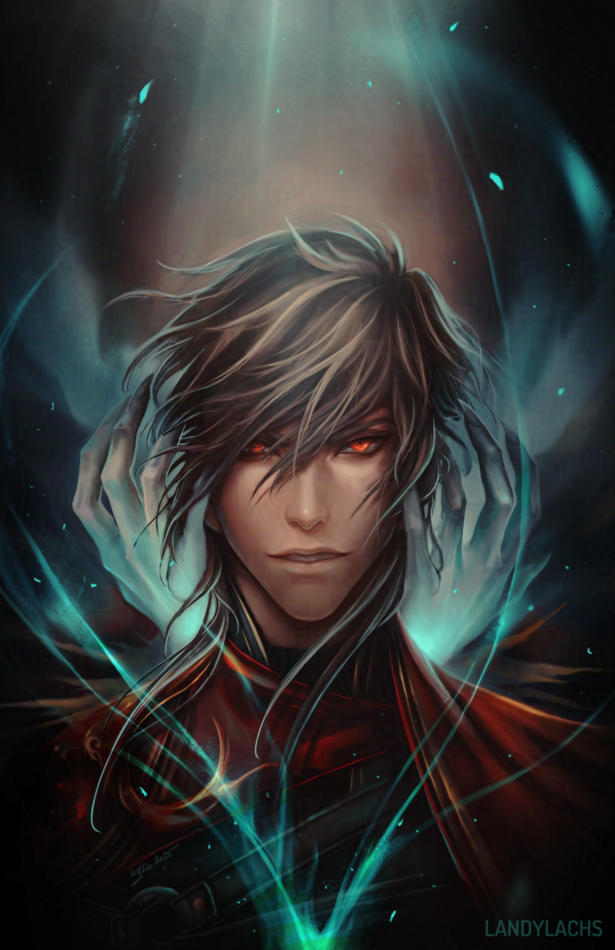
“Don’t Listen” | Corveil Portrait: February 19, 2025
Edit: March 2, 2025
Moved all the edits log to the end of this post to make the post read more easily. :)
Original post below:
Here’s an illustration where the original sketch was from a long time ago – November 2023, in fact! I’ll add a crop of that version at the end of this post.
This painting has a loose idea behind it, but it is primarily meant as one of the front portraits I seem to do of my characters every now and again. I believe with this one, the initial drive was to paint Corveil’s current design, which I had been tweaking here and there at the time. He originally had hair on the darker side, which I decided to change because too many of my characters were looking similar. I tried him with much lighter hair for a while, which I thought worked better for him, but didn’t completely fit.
For a bit now, I’ve been drawing him with something in-between – still fairly light, but a more warm grey or ashy, light brown. Though it’s probably not noticeable in this piece, specifically, since I did add more shadows for contrast. Haha.
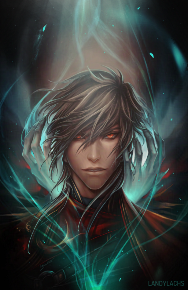
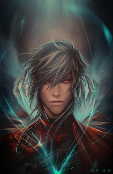
I have a few alternate and earlier versions of this one I’m still considering, which I’ll add below:
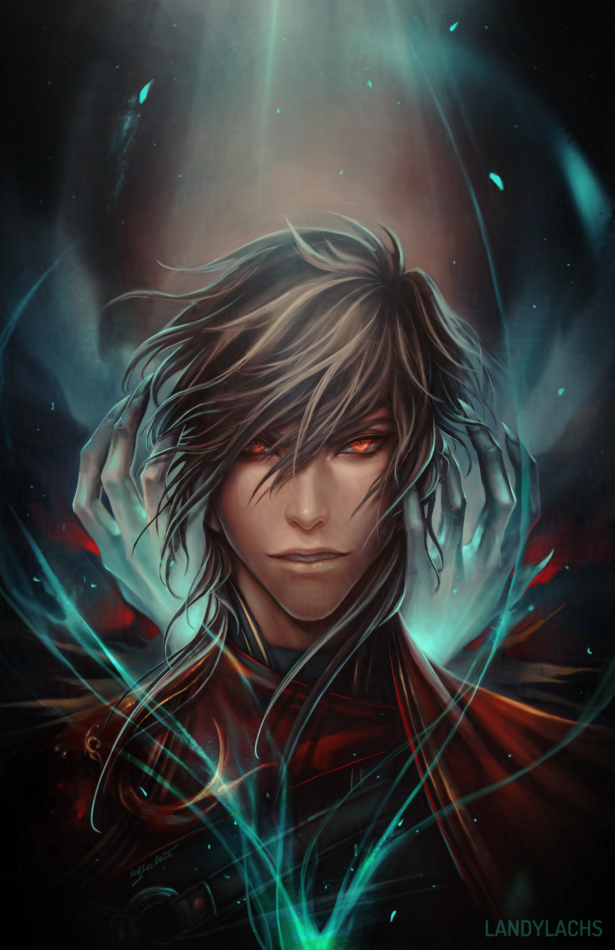
This is also an even earlier version, before I added more contrast. I sort of like the softer look here.
The initial idea and some additional thoughts in the full post below: