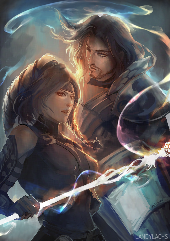
Guild Wars 2 commission to commemorate the characters’ owners’ anniversary! This one was commissioned several months ahead of time for a surprise gift, and I’m excited I can show it now.
There seems to be a theme between this and the last post. Haha.
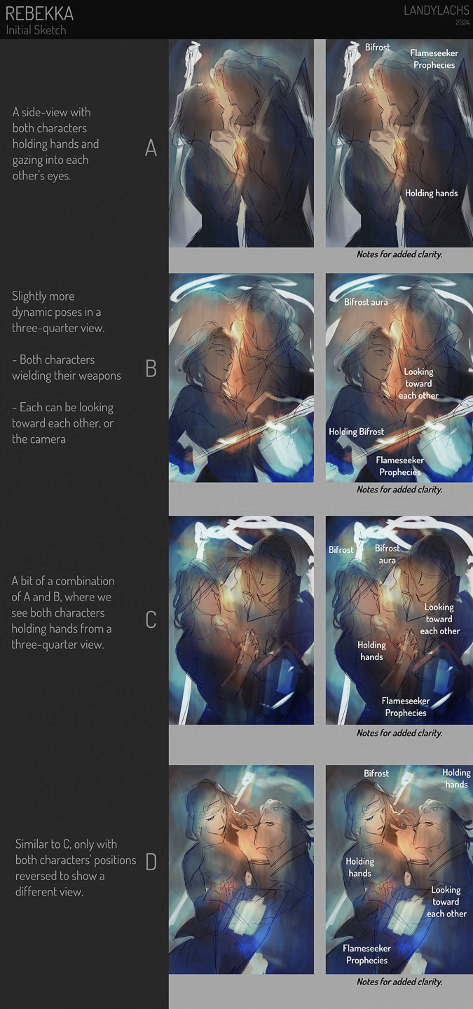
This was a sketch idea I wanted to jot down yesterday. I started trying out some vague decorative background ideas. Still deciding which way to take it. Other than the general pose, I didn’t plan the rest out. It felt nice to just scribble-wander for a bit. Backgrounds are secretly one of my favorite things to paint – but I oddly don’t end up showing too many here. Maybe that’ll change this year!
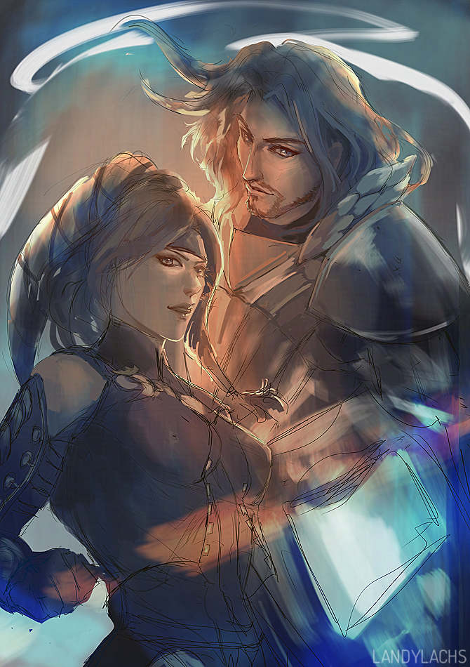
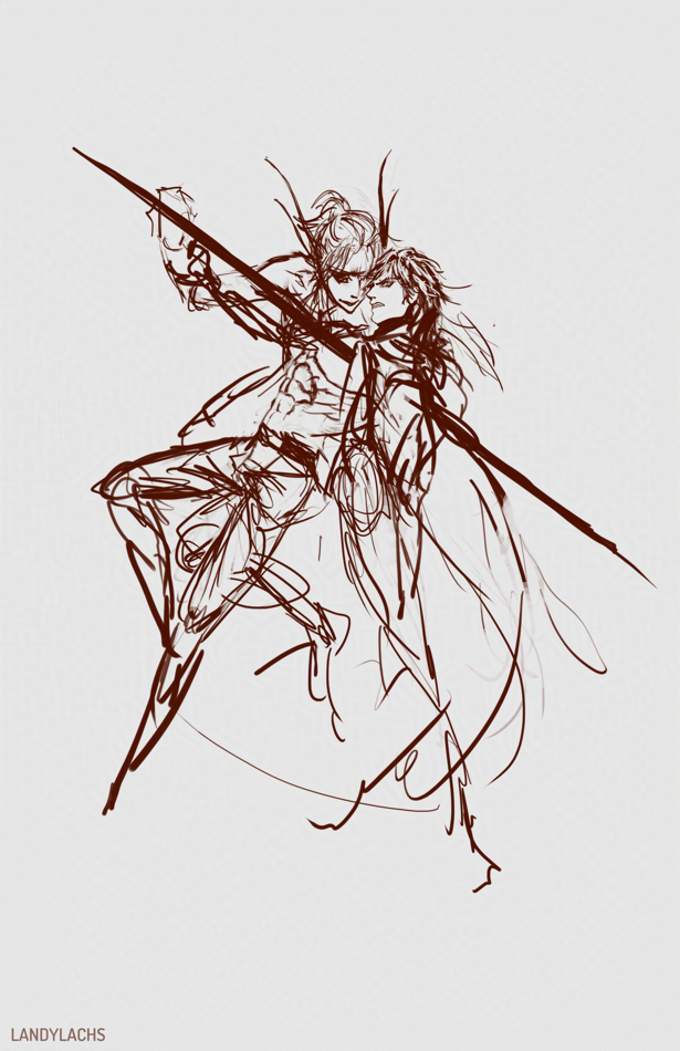
Initial sketch.
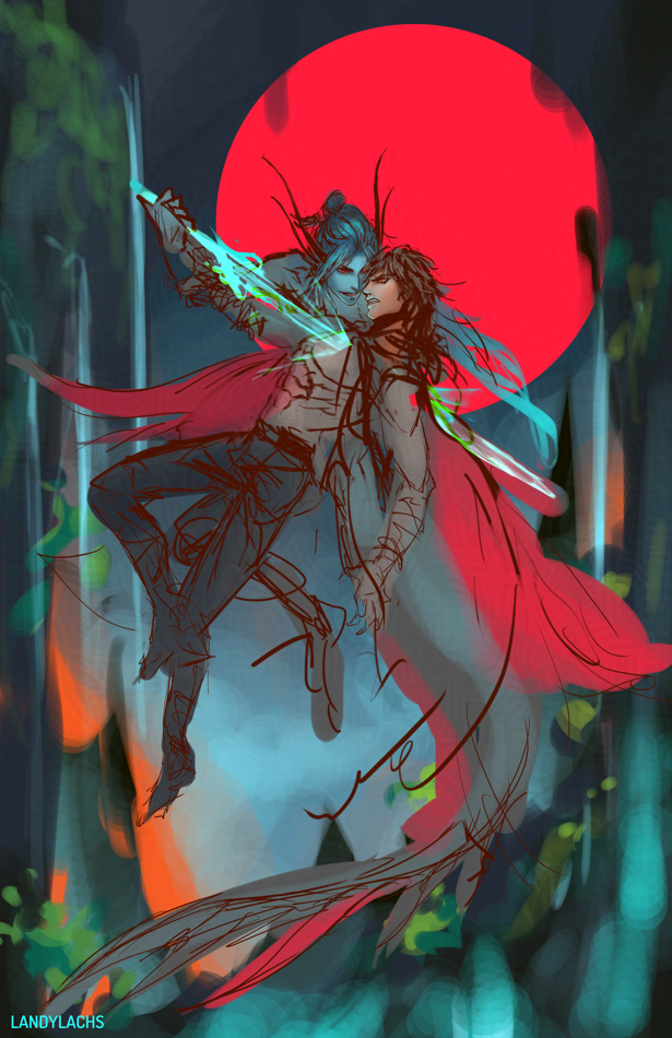
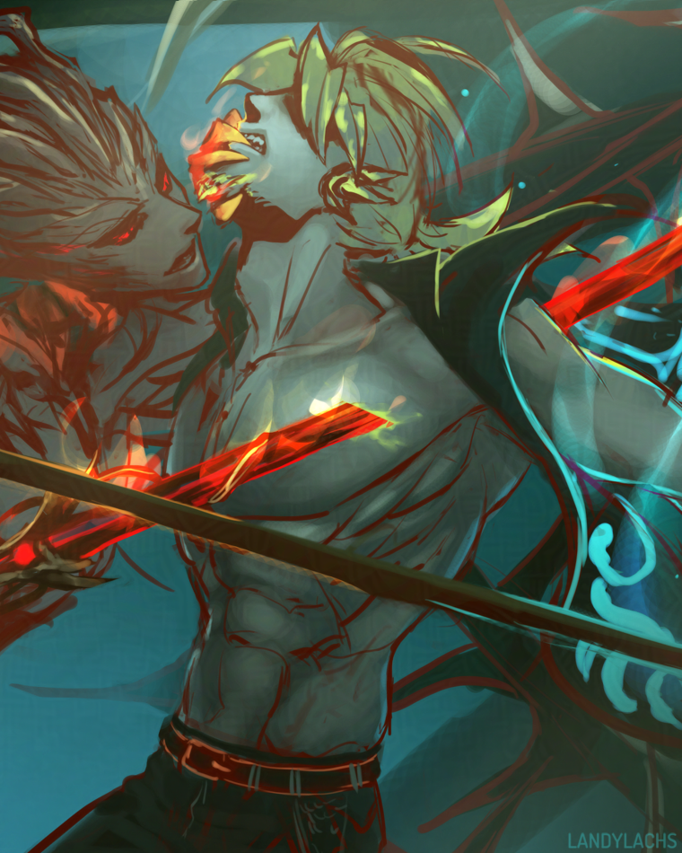
There are some things about the sketch I like better than the current version – mainly the angle of Arquel’s head. The way it was changed probably reads slightly more clearly – I think – though I like the intensity of the sketch. That might also just be by virtue of being a sketch, though. That sketchy energy! Why sketching is still probably my favorite part of the drawing process.
Current version (in-progress) | From left to right: Caydren, Landis, and Lorcan
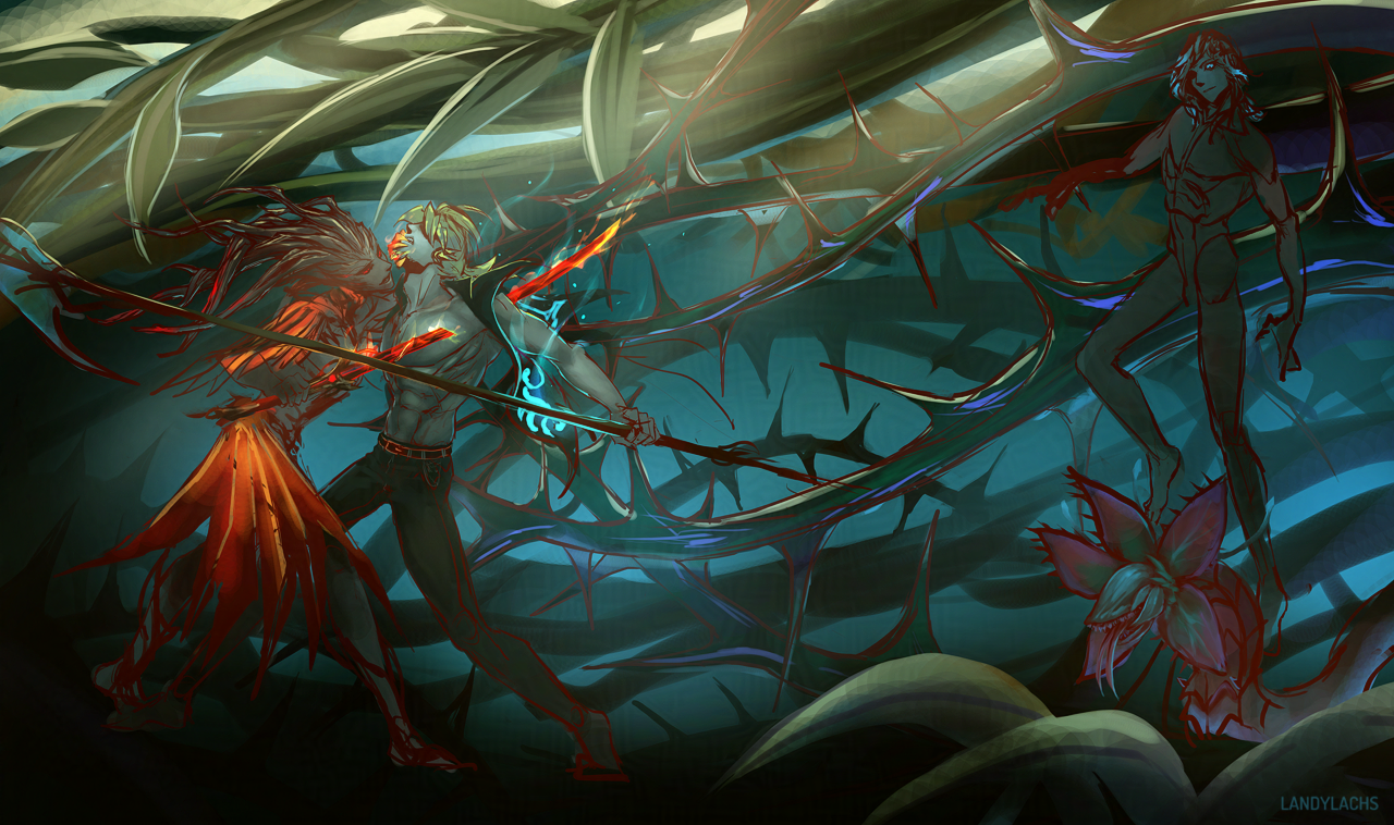
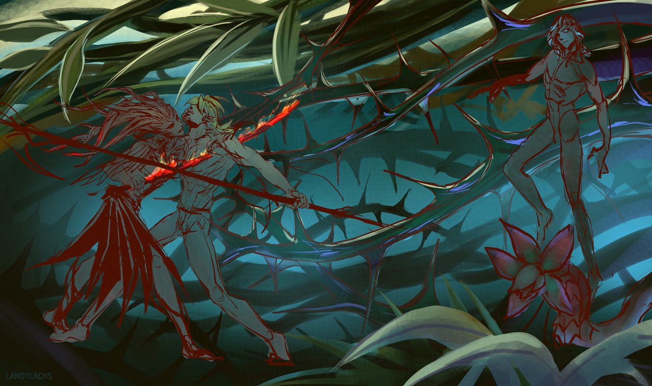
Had an idea with my sylvari characters I wanted to jot down! It turned into a book cover composition, somehow. It’d be reversed if I used it as one – but I mainly wanted to sketch my three characters together, since I haven’t drawn them all together in an illustration in a while.
The left character is my Nightmare Court elementalist, Caydren; the middle character is my sylvari reaper/necromancer, Landis; and the right character is my Nightmare Courtier ranger/druid, Lorcan (who has yet to have his outfit added).
Initial sketchAn earlier progress step
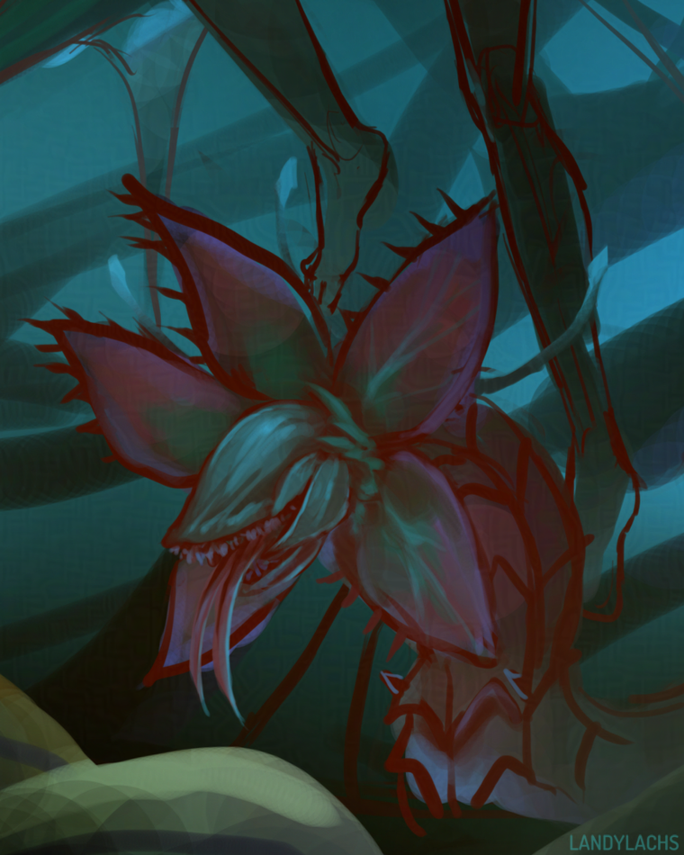
Iboga WIP 2
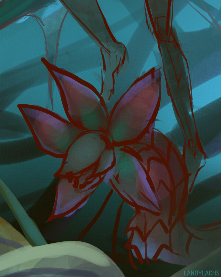
Iboga WIP
My Nightmare Courtier ranger/druid’s favorite pet Iboga, which he affectionately named “Mordremoth.”
Close-up of the current in-progress version.
Close-up of my necromancer before I begin adding sylvari features to his anatomy.
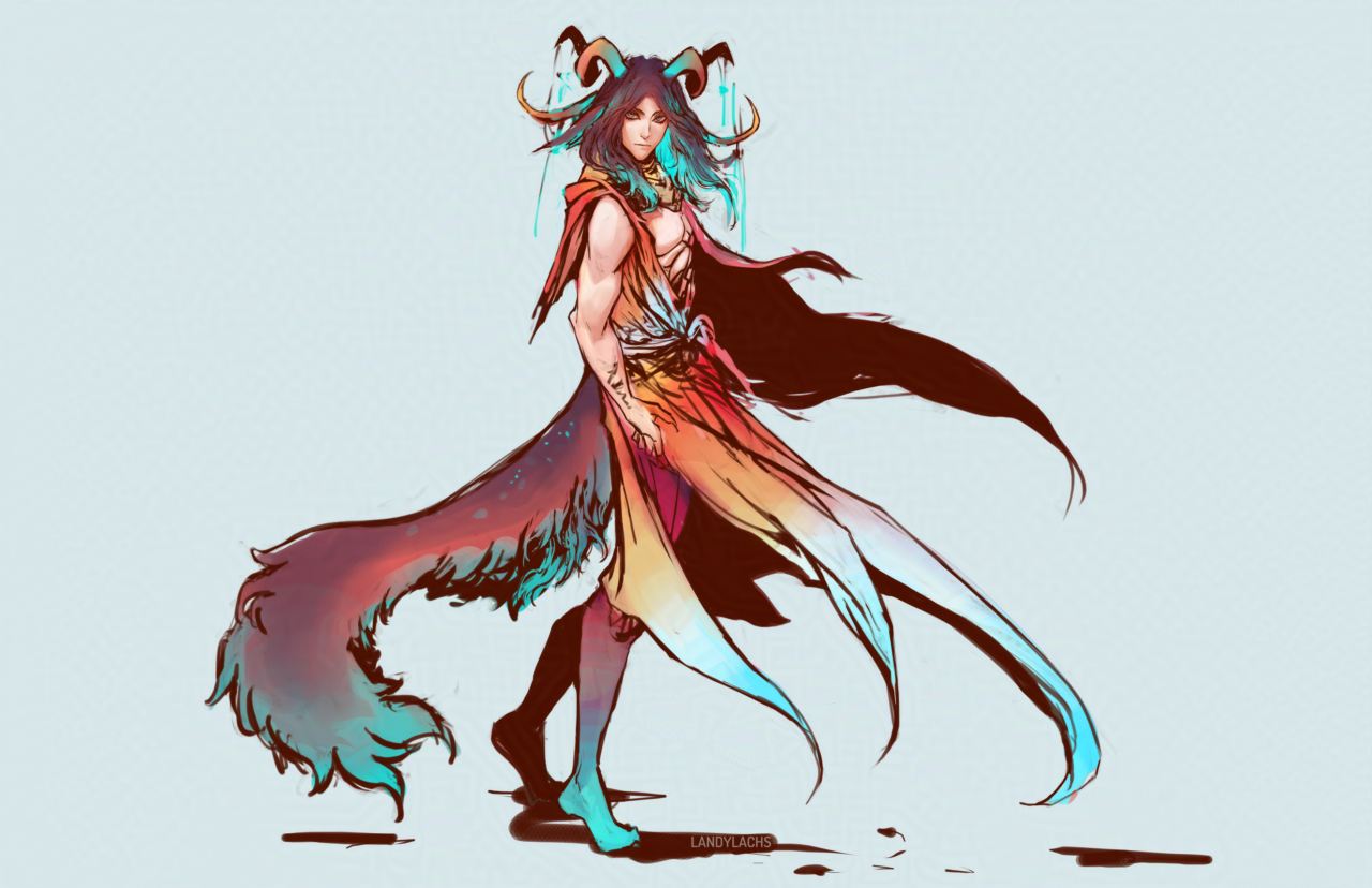
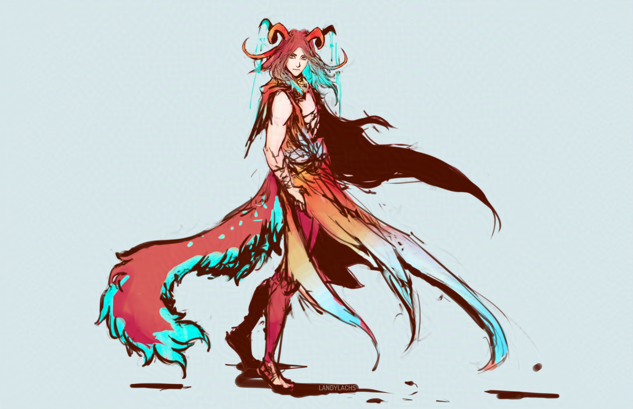
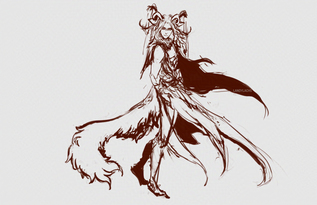
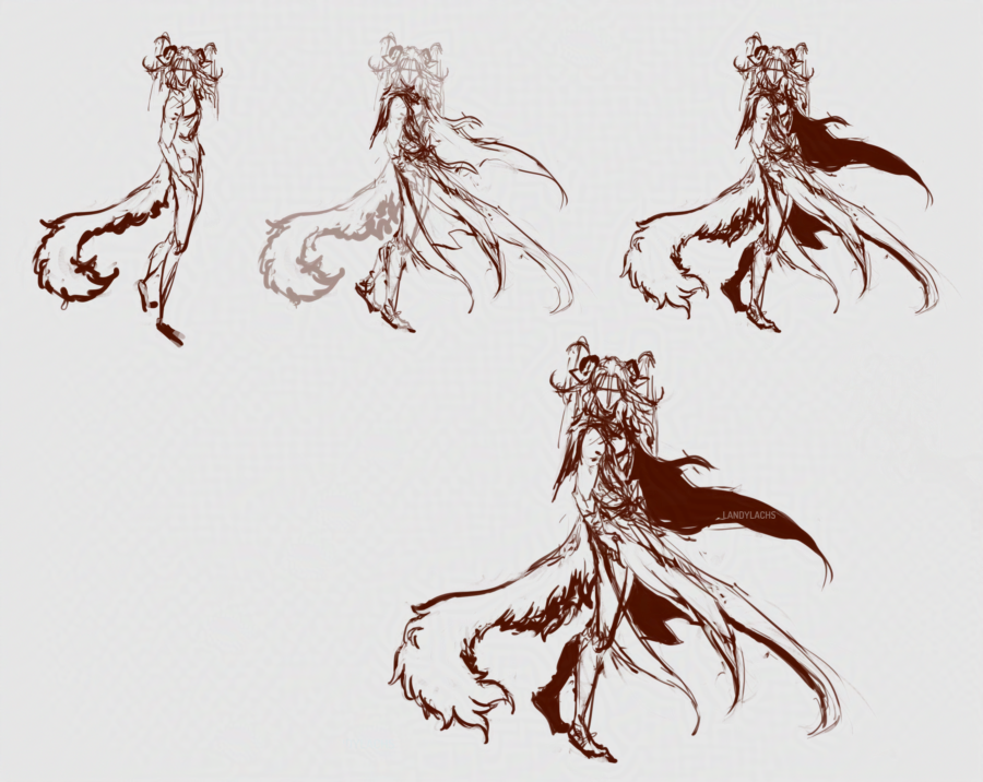
I’ve been meaning to try some different designs for Geissler for a while – here’s a recent attempt! I’m not sure if I’ll finish this one, but it felt good to draw him again. The “in-progress” of the title refers to the design – he’s meant to have an accessory by his wrist, and probably sandals with some sort of leg wraps. But, since I’m not certain whether I’ll finish this drawing or do another one with the design, I wanted to post it as-is for now!
Flat colors.
Geissler’s previous design was much more monochrome – essentially dark hair, dark or gray eyes, pale skin. I have a lot of characters with darker-toned hair – including the character Geissler is meant to foil – which is another reason why I wanted to explore a potential redesign. So, here I tried adding more color to him. In the image at the top of the post, I brought back some of that monochrome aspect, by darkening his hair and subduing the color contrast – which I’m not sure whether I like yet or not. Hopefully seeing it here on the blog will help me with deciding which fits him best!
Looking at him now, I sort of lean toward going with the lighter/redder tones.
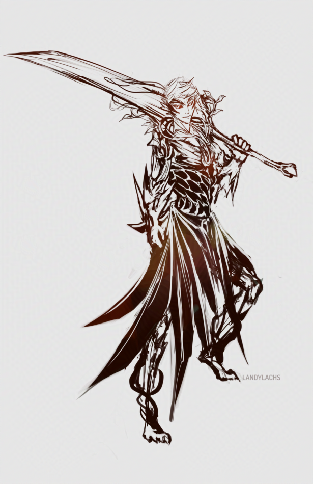
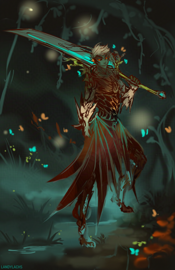
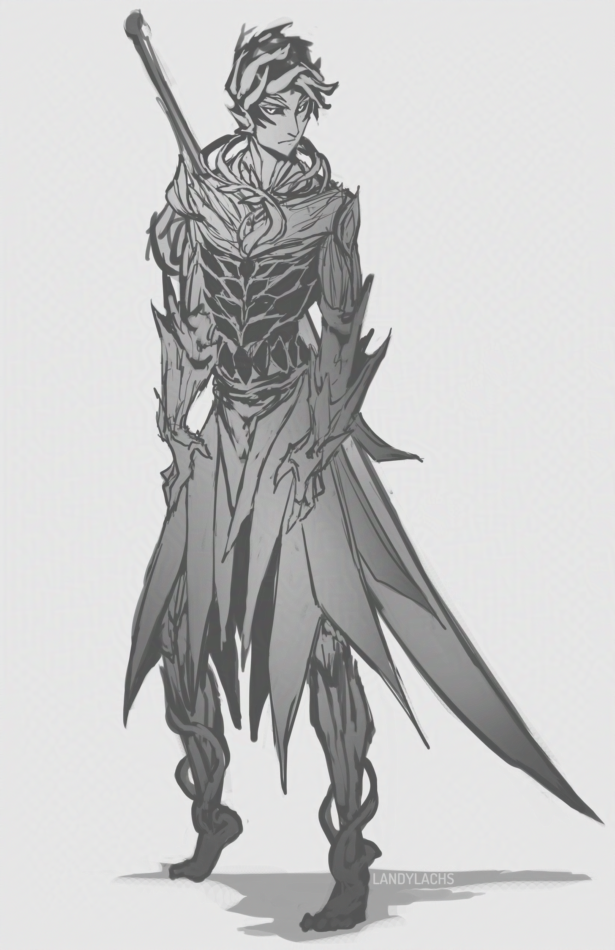
Trahearne sketch ideas (character from Guild Wars 2).
The idea was, I wanted to see how Trahearne looked if he held Caladbolg in the “modern fantasy” greatsword style, where the weapon is slung (probably impractically) over the shoulder. I suspect (though could easily be mistaken) this pose was once popularized by FF7’s Cloud Strife player character, and has since become a standard fantasy pose. I think GW2’s in-game male humans and norn also take inspiration from that pose, instead of the more practical carried to the side, as GW2’s in-game male sylvari characters wield them. Incidentally, this was one of the early things which endeared me to my male sylvari character – and eventual new main – over my original female charr main.
While I cannot help but think the pose is impractical whenever I see it, there’s no denying it looks slick, in an anime sort of way, haha. It admittedly also probably looks more practical in this case, as I made Caladbolg smaller than I would have otherwise, to fit in the composition. If I take this further, I’d need to push Caladbolg’s perspective more, to appear its proper size.
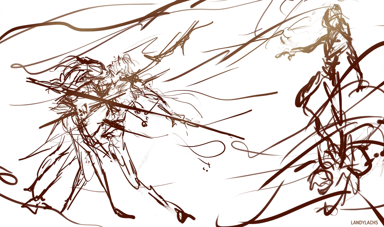
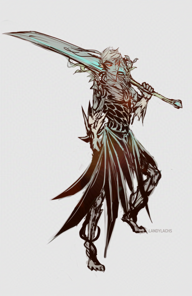
Earlier versions, plus a rough color test.
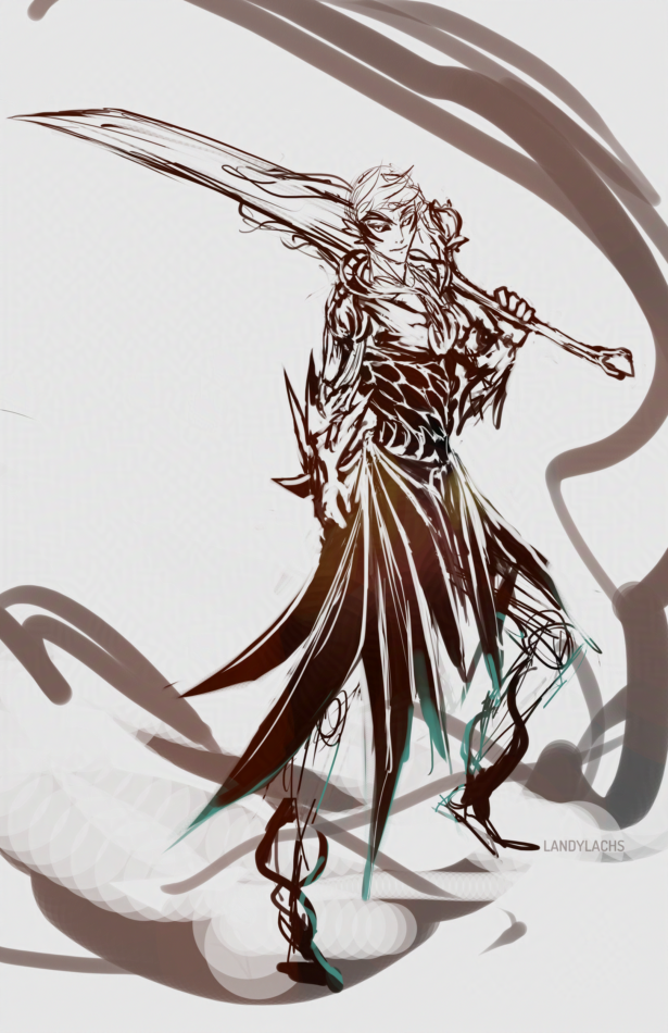
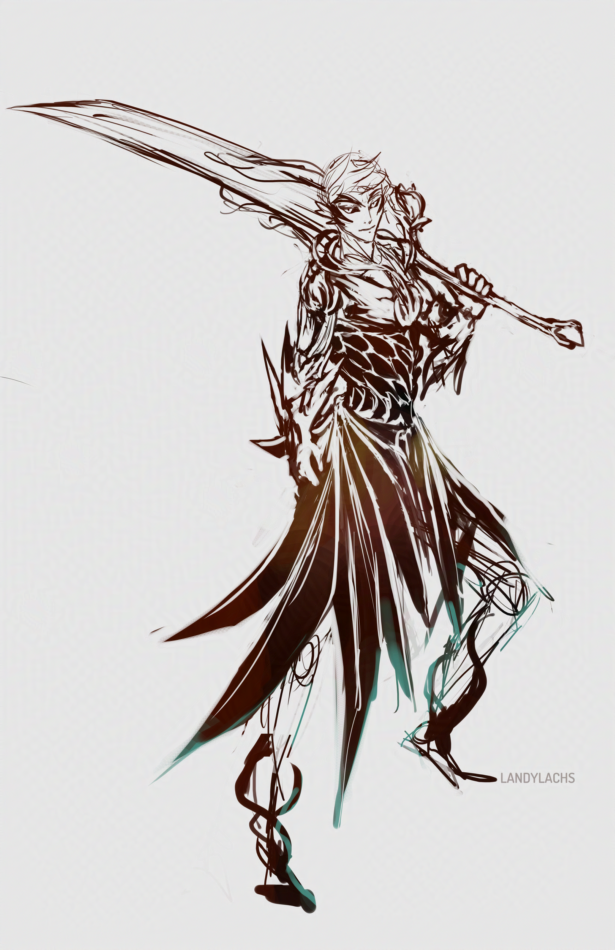
Random Trahaerne sketch from last week. I think it became unintentional practice for the sketch from this week.