Ah! The dreaded hiatus! I was hoping I’d be able to continue The Harbinger’s Path update schedule until Chapter 3’s conclusion. When I originally planned the page schedule, I had more time during November & December than what ended up happening. There was a point in November where I thought I’d have to put the comic on hiatus for about a week and a half due to learning I’d be out of town for a bit, but I scrambled to finish a few pages early, and was able to keep the schedule last month without interruption.
While I’m pleased I kept a consistent 2-pages/wk update post schedule since Chapter 3’s launch on September 29 through December 8 today – I think that isn’t too shabby considering this was my first time trying a webcomic update schedule! – I unfortunately don’t think I can do what I did in November again this month. Between deadlines and holiday obligations, December is turning out even busier than November. Most importantly, these next few pages are more complex for me to draw than the pages in November. I mentioned the possibility of a hiatus in last week’s post, but didn’t link it anywhere because I was hoping I’d be able to avoid one.
As mentioned in that post, my main concern is I don’t want the quality of the pages to suffer due to lack of time. Or even fatigue, as I’ve been sacrificing a bit more sleep than I really should for the most recent pages. I felt it beginning with today’s page 21, as it is not as refined as I would like. I plan to touch it up this month during the hiatus.
So, the hiatus! What does this mean? This is a hiatus for the comic’s page updates, but not the comic’s progress. I will be drawing the remaining pages during this hiatus, and using this additional time to try and make them a little extra special!
I’m very sorry to interrupt the comic’s update schedule, as I fully intended to continue with regular page updates until Chapter 3’s conclusion. It seems a bit silly in hindsight, but I didn’t account enough time for the unforeseen circumstances that inevitably crop up this time of year (Nov & Dec specifically). Back in September/October, my schedule for Nov/Dec looked so much more open than they ended up being. In the future, I would plan for more of a page buffer during busier times of the year like now.
I promise I will work very hard to make Chapter 3’s conclusion worth the wait, and I’m confident this is the best decision for the comic to maintain its quality. And, hopefully, your enjoyment of it!
New pages will tentatively be posted on January 19, but I’ll confirm this as we approach closer to this date.
Thank you for reading this year!
Thank you so much again for reading The Harbinger’s Path this year! Truly, it means the world to me. I’m still amazed there are people who enjoy reading my comics. It’s been a pleasure drawing this story for you, and especially reading your reactions and thoughts. I can’t wait to finalize this chapter, as well as look forward to drawing new comics and new stories in 2026!
In the meantime, enjoy your holidays! And, please look forward to January 2026 to find out what happens next with Trahearne and Malyck!
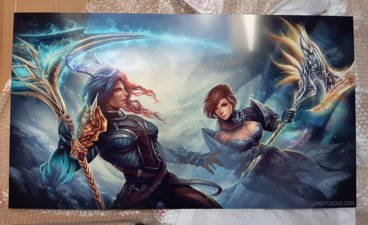
“Bou and Dali” Print, Photo 01 Photo credit to the commissioner; shared here with permission. Sketchblog post for this artwork here.
Ever wondered where those gorgeous prints you see in artist alley conventions are printed? Or do you have commissioned artwork you’d like printed for your personal use, but wondered where to print them? I was always curious about this – and a few years ago, I learned a little more about it!
These are adapted from two email replies I wrote a while ago for previous commissioners, who wished to print the art I painted for them afterward. I’d been considered formatting those emails into a post for this blog, because I found the info helpful both for myself, and to to share when occasionally people ask printing-related questions. Now’s as good a time as ever!
As I wrote these both over a year ago now, if you notice any out-of-date info, please feel free to comment or let me know somewhere. I’d be more than happy to keep this post updated!
Printers in the US
For the US, I recommend these two printers. :D To my understanding, these are among the most popular used by artists for artist alley conventions.
I’ve used this printer before. Their quality is excellent. Their prints are archival quality (they should not fade or yellow over time).’
Only note is, factor in the lighting for where you plan to display your print. Their prints have lovely depth and richness of color, but they might need proper lighting to show their full vibrancy. In dimmer lighting conditions, the print might appear too dark.
Their extensive options can be a little confusing:
Posters & Brochures is the most likely option you’d want to use for your print , as they offer a range of standard sizes.
If you wanted a larger size not mentioned in those options, then you’d want to go with Large Format.
Their biggest downside is their standard art prints are not archival quality (they might fade or yellow over time).
They do also offer archival-quality options, but they might only be for larger prints. They classify them as Posters.
I haven’t used this printer, but I’ve heard many good things about them. People seem happy to print with them.
They offer free hard copy proofs, which lets you see how your print looks before committing to the final print. This might be a good option to consider, especially if your painting has some darker tones in the background. Being able to preview a physical proof, before ordering the final print, may provide peace-of-mind it won’t print too dark (and gives you the option of adjusting the file before printing the final).
The original for this section was written July 10, 2024, and I did some formatting for the blog here today. I checked that links still work, but keep the date in mind for when this was written, compared to when you’re reading this. It’s possible some of what I wrote here is out-of-date, since it’s a year later now. On the other hand, I’ve known these two printers have been among the most popular ones used for artist alley conventions for years, and my impression is they are fairly stable platforms given their longevity.
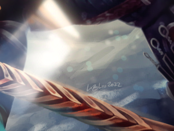
“Bou and Dali” Print, Photo 02 Photo credit to the commissioner; shared here with permission. Sketchblog post for this artwork here.
Printers in the EU
For the EU, I asked a few people, and was recommended these two printers!
The person who recommended them to me has used them in the past, and was happy with them. They said to feel free to reach out to the website’s support team if you need help or questions about their prints.
Update 12/4/2025: I’ve heard Mixam’s quality has become a little less reliable in recent years, compared to the stellar quality they were previously known for. People advise planning ample shipping time to review proofs or additional orders, as their defective rate seems to have increased.
Mixam also has a US site, but because of the previous bullet about wavering print quality, the two in the “Printers in the US” section might be better, depending on your location.
This print shop is located in Paris. I am unsure if they are a retail store only, or if they also have an online store. You will probably be able tell more easily than I can, because it looks like their site might be French-only. :p (This was originally written for a French-speaking commissioner.)
The person who recommended this printer to me said they are very high quality, but implied they might be more expensive.
The original for this section was written July 25, 2022, with some formatting edits today. Again, keep in mind the date the info here was written compared to when you are reading this, in case anything has become out-of-date.
Local Printers (Any Region)
If you have access to a local printer, this is always a recommended option!
Local means you have the added benefit of being able to receive customer support in-person. You can also immediately see the proof quality, and speak directly with someone who will help you with any adjustments needed for your print.
In the US, a few local printers I’ve heard people use are:
FedEx Office Stores
Office Depot
The main issue I hear about stores like FedEx/Office Depot is the quality can sometimes vary significantly – even at the same store – depending on who is working on a particular day. I’ve heard experiences ranging from surprisingly wonderful to shockingly disappointing. I would guess the quality, on average, is generally satisfactory. But, it might depend on your use-case scenario.
Michaels (the craft store!)
I only recently learned Michael’s does prints! I haven’t used them personally, but the person who mentioned them to me was very pleased with their print quality. And that the cost was reasonable, though not inexpensive.
With Michael’s, you also have the added benefit of having their framing department in-store. Frames can be essential depending on how you wish to display your print – don’t overlook them!
It’s possible my info is out-of-date, but I always heard praise for their framing departments (I’m not sure how much this might vary from store-to-store).
I’m unfortunately unfamiliar with specific local EU printers – check your area, or if you know one, let me know and I’ll add them here!
That’s the summary! I hope it might be helpful to someone. If you have feedback or suggestions for this post (or questions about printing), again feel free to comment or let me know wherever you see me active. Happy to keep it updated!
A hearty thanks to Bou & Dali for taking these wonderful photographs, and for their permission to share them here with you!
Close-up photo from the commissioner showing print quality details.
Updated December 5, 2025: Added the “Local Printers” section after receiving helpful feedback!
I will also show 2 bonus crops at the end of this post – one that I posted yesterday on Bluesky, and a bonus version here with color flats added.
Bluesky Censorship
Though before showing the images, I want to briefly mention the widening scope of censorship currently going over on Bluesky. This isn’t something that has only happened on there – it’s been a recent occurrence across several platforms in recent years. Most notably, for this year, are the Itchi.io and Steam bans. But before then, it was Patreon and Gumroad, as well as others. Bluesky, however, is a little unique in it is one of the most far-reaching among these recent censorship pushes.
These are important topics to me, but (at least, for now) too wide in scope to broach entirely in this post. I’d want more time to word everything properly, as it’d likely be an essay’s-worth of words, if I tried and tackled it now.
But what I want to note about Bluesky for the time being, is something I thought about posting there – and maybe I still will, depending on how this week goes, and if the admins there react to the backlash or not.
What I want to say is this:
General thoughts on the widening scope of censorship in recent years
Some years ago, it used to be widely understood that if you wished to protect the art you like, you must also defend the existence of the art you dislike – or even find repulsive. You are free to be disgusted by anything, not look at and filter it, and move on.
It was when people began forcing everyone to censor anything uncomfortable that lead to where we are now. Where multiple platforms are widening their scope of censoring artistic expression, which used to be widely understood as a key aspect of what it even means to be human.
Social platforms have spent years inciting the dehumanization of their own users toward themselves and each other. These recent censorship crackdowns are a reflection of this. Platforms would prefer censoring expressions of sincere humanity, in favor of the most banal visual products, aka “content”
Bluesky specifically
With that, I’ll just write what I posted there, with some expanded thoughts since I am not limited to a wordcount here (I’ll link to the social post itself afterward, if you’d like to see the original, much shorter thread):
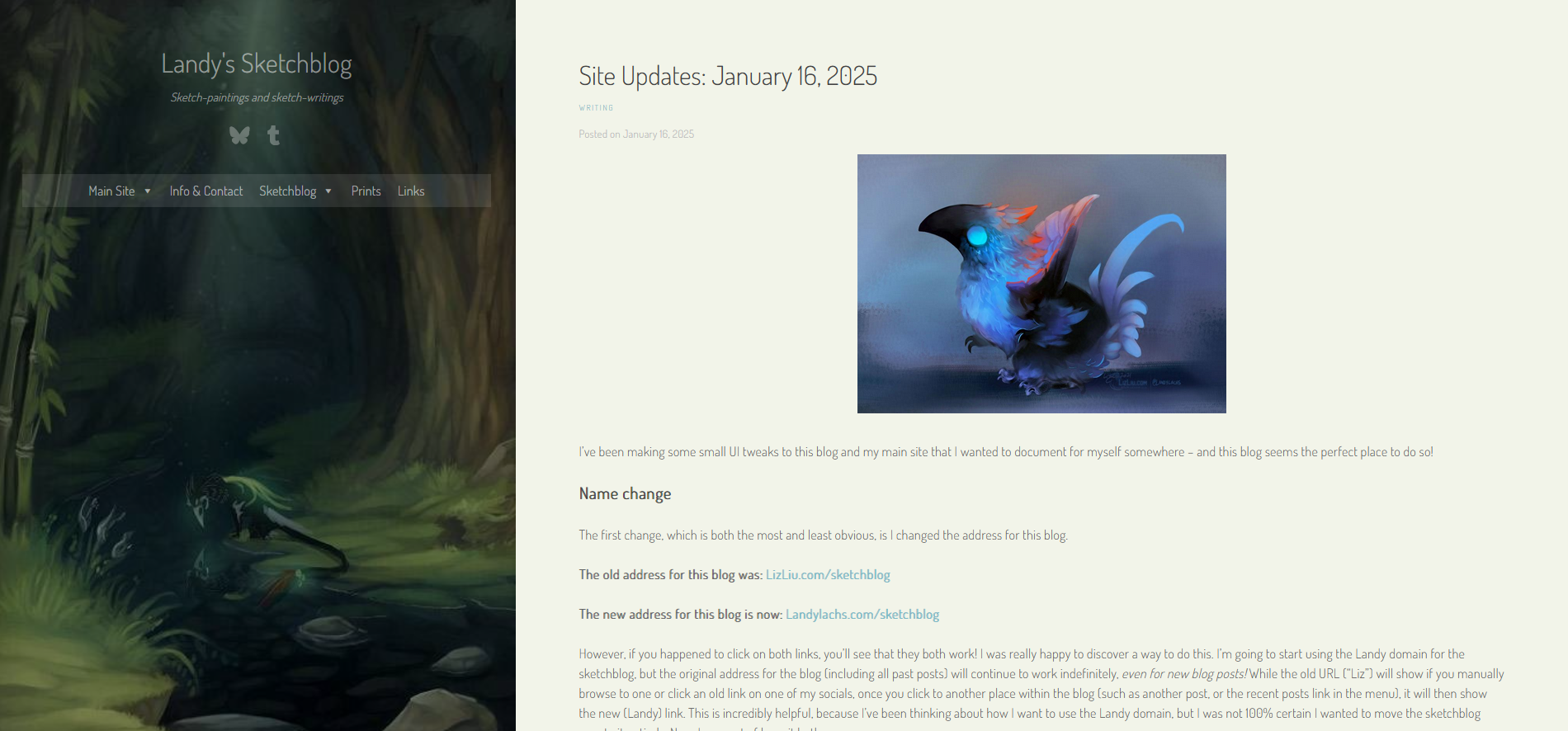
I’ve been making some small UI tweaks to this blog and my main site that I wanted to document for myself somewhere – and this blog seems the perfect place to do so!
Name change
The first change, which is both the most and least obvious, is I changed the address for this blog.
However, if you happened to click on both links, you’ll see that they both work! I was really happy to discover a way to do this. I’m going to start using the Landy domain for the sketchblog, but the original address for the blog (including all past posts) will continue to work indefinitely, even for new blog posts! While the old URL (“Liz”) will show if you manually browse to one or click an old link on one of my socials, once you click to another place within the blog (such as another post, or the recent posts link in the menu), it will then show the new (Landy) link. This is incredibly helpful, because I’ve been thinking about how I want to use the Landy domain, but I was not 100% certain I wanted to move the sketchblog over to it entirely. Now, I can sort of have it both ways.
I’ve actually had the Landy domain for several years, mainly for identity reasons, but I never got around to using it for anything (other than the base URL – without the “sketchblog” part – redirecting to my portfolio site). The base domain still redirects to my portfolio site as of this post, but I have plans for it soon for it to become its own thing, separate from my portfolio.
Along these lines, I also changed the blog’s name to “Landy’s Sketchblog,” whereas before it was “Liz’s Sketchblog.”
I’ll go into why I wanted to consider this change later on in the post, after showing the layout changes. But I wanted to note down this name change at the top, because it is an important change for the clarity of this blog.
Layout Changes
While looking through my files, I unfortunately realized I didn’t save as many screenshots of the layout changes as I thought I had. But that’s okay, I’ll just post what I do have.
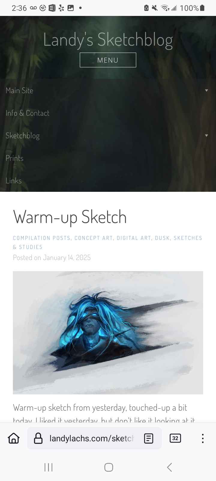
Desktop Layout (Sketchblog)
Let’s start with the changes to this blog! Here’s how it looks now:
Current sketchblog layout, main page with off-white background. Link color also adjusted to slightly more green.
The latest change I made was switching the background color for the main content area from white to an off-white – I’m not sure this will be the final color, but I’ve been leaning toward using more of a variety of colors for my Landy/non-“Liz” pages recently. It’s more fun!
Here’s how it looked before deciding to change the content area background color:
Sketchblog layout, main page with white background.
Here’s how it looked before I decided to change the blog’s name (also apologies for the misalignment of these screenshots, they were taken on-the-fly while making the site updates):
Slightly before the current layout, main page.
In the above, the main change with the current layout is decreasing the size of the blog title and description, as well as lowering the opacity for both, as well as the nav links and social icons. This is to emphasize what should be the main draw for this blog – the content of the posts themselves.
And here’s how it looked before I made the small tweaks earlier this week (showing the archive page, though without the categories I added later – this screenshot is from a while back):
Before the main changes from earlier this week, blog archive (without categories showing).
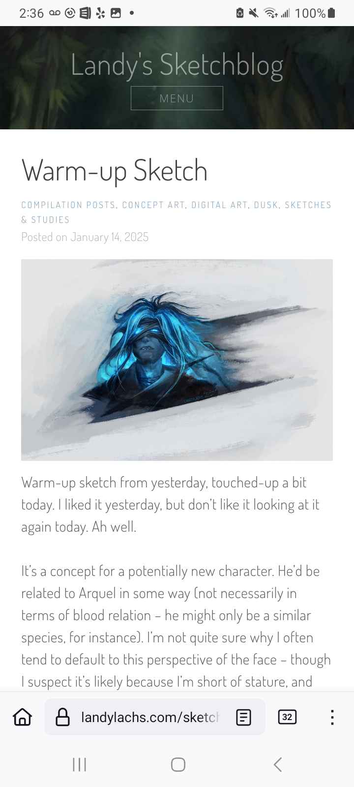
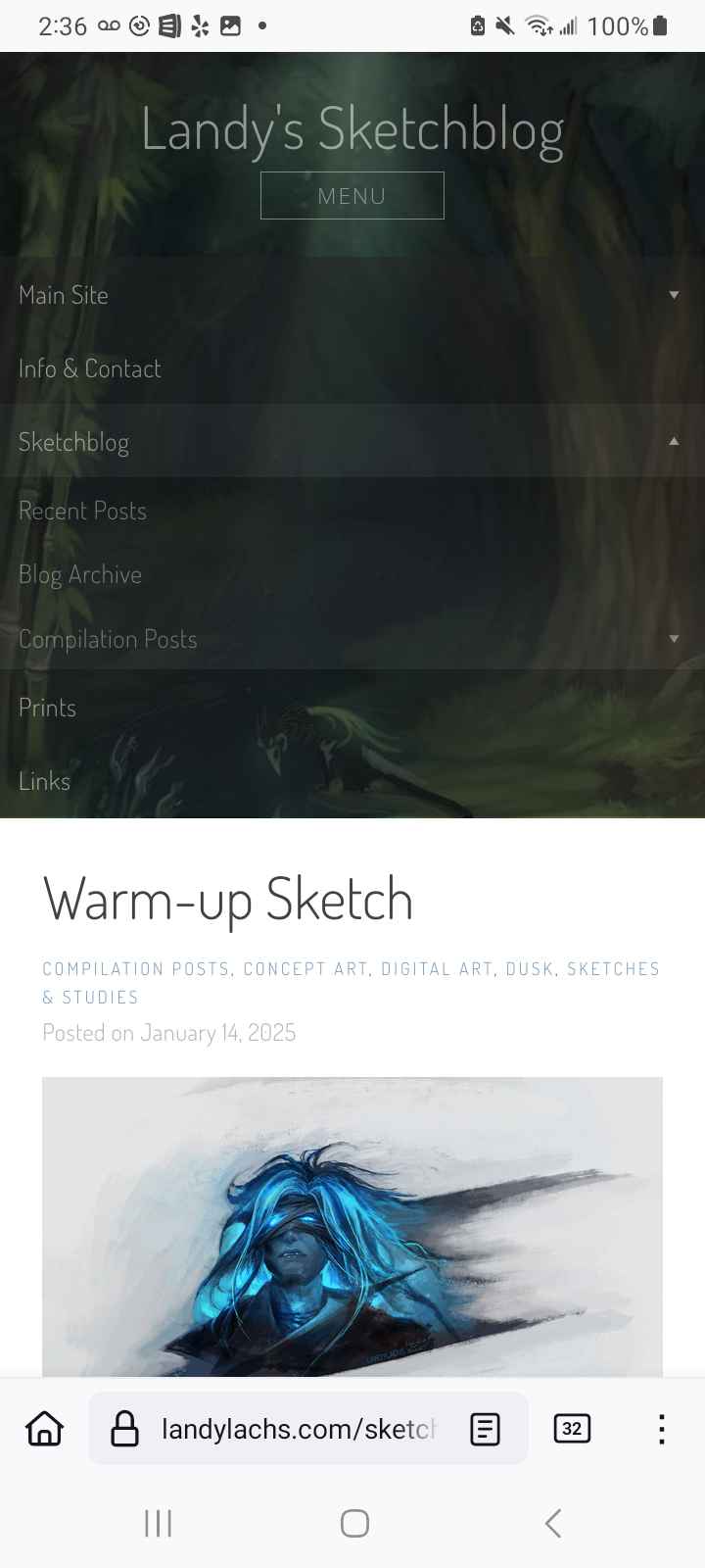
Mobile Layout (Sketchblog)
Mobile version of the sketchblog upon open.
When the “menu” button is pressed.
Menu expands when a category with sub-items is clicked and expands,
Here’s how the sketchblog should now look on mobile – before, the top bar was much wider by default. It still isn’t as small as I’d like (the leftmost image), but it should be a much better viewing experience now compared to before. The menu also expands, and reveals the sidebar image when the nested items are expanded. This isn’t fully to my preference (see below), but I am okay with it for now.
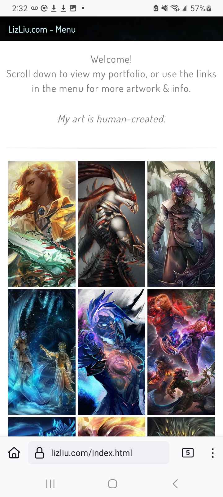
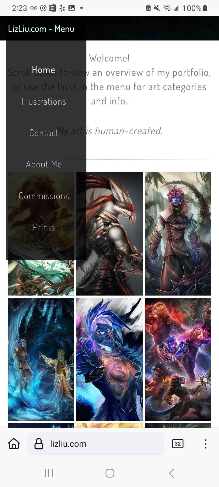
Mobile Layout (Portfolio Site)
I also wanted to jot down a change I did last year – I finally created a mobile-friendly layout for my main portfolio website. I know I took screenshots of how it looked before, but I couldn’t find it among the cacophony of photos on my phone – so I have only the current layout to show (I’ll edit the “before” screenshots in the future, if I end up finding them again):
Portfolio site, mobile layout, default view.
Menu expands upon clicking the topbar button.
For a sense of the previous layout, imagine that topbar covering about 30% of the screen (with an art graphic on it) with the navigation bar on it, instead of the thin bar that’s there now that appears when tapped.
With the sketchblog changes, I was actually trying to have it look closer to how I changed it for my portfolio site – but because I use WordPress for the sketchblog, I don’t have as much flexibility or control as I do for my portfolio site. I’m sure there is a way to have the topbar as slim as my portfolio site, but the time investment for me to figure that out doesn’t make it feasible, for now, as I’m not a web developer by trade. The sketchblog’s mobile layout should be functional, as well as a more pleasant browsing experience now, which was my aim.
I am pleased that I was able to figure out a way to have the menu bar on my portfolio site look more elegant than using a content managing system like WordPress! I always created the sketchblog with WordPress as a kind of “testing ground,” as I like using WordPress, but I also love the control manually writing your site gives you. I think both work well for different purposes – for something like a blog, it would probably be too inflexible if I tried to do that manually (as well as take up too much time, most likely, in terms of maintenance).
Why the changes?
So, why these updates? Well, the mobile changes are obvious – I’ve long preferred browsing via desktop over mobile. This caused me, probably unwisely, to prioritize the desktop experience over the mobile one for many years – long after mobile eclipsed desktop use. This was partially because I find the mobile browsing experience personally vaguely unpleasant – the physical act of looking down at this tiny screen has always been sort of uncomfortable or unpleasant. I think I became used to the sitting-up posture growing up with desktop computers. I never wanted to spend longer looking down at this ridiculously tiny phone screen longer than I had to.
But I understand that I am not the main demographic, and that the majority of the browsing experience nowadays is through mobile. I have to admit I partially was spurred to fix my layout after some friends mentioned they were looking at my portfolio website, which I assumed was through their phones, and was mildly horrified as I knew I had been neglecting the mobile layout. So I have them to thank for spurring me to improve it, which I should have done earlier than this/last year – but! Now it’s done (or functional).
Additional changes & thoughts
Another change I did spur-of-the-moment earlier this week, while working on the blog, was changing the title from “Liz’s Sketchblog” to “Landy’s Sketchblog,” A small change, but something I wanted to note down for myself here.
The reason is something I’ve been thinking about for a while, and that I’ve decided to begin implementing this year. I have always had a bit of a disconnect between my name and my art versus my pseudonym and my art. For a long time I only used my pseudonym (“Landylachs”), and avoided actively associating my name with my art. A few years ago, I decided to try using my name with my art, in addition to my alias, as it felt right at the time. I don’t think that was the “wrong” decision, but I do think it has created this underlying tension I always have between my work as “Liz” versus my work as “Landy.” I suspect this makes little difference outwardly, and it is likely entirely an internal perception thing I am overthinking. I’ve tried to ignore that discrepancy ever since, but it never truly went away.
The main cause of the tension in this discrepancy is I am always conflicted about how I wish to present myself under these names. I feel I should maintain a certain level of distance and professionalism with “Liz,” but there are times when I wish to be more of a hobbyist, more casual and whimsical (and, let’s be honest – feel allowed to show more excitement about whichever fandoms I’m into at the moment) – which I don’t feel comfortable doing when I am “Liz.” Because even though I do art professionally, at heart, one of my favorite things about art is how it helps you discover people who share genuine love over the things you’re passionate about too – whether that is fandom or original art and stories. Since I use both names interchangeably, I think my accounts have been trying to present both ways, and not fully succeeding at either.
So! This year, after thinking about it for too long (and a wholehearted thank-you-and-apologies to friends and fellow artists I’ve reached out to ramble about this and seek out their advice and opinions – which have all been incredibly helpful!) – after thinking about it, I’ve finally settled on what I want to do about this, I’ll continue calling it, “discrepancy.”
The portfolio site (“LizLiu.com”) won’t be going anywhere, but I’m going to start using it more for my more fully-polished art. For my more hobbyist art and personal projects, I’m going to start doing them under “Landylachs.com” – thought that leaves the question of my social accounts, which are all under the Landy identity. I’m not fully certain what, if anything, I’ll change with those – right now, I’m leaning toward slowly transitioning them to being more casual, maybe, and I might gradually move all the socials from my portfolio site to the future Landy site, and have the portfolio site exist as its own, mainly self-contained thing.
Part of the reason for using this blog again, is I think writing this out helps me decide what I want to do, so this is part of that process. I’m trying to implement more things this year, instead of overly ruminating or overthinking it to myself. I think the rapid pace of social media adds to this rumination, causing me to constantly second-guess whether I want to even share anything at all, and then I end up keeping everything I’m excited by offline and not sharing anything online at all. This blog has been helping me slow down a bit, and decide which things I do want to share, and which things need more time to percolate and keep to myself until they’re ready. I’m excited so far!
Add-on Update: January 29, 2025
Adjusted navigation menu. Reduced the number of links for conciseness. (In preparation for future links, hopefully soon :) )
Add-on Update: January 30, 2025
Adjusted caption text to improve legibility. (Decreased letter-spacing and line-height)
Changed the “Recent Posts” layout to a list-style one for improved legibility.
Changed “Recent Posts” and “Blog Archive” pagination style to be more consistent with the main blog’s pagination style. (Note: Hover text is still incorrect, showing the blue-green link color instead of #fff as intended. Aim for fix in the future.)
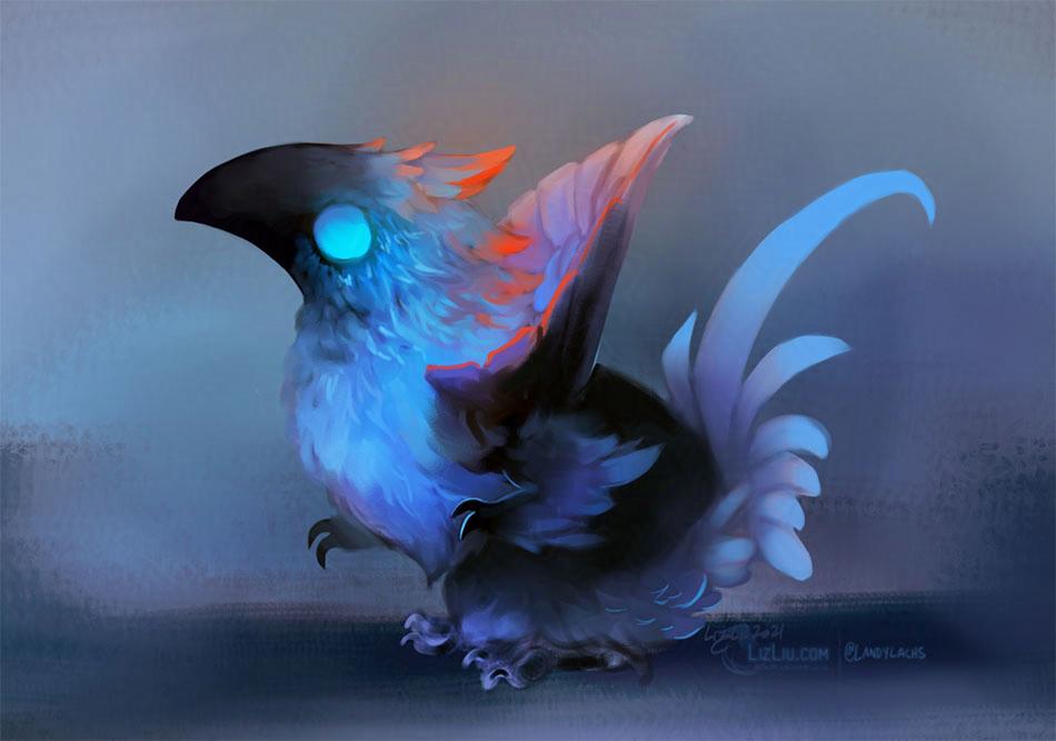
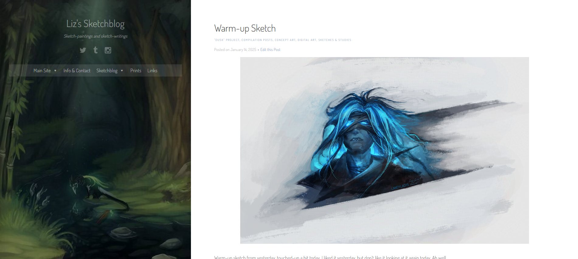
My sylvari warrior from Guild Wars 2! Crop from the full painting.
I was inspired to paint after seeing the new mount option in Guild Wars 2! It’s a “roadrunner mount,” but I was very excited because it reminded me of a mount idea I had a while back:
Mount idea based off a “greater prairie chicken” from a while back!
This mount idea is based off a greater prairie chicken, which is one of my favorite chickens! They are beautiful creatures.
I tried to recreate my mount idea in-game using the dye system, and though I did not really succeed, I am happy with my turkey mount, haha:
My sylvari warrior with his turkey mount!
This screenshot is heavily edited, as I’m currently on a laptop with integrated graphics. GW2 runs surprisingly well on it, but I wasn’t able to find an area that lit the character models well enough for us to see them. I’ll post the original screenshot below!
Original screenshot! It’s fun to compare the two.
Anyway, here is what I ended up sketching!
It’s a bit of a chimeric melding of my greater prairie chicken mount idea, the GW2 roadrunner skin, and the greater prairie chicken itself. The painting manages to look nothing like either my sketch or the in-game mount, haha, but it was really fun to paint tonight.
Here’s how the rest of the painting looks.
And now for the thoughts about cynicism in today’s media entertainment!
Thoughts about cynicism in today’s modern shows
While painting the above tonight, my mind started to idly wander about general thoughts regarding media entertainment. We finished the season finale of The Boys earlier tonight, and I’m sure this what prompted tonight’s meandering thoughts.
The primary thought is this: I can’t get into shows that revel in celebrating the worst in humanity.
There is a certain cynicism that pervades many of today’s popular entertainment media. I suspect this is why many modern shows haven’t clicked with me. The ones I do enjoy seem to be fighting for a widespread audience (Cobra Kai being a welcome exception). My two other recent favorites, Person of Interest and Dark Matter, were both cancelled after only 3 or 4 seasons! (“Recent” by modern standards – both are several years old now.)
Let’s take Cobra Kai as an example. Cobra Kai introduces itself in a very deliberate way. In our current media climate of “dark and gritty, humanity is irredeemably evil,” you think it will go in a predictable way.
The show shatters this expectation. (At least, it did for me.) Instead of taking the predictable route of a villainous, irredeemable main character – as he is introduced – the show invites us to ponder the idea of bettering ourselves. And in doing so – at least this is my interpretation – possibly even bettering the world.
It allows us to contemplate this in a way media like Westworld, Game of Thrones, Black Mirror, The Boys, or The Witcher feel like they want to choke out this desire in its audience. They arguably disavow the notion of any good in humanity. They also seem to disavow the idea that people might be redeemable, and might become better versions of their past selves.
These shows appear to desire bludgeoning their audience under the premise that humanity has little to no positive qualities, and that humans are overwhelmingly, irredeemably flawed creatures.
Humans are unquestionably flawed – it is those flaws that probably inspire the majority of our literary history (at least the most interesting works!). Our flaws – and our striving to conquer them – seem to be a central part of what it means to be human.
Possibly I’m an overly optimistic Star Trek fan, but as long as we aren’t naive about or excuse these flaws, I don’t see negatives to aspiring to be our best selves.