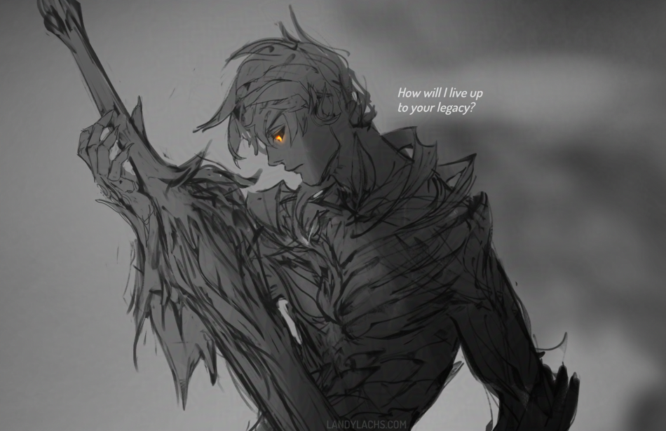
 Crop from a Trahearne sketch started a while back I’d like to finish sometime.
In my mind, this more or less pairs with the Malyck WIP sketch from last month. Both were initially drawn at around the same time.
Crop from a Trahearne sketch started a while back I’d like to finish sometime.
In my mind, this more or less pairs with the Malyck WIP sketch from last month. Both were initially drawn at around the same time.
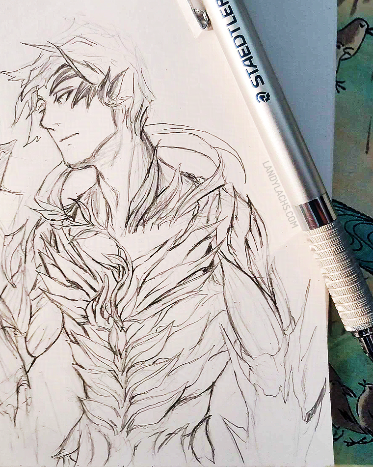
Sketched Trahearne the other day when Krita froze, and I decided waiting in vain even though that only seems to work 10% of the time (this was not one of those times). Fortunately, I didn’t lose anything substantial since my last save.
The full sketch has Malyck in it, but I don’t think he turned out as well. Might still post the full version later in this post at some point. The photo above is also an earlier version, and I slightly prefer this version – I think I overworked parts of it later on. Ah well, learning! Remembering how to draw with pencil again!
My installation of Krita has been acting a little oddly, which I suspect might be because I have it installed in a portable installation on an external, and I think it is copied over from the previous external I was using. I’m not sure if that should affect anything or not, but I finally installed the latest version of Krita onto it. It immediately loads much more quickly now – hopefully there’ll be no more freezing, too!
Also! You can see I did end up eventually acquiring the Hobonichi pencil board I semi-joked about way back in February! :D It was a bit of a splurge purchase when I made an order to JetPens earlier this year for some notebooks. It ended up being very practical, though – sometimes I want to jot down a note right after doing something in the kitchen that requires me to wash my hands, and before the pencil board, I always had to wait a few minutes for them to completely dry, otherwise any residual moisture crinkled the paper. But now, with the pencil board, I can just jot down a note right away without needing to wait those moments. It also is very useful as a bookmark (it has currently been living on page 178, which is a chart I made during chapter 2 to plot every page’s progress for the entirety of the comic!).
The last thing I use it for is as a smudge guard for pencil drawings, like this one, though I feel I did something wrong because it ended up smudging the drawing lol, that I later had to fix with some pinpointed erasing. And I don’t ever use it for its “intended” purpose, which is to put behind the current page, to draw over a flatter/smoother surface. But it is so useful in these other ways, that I don’t mind this. And the pattern is too appealing! Tiny birds!
Update: May 22, 2025

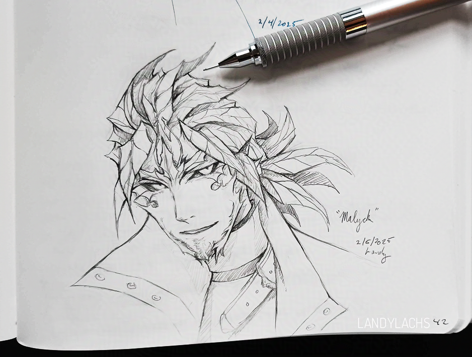
I think I figured out what I found displeasing about the original “finished” version of this drawing (the version right below this text), and why I preferred the earlier sketch – it’s likely because I didn’t darken the tops of his eye socks/below his brows, to match the contrast that was in the earlier sketch. I think it gave him the appearance of not having eyebrows, or having too-light eyebrows, which lessened the contrast I liked in that early sketch version.
Changed the date on the drawing to today’s, since it’s a different enough change to me now. Oh! I also meant to mention how the lighting conditions varied a bit through the photos (I’m next to a window) – I tried to adjust the photos to match the drawing as closely as I could to how it is on the paper, and hopefully the lighting doesn’t look too inconsistent.
Original post below:

Malyck warm-up drawing from yesterday when my hand was feeling stiff. Also, I’ve been practicing my letterforms recently – how does it look? Is it too ostentatious? Haha.
I’ve never been fond of how cursive “L” looks when I write it, which has been a small annoyance throughout the years as both my name and pseudonym begin with the letter. I also have always had messy handwriting, and earlier this year when I started using physical notebooks again, it inspired me to try practicing my handwriting to see if I could improve it.


To my mild horror, I realized so much time had passed since the last time I wrote cursive by hand, I had to look up how to write some letterforms again! This shocked me, because I grew up writing almost exclusively cursive. I remember enjoying writing in it over print/block letters, by a substantial amount. How could I have forgotten?
Anyway, in my search for a sheet showing basic cursive to remind myself, it lead me to become interested in “scripts” – not programming scripts or screenplays, haha – but styles of calligraphic writing which have been popular in the past (and present!).
I became partial to a script called “Old English Copperplate,” which is a type of handwriting which seemed most popular during the 18th century/1700’s in the west. It has flourishes and embellishments I find aesthetically pleasing, and I also thought they might be useful practice for improving my hand control. As I’ve never been confident in my writing abilities (or fond of how much hand writing looks). Oh! Though, I should mention that while I follow some of the script’s letterform’s, I don’t follow it precisely. The – I think they’re called “descenders?” – but tlike what you see in the lowercase “g” and “y” in “Malyck” and “Landy” written beside the artwork – those aren’t aren’t accurate to the script. They’re fun to write the loops this way!
And, as a bonus, I think it has been improving my drawings when using digital!

I like this drawing more as a sketch (the image captioned “Drawing work-in-progress” above) than how it looked in its original final version, seen above. I tried some small refinements this morning (the top image of this post), which I think helps a bit. But I still prefer how it looked in that earlier sketch version.
Edit: February 6, 2025
I decided to refine the Malyck drawing a bit more, seen above! I since wrote on the following page, and there was quite a bit of see-through. I tried to remove it as best I could digitally, but it makes me consider acquiring a pencil board in the future. There is a Hobonichi pencil board I was eyeing the other day, and looking for an excuse to justify its purchase… haha.
Anyway, since I ended up adding more to it today, I changed the date on the drawing to today’s.
Original post below:

Did a warm-up sketch of Malyck earlier today, initially with the intention of inking it. I’m very out of practice with clean pencil drawing – I mainly use one for jotting a quick note or a rough sketch idea, nowadays – but I was enjoying using it a lot today. And ended up adding more to it in pencil instead, which may or may not have been to its detriment. I’ll try an ink test another time. :)
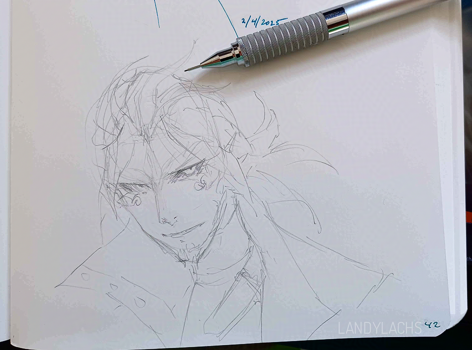
I was going to leave the sketch like this, before deciding to draw on it a little more and ending up with the sketch at the top of this post.
I love working with mechanical pencils, and it used to be the medium I used the most often. I still use one (the Staedtler 0.3 mm drafting pencil is a thing of beauty, and incredibly durable), but it’s more infrequent than I’d like. I mainly use it for jotting down quick ideas, and not finished drawings. Maybe I’ll try doing some cleaner sketches this year.
With support from ArenaNet.

Hoatzin pencil sketch/study. A Hoatzin is a type of cuckoo! A very pretty one at that. It’s the punk bird of the cuckoo world.
It’s amazing how much more fun drawing can be on different types of paper. This is on a lightweight watercolor paper.