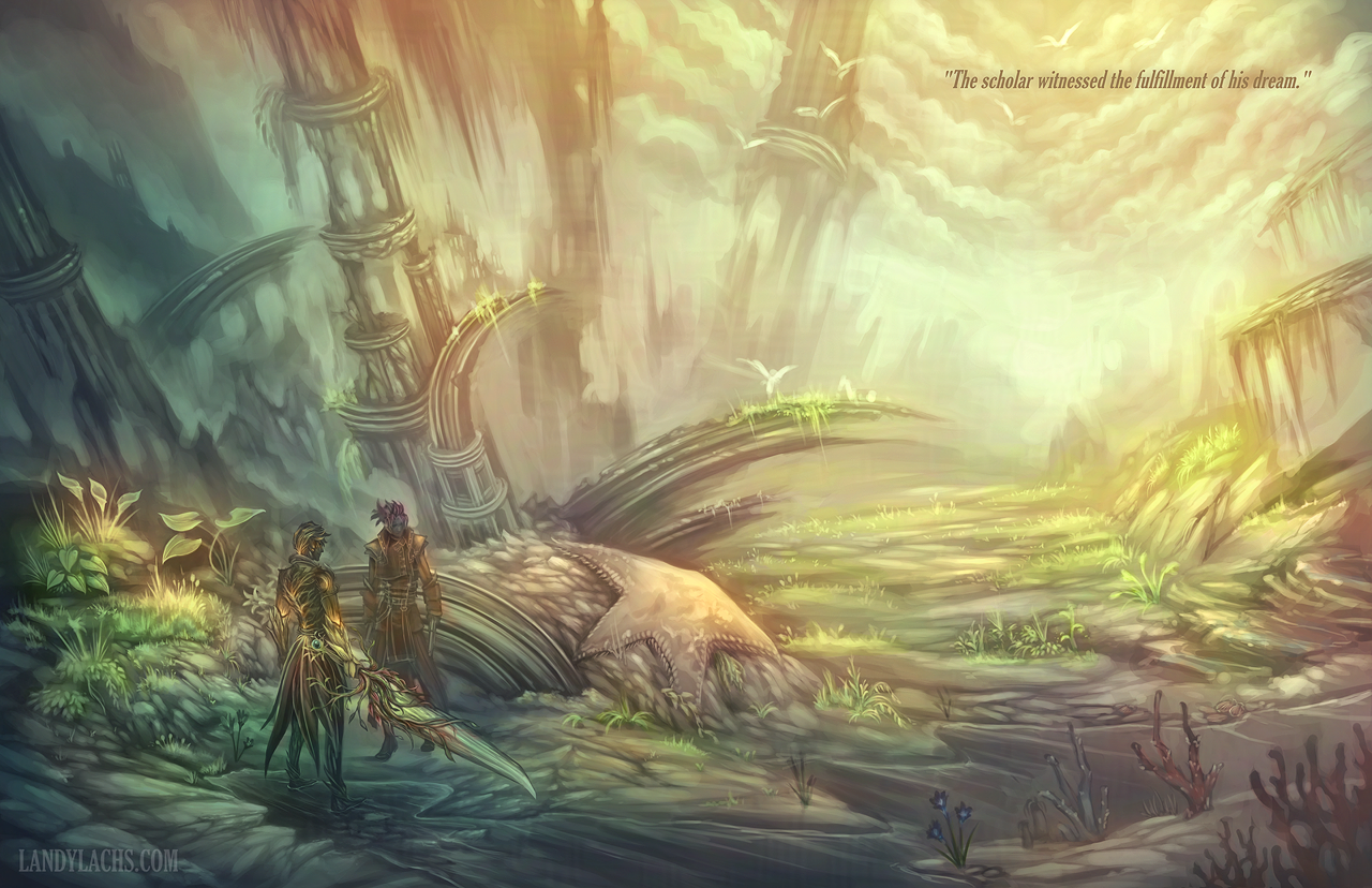
“The scholar witnessed the fulfillment of his dream.”
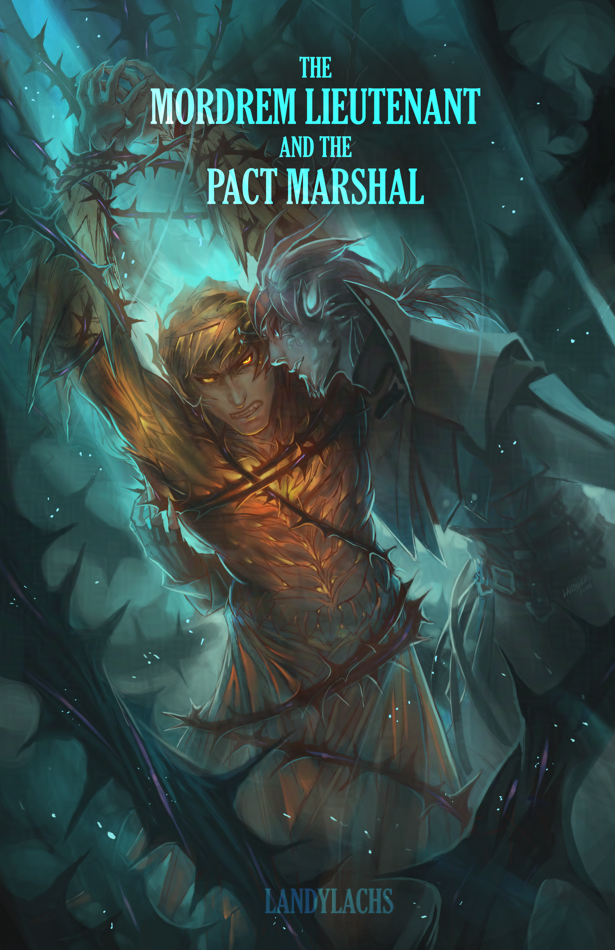
I was reminded of this drawing last week, during the lead-up to Guild Wars 3’s announcement last Friday. During those days before – when GW3 was still a whisper of a guess – I saw fan speculation about how the teaser the studio showed early las week might be a “cleansed Orr.” Which reminded me of this older art I was inspired to paint shortly after finishing the Knight of the Thorn questline when it was first added to the game.
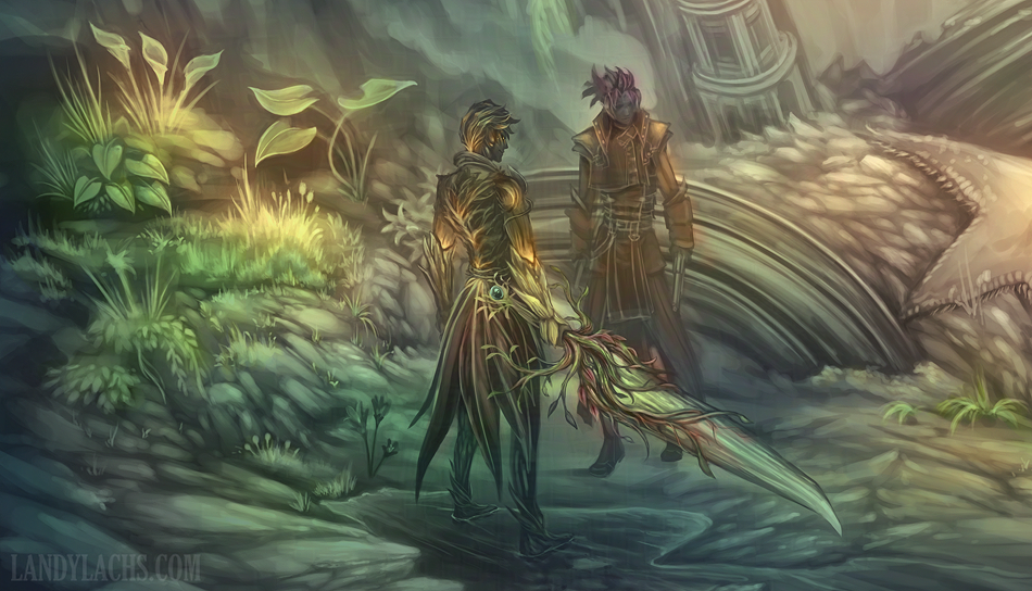
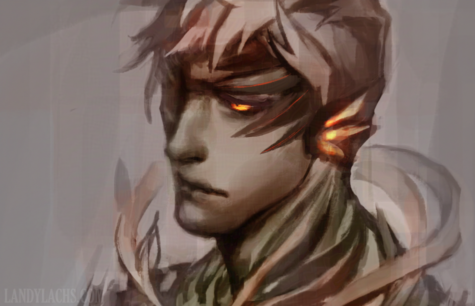
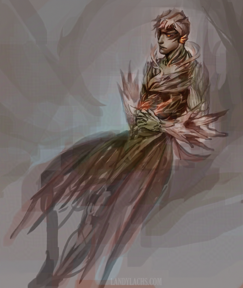
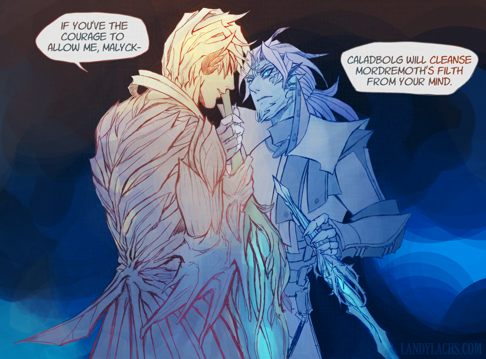
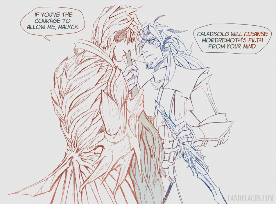
It involves one of my fan stories where Trahearne brings Malyck to a cleansed Orr, after Trahaerne cleanses Malyck from Mordremoth’s corruption (this fan story takes place after Heart of Thorns).
Slightly higher-resolution version in the full post, after a reddit user asked for a higher-res version for their desktop (I hope you enjoy it!):