Edit 10:33 pm:

 Touched them up a bit more!
Original post below:
 Spurred from a conversation with Jasmine on bluesky yesterday where she said, “trahearne is back and he’s santa– 🧑🎄” – which gave me a variety of amusing mental images I immediately wished to draw.
This is a warm-up sketch that I might finish another time.
This is 3/4-body in the full composition – putting it in the full post, because I think the shoulder is a little off (this is another anatomy construction practice from imagination drawing). Edit: Updated the 3/4 version it slightly; I guess I’ll leave it without a readmore now, though there are still off things about it – still a sketch/potential WIP).

Edit December 18, 2025
Adding one more. :p
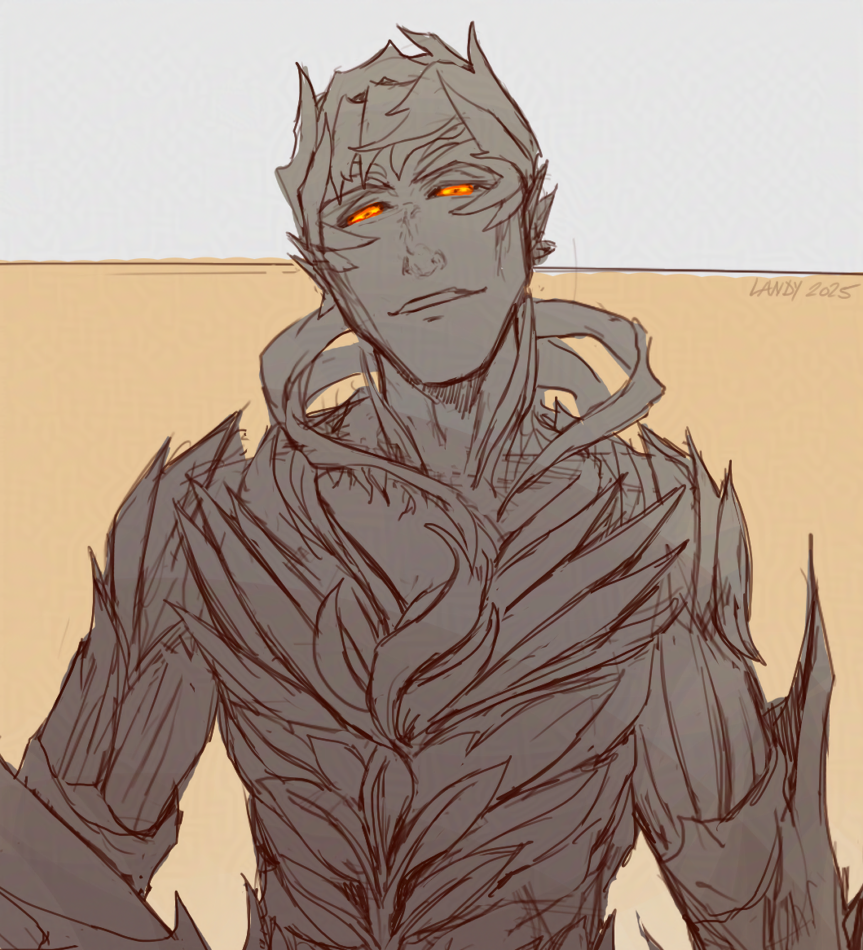 Larger crop in the full post:
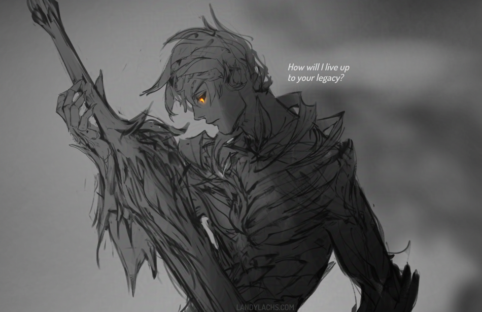 Crop from a Trahearne sketch started a while back I’d like to finish sometime.
In my mind, this more or less pairs with the Malyck WIP sketch from last month. Both were initially drawn at around the same time.
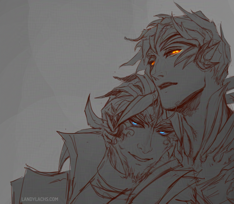 Sketched them again yesterday in-between waiting for commission feedback! I’m so happy I started drawing with lines again this year. I have to admit that before this year, most of the time I found line drawing one of the less enjoyable parts for me. Which is a bit peculiar, as I loved drawing when I first started art – pencil drawing was my favorite for many years.
This year has felt like rediscovering all those aspects about drawing which made me fall in love with art in the first place. I haven’t spent time enjoying drawing lines for so long – before now, it was a necessary step, not my favorite one. Which is why I was very surprised when I recently realized the line step has become my favorite part about drawing comic pages.
I think part of it was also doing those occasional pencil drawings this year. I truly forgot how pleasurable it is to use a mechanical pencil for more than jotting down loose concepts. Before February, I can’t even recall the last time I sat down and tried making a pencil drawing look presentable. I’d been so separate from physical media for so long, that I marveled at the control of the graphite, the texture of the paper, dealing with brushing away those eraser bits without smudging the drawing. All those parts about drawing which sound pretentious to describe, but which are difficult to explain its appeal otherwise.
 Anyway, that is to say, both this drawing and the previous one are results from using an opacity brush to sketch with again (meaning a brush with pressure sensitivity). I haven’t used one for doing line sketches/drawing for a few months. Before now, it tended to be a crutch for me – it made me take too long with squirrelly, indecisive lines I was never satisfied with. That’s partially why I switched to sketching with a hard brush for the past few months (meaning a brush without pressure sensitivity), both in the comic pages and in sketches. It’s probably easiest seen in the Diarmid drawing from August. That line drawing, in particular – even though the line portion is only a rough sketch – it turned out much stronger than my line drawings or sketches usually do. The idea is described more clearly, because having that hard brush forces me to make a decision with where to place the line. It prevents me from endlessly deliberating, as I tended to do when using brushes with pressure sensitivity.
I’m essentially describing the advantages many artists have described in advocating for sketching with ink versus pencil in physical media. (Though of course, digital has the significant difference of being able to easily erase – even when you “ink,”)
I’ve briefly tried ink sketching before in physical media – it’s very enjoyable, but my results were always mixed. Which made me unable to overcome the sense that I was just wasting paper. This is the main reason I didn’t persist with it.
This is becoming more rambling than I intended – the point I meant to jot down here is, I began sketching with an opacity brush again because I was trying to recreate the feeling I enjoyed so much when doing the Trahearne pencil drawing from the other day. I really loved the process of drawing that one. The strange thing about using opacity brushes digitally is, that “squirreliness” which always plagued me in digital line drawings – it wasn’t happening in these pencil drawings (or, it was at least happening less). I’m not sure why. I suspect it’s a combination of physical having more “permanence,” which perhaps forces me to be more decisive. Practicing sketching with the hard brush over the past few months likely also helped.
After using the hard brush to sketch, sketching with an opacity brush again felt so strange! In a good way. This time, it seems easier to be more decisive. And I think I am better avoiding that “squirreliness,” while also adding the benefits you gain from having pressure sensitivity available to you.
I’ll have to continue doing experiments with both types of sketching!
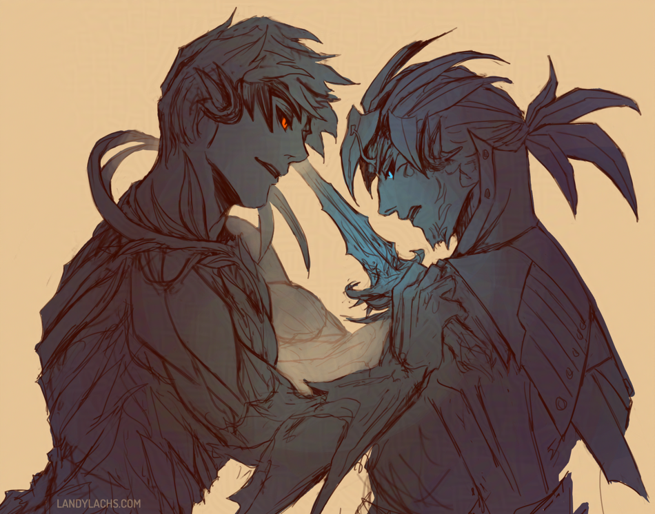 Sketch from last night. I never tire of drawing them!