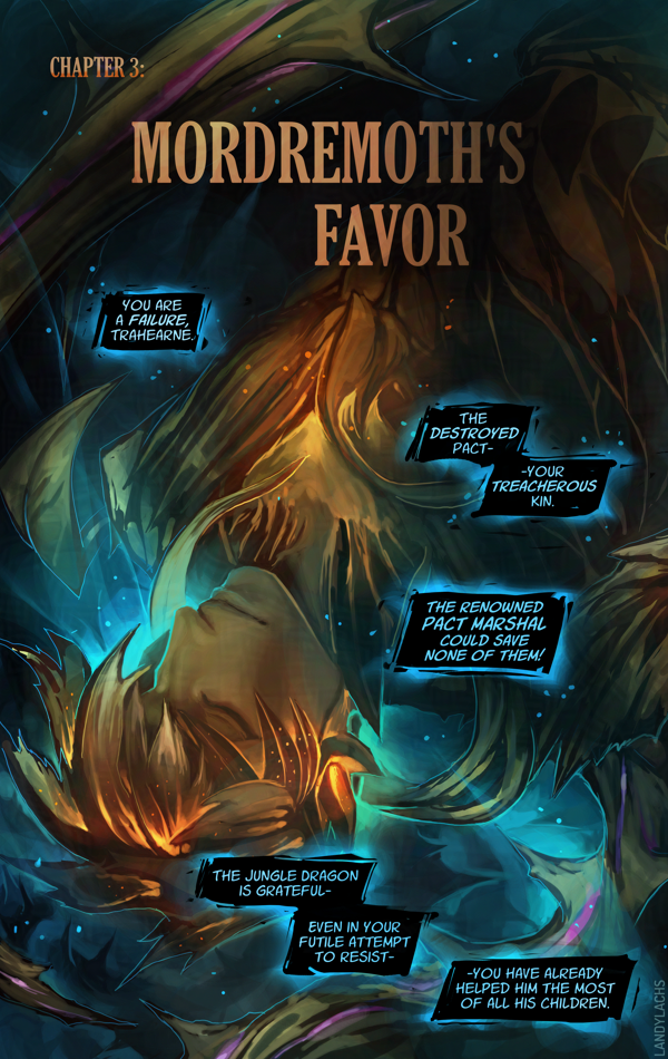
Updated typography | Ch2 Title Page | The Harbinger’s Path Link to live page here.
I’m here with an update about The Harbinger’s Pathprint book’s progress!
As of this writing, I have finished the first edit pass for all of Chapter 1, all of Chapter 2, and I am now up to pages 5-6 in Chapter 3. These edits include adjusting the pages to factor in margin, bleed, and trim, for when the pages are cut for printing. I have also retouched the art for certain pages along the way (one of them might even be live on the site!).
Book Dimensions and Page Count
I can also share some of the physical attributes of the book. It will be 5.5 x 8.5 inches, which is slightly wider than A4Correction: A5.(I always mix these two up, forgive me.) This is a standard size for US printers – a size below the standard 6 x 9 in for many US comics. This made figuring out some of the cost logistics easier. The current page count, including the cover, front and back matter, and bonus material, is 84 pages. This version will also be perfect-bound (like a standard book/not like a magazine).
With the comic pages themselves adding up to 55 pages, this means the remaining pages are bonus material! This page count will likely change as I continue working on the book’s layout, but increasing the page count from the original ~60 to the current 84 had a negligible effect on cost (to my surprise and delight). And, it is giving me an excuse to refine and polish several illustrations of Trahearne and Malyck I’ve started over the years – some I’ve shown before, but a few I never have!
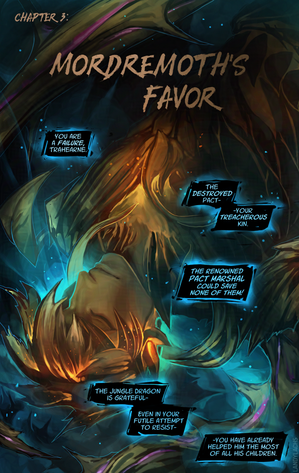
Typography Updates (Live)
In addition to the above book info, one of the updates I wanted to show are typography updates!
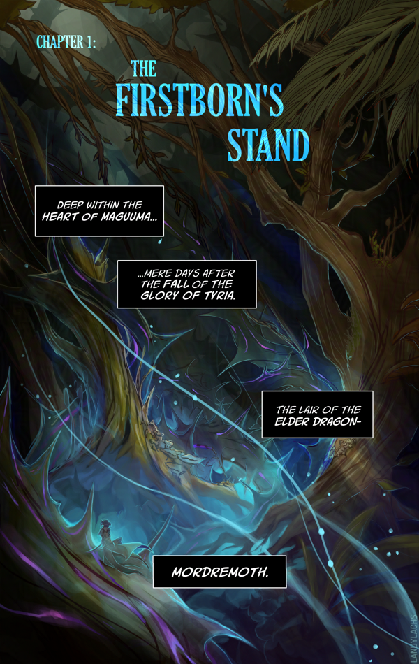
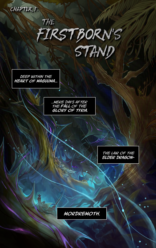
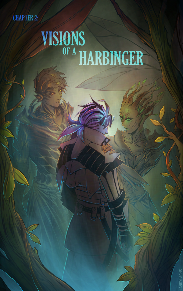
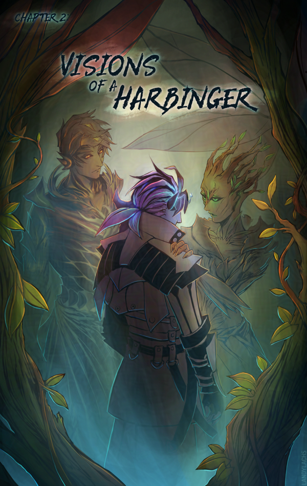
Below are comparisons of the updated versions with the previous typography, as I’ve updated the title pages for all 3 chapters on the live site now.
Left is the updated version, right is the previous version.
One of the changes that’s always been in the back of my mind was updating the typography for the chapter title pages. I don’t know why I didn’t think to try this before, but I tried out using the same font I used the the cover (“Gloucester MT Extra Condensed”), and I much prefer the look of this one compared to the previous version.
I remember I spent a good amount of time with the typography in the original, as I was never quite satisfied with it. I should have realized it was my choice of font face! Once I changed it to this Gloucester font, it fell into place quickly.
I’m fond of that previous edgelord font, but after trying it for 3 chapters, I’ve realized it isn’t the best fit for the tone I want to convey in this comic. I still love the font, but it’s better suited for a different project.
In addition to font changes in these comparisons, you might also notice the slight adjustments made to account for page trim and bleed.
Very luckily, it turns out the dimensions I used for the pages spread layout is the exact same ratio as 5.5 x 8.5 in. I am not sure how this happened, because this entire time, I was formatting the pages only with web in mind. I specifically remember originally starting with a 6 x 9 ratio, and then manually adjusting the dimensions to be taller, to fit better for web and mobile. I don’t recall specifically formatting the page dimensions for 5.5 x 8.5, but I either must have and it was so long ago I no longer recall, or this is an incredibly very fortunate coincidence.
If you’d like to know more about this print version of The Harbinger’s Path, click here or the banner below for January’s announcement post which has more info!
This post is adapted from what I originally wrote in the email update for Chapter 3, page 5 of The Harbinger’s Path. I ended up having more thoughts about this page than I expected, and wanted to jot them down somewhere that can be referenced more easily than email.
I’ve also expanded it in some areas, since I feel less annoying doing that on my blog here – I try not to overly ramble in email updates. ;D
“Headcanon” Background Info
This page has one of the clearest reminders this is a headcanon story. Malyck’s choice of using “Nightmare Commanders” is an intentional callback to the concept art Carlyn Lim did for three “Nightmare Court Commanders” during Heart of Thorns’ pre-launch development. (You can see her brilliant concept artworks for them here.)
In her concept art for these three, she labels each as:
But how those original descriptions on Carlyn’s concepts stir the imagination! They conjure endless story possibilities. What potential narratives might a “Nightmare Court Commander” have been considered in, during those early Heart of Thorns writing sessions?
What if Diarmid, Hareth, and Adryn had been part of the Nightmare Court – leaders, even! – instead of a faction entirely separate from it, as they are in the canon story?
What might they have been like, what might their stories have been? I haven’t even touched on what a “Nightmare Court Seer“ might have implied! Was Adryn possible some type of “Seer of Mordremoth” in his early incarnations?
How would this have changed their relation to Mordremoth? To the Nightmare Court?
To Faolain?
It is far too easy to pleasantly ruminate on this!
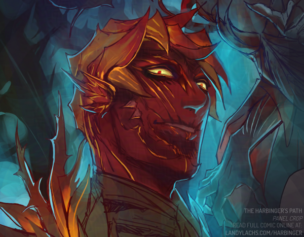
Page Layout Process
Chapter 3, page 5 is one of the earlier pages I drafted for The Harbinger’s Path. A version of this page has existed, in some form, as early as Chapter 1 of the comic.
As such, to me, this page’s layout is not as strong as I think I could do now. I’ve hopefully learned some things since Chapter 1, page 1! If I were to do this page again now, I would do several things differently – but I decided to keep the page’s panel compositions relatively the same. For a few reasons – the main one being, when I began this comic, my aim was for this to be practice and a learning experience. It is very easy for me to end up not finishing what I start in my personal art. It is something I have to consciously choose not to do. It is why I have many “works-in-progress” – something I suspect many artists can relate to.
Additionally, I’ve never managed to draw a “finished” a graphic novel page – not a single one – before starting The Harbinger’s Path. Much less an entire chapter! My initial aim with this project was to finish one, completed chapter. Just one. I did not know if I could do it.
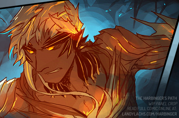
The Harbinger’s Path | Chapter 3, page 5, panel crop
Chapter 3 Layouts
And here we now are on Chapter 3! Much to my amazement and surprise. I am not sure how that happened, but one of the things that helped me enormously was setting personal deadlines. This helps me to continually move forward, and not become too “stuck” on something. Such as continuously redoing an early page (which did happen to some of those pages in chapter 1 – especially earlier on). One of the things I had to practice was being okay with calling a page “finished,” even if it was not what I would consider truly “finished” – which became easier over time. The more pages I complete, the better I understand that comics, more than illustrations, are sums of the whole instead of their parts. Small quibbles on individual pages are not as substantial, if sequences of pages work coherently together – as an interconnected, narrative whole.
This is an arguably convoluted way of explaining why I did not redo more of chapter 3, page 5’s layout. I could have either done this – which might have made this page stronger, even though it is (hopefully) currently in a presentable state – or I could have dedicated this time to furthering future pages in chapter 3, which were (at the time) not yet drafted.
I ended up doing the latter, which is partially how chapter 3 gained a few more pages than I had initially planned. i think this time was worth it, and benefits the chapter and overall comic. And, on a personal level, I like seeing the progress of these earlier drafted pages, in comparison to the ones I drafted later – though I do question a bit whether this might be jarring to a reader, who hasn’t seen which pages were drafter more recently, versus earlier.
Of course, you can be the judge when you see the rest of the chapter. ;D
The Harbinger’s Path | Chapter 3 work-in-progress crop (art not final)
Progress crop from the page I’m cleaning up today I felt like sharing. The colors are not the actual ones – it’s just a bright color I’m using to see the mask more easily.
Edit: October 13, 2025
Repurposing this post to add any additional process crops I feel like sharing for chapter 3!
Did some drawing for this panel tonight! Did the line sketch drawing and color masks The red there is again only for masking, and not the final color – though it looks a little nifty to me, as-is.
I have a confession to make – I have never been comfortable choosing local colors until drawing this comic. I’m not sure what happened, but I would never, not in a million years, have been able to choose the colors in this panel a year ago. My local colors often lacked harmony when I chose them, and I would need to do quite a bit of trial-and-error until figuring out a palette which was somewhat decent – and even then, I was often displeased by the colors.
Remember, Chapter 1 was initially conceived as a black-and-white comic. For that chapter – and that chapter alone – I added color after doing a greyscale value pass. This was my initial plan because I am very fond of black-and-white comics – but it was also because I was not confident whether I could pull off color successfully for a comic page.
In Chapter 2, this chapter was conceived in color from the start. However, it uses a mixture of different workflow experiments for different pages. Many of these pages didn’t begin with local color. Many began with a burnt sienna value drawing, with colors layered on top (though I might not have used this method for every page).
Chapter 3 is the first time, I think, where I’ve been starting with local colors first (though I’d need to check chapter 2 to be certain). I never would have had the confidence to do this in chapters 1 or 2 – or anytime before this year. I definitely focused on values first before now, and drawing the comic has really felt like remember all the things I used to love about lines. I haven’t really worked with lines (beyond very loose sketches) for years.
It’s been helping so much with making several things which have eluded me for years feel much more natural to me. Mainly improving my construction drawing from imagination skills, and I think it is also the reason my ability to choose local colors seems to be improving.
I’m so happy I started this comic, for so many reasons, and this is just one more reason to add.
Here’s how it looked when I opened the file tonight (with some text redacted to prevent spoilers).
Edit: October 19, 2025
Crop from one of the panels I’ve been drawing this weekend. While drawing chapter 2, discovering Krita’s “isolate layer function” felt like unlocking a superpower. I was vaguely aware this functionality existed in Photoshop, but I never used it, because I rarely worked with lineart until this year. I never appreciated how useful and time-saving it was until now.
During chapter 1 and partway in chapter 2, whenever I needed to adjust part of the lineart, I was manually going through my convoluted stack of layers, hiding and un-hiding through them until I could see the lines clear enough to pinpoint what I needed to adjust.
But now, no more! All i need to click is “isolate layer” and that’s it! I can see the entire layer! Right the, right there.
Magic, I tell you.
Edit: November 14, 2025
Currently enjoying cleaning up this panel!
Edit: December 5, 2025
Edit: December 13, 2025
Edit: January 17, 2025
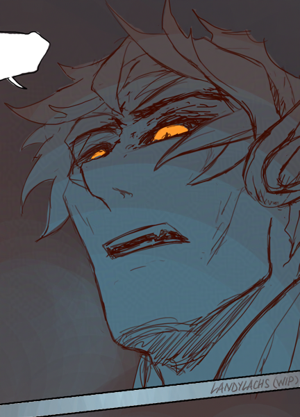
A work-in-progress panel, and––a no context Trahearne!
Here I’ll begin logging all of chapter 3’s page previews! This is mostly for myself, because it was convenient having a single post with all of chapter 2’s page previews I ended up posting to socials. It saved a lot of time having that post to reference for posts to more than one platform (because I am still stubborn about not using bulk posting tools). I also wouldn’t have been able to be as diligent with alt text otherwise.
It always surprises me how much time these small posts to socials sometimes end up taking me – having this sketchblog to reference this year has made it so much more manageable. One of the reasons why I’ve been able to be more active this year, compared to some years prior.
Plus, I think it’s sorta nifty seeing the chapter at a glance, after the chapter finishes and all the previews will be below.
The Harbinger’s Path | Chapter 3, page 2, page crop
The second half of this two-page chapter-opener spread!
Next Monday’s page has a mild advisory for violence. It is nothing graphic, and doesn’t go beyond what you’d see in a Star Wars movie.
I’ll mention this again for page 3’s update, but wanted to give a heads-up viewer discretion advisory. I’ve also added content descriptions for “fantasy violence” and “suggestive themes” to the comic’s existing PG-13 rating (at the top of this index page). It’s important to me that you have a general sense of what to expect in the comic, and are not unpleasantly surprised by something unexpected (of course, I do aspire to pleasantly surprise you!).
Thanks as always for being here, and I hope you’re enjoying Chapter 3!
Next page on Monday. Enjoy your week and weekend, and the first day of October!
The Harbinger’s Path | Chapter 3, page 3, panel crop
As mentioned in the previous update, mild advisory for violence for this page. Again, nothing graphic or beyond what you’d see in a Star Wars movie. But please use your discretion, as it might be considered a little more intense than previous pages.
Next page on Wednesday!
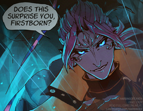
The Harbinger’s Path | Chapter 3, page 4, panel crop
I’ve been anticipating when I could finally show this page! Malyck brings up a few points here that I was eager to portray in the comic.
I suspect the point he mentions in panel 3 might be a smaller detail within the wider scope of things – but it’s one that’s important to me within the comic’s context. I always knew I wanted him to address it somewhere.
Malyck’s choice words for “Nightmare Commanders” is also one of the more overt indicators this is a headcanon story – it’s a very old callback to the original concept art Caryln Lim created during Heart of Thorns development! In those artworks, what we know as the “Mordrem Guard Commanders” in the canon story, were described as “Nightmare Court Commanders” in those earlier concepts.
Next page on Wednesday!
*Edit: Made slight touch-ups to this page later during the same day.
The Harbinger’s Path | Chapter 3, page 6, panel crop
This page touches upon one of my favorite fan interpretations/speculations – the one involving Trahearne’s “last order.”
The way the canon story treats this event always left me wanting more exposition. Possibly because, during the lead-up to Heart of Thorns’ original release, a few fan theories were floated around. A certain one lit up my imagination, and has remained my headcanon ever since!
There have been a few hints this chapter about which theory it is. I’ll be curious if you can predict it!
Next page on Monday, enjoy your week/end!
*Edit: Made slight touch-ups to this page later during the same day.
The Harbinger’s Path | Chapter 3, page 7, panel crop
With this page, I have to remind you to please trust me that I admire these characters – whatever I put them through, there is intent behind it that will have payoff later. This will (hopefully) be clear when reading the pages together. I really only have to note this now because you can’t yet turn to the next page.
Speaking of, next page on Monday! Enjoy contemplating what the next page might be until then. ;D
Tomorrow is Heart of Thorn’s 10-year anniversary! 10 years we’ve had to wonder what happened to Malyck! When I began the comic early this year, I did not realize 2025 was HoT’s 10-year anniversary. I realized after starting. As I continued drawing, it felt quite fitting. This comic, among other things, is an expression of the fondness I feel toward that original expansion, and all involved in its development – and drawing it during its 10-year anniversary year seems an appropriate way to celebrate this!
*Edit: Added edits to this page later during the same day. I had forgotten to add Trahearne’s thorns! I was enjoying drawing his pose too much, perhaps. ;p
The Harbinger’s Path | Chapter 3, page 9, panel crop
Advisory for sylvari “sap blood” this page. If you saw the previous page, this likely isn’t surprising. In my opinion, the depiction leans more “artistic” than “violent” – but as this is subjective, please use your discretion for your personal comfort level.
Next page on Wednesday!
—
For Heart of Thorns’ 10th anniversary last Thursday, I also made two things to celebrate – both related to this comic! A Trahearne and Malyck 2D animation, and a small addition to an earlier page of the comic, which I remarked I might do back over the summer. I haven’t mentioned I added this addition anywhere yet – a little mystery, but I’ll mention it soon. I applaud your diligence if you find it earlier!
*Edit: Touched-up this page later during the same day – I had less time this weekend than expected. I also had trouble cropping this one in a way that worked for socials, while also not spoiling the page. I ended up taking some extra time to clean-up parts of the art underneath the speech balloons hidden in this crop. I normally don’t do this, because thinking of the speech balloons as part of the page helps me to think of the page as a “comic page” and not an “illustration,” if this makes sense.
But I’m pretty proud of this page, and I think it’s an important one for the comic, especially after page 8. I think it warranted a little special treatment!
The Harbinger’s Path | Chapter 3, page 10, panel crop
Aha, the return of the “fan speculation/theory” mentioned way back on page 6 ‘s update for this chapter, last month on Oct 15! (The link there goes to the archive for that page’s update, if you’re curious to read it and compare with today’s page.)
Next page on Monday! I hope this slightly longer chapter has been pleasant to read compared to the two earlier chapters – it’s certainly a pleasure having an excuse to draw even more Trahearne and Malyck this year. :D
Similar to the November 12 update, two preview crops to archive here. The version featuring both of them would probably be more ideal, but I was shorter on time for this week’s pages, and don’t think this panel is refined enough to show on its own as a preview crop.
The Harbinger’s Path | Chapter 3, page 17, panel crop
A question I’ve always wondered, and that I like to think Trahearne wondered, as well. I wish we could have seen him learn the answer.
The potential for what was teased in Heart of Thorns’ launch trailer seems to live rent-free in my mind at this point. :p (If you’re not clear on what I’m referring to, watch the opening lines of that 10-year(!) old trailer after reading to the final line of this page, especially coupled with the previous page 16.)
Next page on Wednesday!
The Harbinger’s Path | Chapter 3, page 18, panel crop
This page references one of my absolute favorite quotes from the game – said by Cadeyrn to the Pale Tree:
“Let me destroy the tablet, and we will see what it truly means to be sylvari.”(Source: “Dream and Nightmare”)
I tried with the original “destroy,” but “smash” seemed to read more naturally for this page when I read it back to myself. But let me know if the difference distracts you. I was between the two, and am open to changing it if the difference detracts!
Next page on Wednesday. Happy December!
*Edit: Added slight touch-ups to this page the same day. I couldn’t resist adding a little more to Cadeyrn. :p
The Harbinger’s Path | Chapter 3, page 20, panel crop
I have a different announcement today. I was hoping I’d be able to continue the update schedule until Chapter 3’s conclusion, but I unfortunately have to put The Harbinger’s Path on a short hiatus until January 2026.
You can read more in the full announcement post here, but I’ll list the main points below.
Updates are tentatively planned to resume January 19, 2026.
This hiatus is for page updates, not page progress. I will be drawing the remaining pages during this hiatus. These next pages are more complex for me to draw, and they need more time than I unfortunately have available this month.
I’m very sorry about this hiatus, but I’m confident this additional time is the best decision for the comic to maintain its quality (and hopefully, your enjoyment!).
Thank you so much for reading The Harbinger’s Path this year! Truly, it means the world to me.
Please look forward to Janaury 2026 to find out what happens next with Trahearne & Malyck!
In the meantime, enjoy your holidays, Wintersday, and New Year’s! I’ll still be around on my sketchblog and socials during this time, and you are also welcome to email me about the comic if you have questions or feedback!
*Edit: Added various touch-ups the same day.
*Edit December 10, 2025: First-pass touch-ups (added Malyck’s beard).
And we’re back, happy new year! These next updates will cover chapter 3’s conclusion.
Also some exciting news! The Harbinger’s Path is getting a limited print run for Manga Ichiba this Fanime 2026. More in the sketchblog post if you’d like to learn more here.
This concludes Chapter 3! Click forward on page 26 for an “author’s note” about my next plans for The Harbinger’s Path, and my next comic project. I’ll also write a summary below:
What’s next for the comic? And future plans:
The Harbinger’s Path: Limited Print Run
My main focus for The Harbinger’s Path right now is editing it for print until the book is finished (which will be by May 2026 at the latest).
This includes formatting all 3 chapters/55 pages (current pages were only intended for web), adding general touch-ups to the art, and creating bonus material.
If you’re interested in a print book, there’s an interest-check poll sent to those receiving Email Updates. The poll link is also currently sent to new sign-ups.
The Harbinger’s Path: Future Comic Pages
After the print book is finished, I’ll have a better idea for what I can do next with The Harbinger’s Path.
If you already receive “Email Updates” or the RSS feed, you’ll be conveniently notified when there’s something new!
Nightmare’s Embrace Mini-comic
While I’m formatting Harbinger’s print edition, this is the next comic project I plan on drawing! It involves my sylvari oc’s, and is smaller in scope than The Harbinger’s Path. I’ve been eager to try practicing a few things learned while drawing Harbinger in a shorter comic story.
*Edit: Slight touch-ups the same day.
*Edit February 3, 2026:
Chose a different cropping for the preview image. Added both above!
I will also show 2 bonus crops at the end of this post – one that I posted yesterday on Bluesky, and a bonus version here with color flats added.
Bluesky Censorship
Though before showing the images, I want to briefly mention the widening scope of censorship currently going over on Bluesky. This isn’t something that has only happened on there – it’s been a recent occurrence across several platforms in recent years. Most notably, for this year, are the Itchi.io and Steam bans. But before then, it was Patreon and Gumroad, as well as others. Bluesky, however, is a little unique in it is one of the most far-reaching among these recent censorship pushes.
These are important topics to me, but (at least, for now) too wide in scope to broach entirely in this post. I’d want more time to word everything properly, as it’d likely be an essay’s-worth of words, if I tried and tackled it now.
But what I want to note about Bluesky for the time being, is something I thought about posting there – and maybe I still will, depending on how this week goes, and if the admins there react to the backlash or not.
What I want to say is this:
General thoughts on the widening scope of censorship in recent years
Some years ago, it used to be widely understood that if you wished to protect the art you like, you must also defend the existence of the art you dislike – or even find repulsive. You are free to be disgusted by anything, not look at and filter it, and move on.
It was when people began forcing everyone to censor anything uncomfortable that lead to where we are now. Where multiple platforms are widening their scope of censoring artistic expression, which used to be widely understood as a key aspect of what it even means to be human.
Social platforms have spent years inciting the dehumanization of their own users toward themselves and each other. These recent censorship crackdowns are a reflection of this. Platforms would prefer censoring expressions of sincere humanity, in favor of the most banal visual products, aka “content”
Bluesky specifically
With that, I’ll just write what I posted there, with some expanded thoughts since I am not limited to a wordcount here (I’ll link to the social post itself afterward, if you’d like to see the original, much shorter thread):