Realized I drew Corveil more than once this week for some warm-ups – so, here they are!
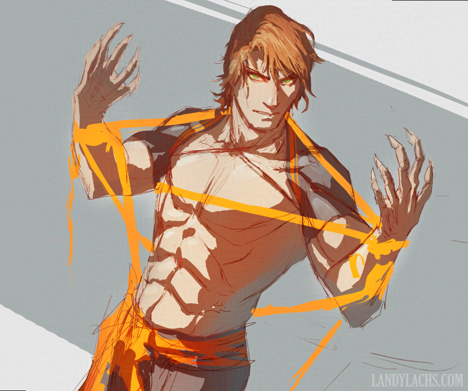
First is a line drawing from Wednesday. There are a few things I’ve been meaning to explore updating in Corveil’s design – mainly his hair and eye color. He originally had dark brown hair and blue eyes, and for a while I’ve been drawing him with either dark or light brown hair, and amber eyes. The amber eyes have stuck around for a while because I have a lore reason for him having them, but I’ve been thinking of changing them to either yellow-green or blue-green for various reasons. This one shows yellow-green.
I rather like this sketch, I wouldn’t mind cleaning this one up to something more presentable sometime.
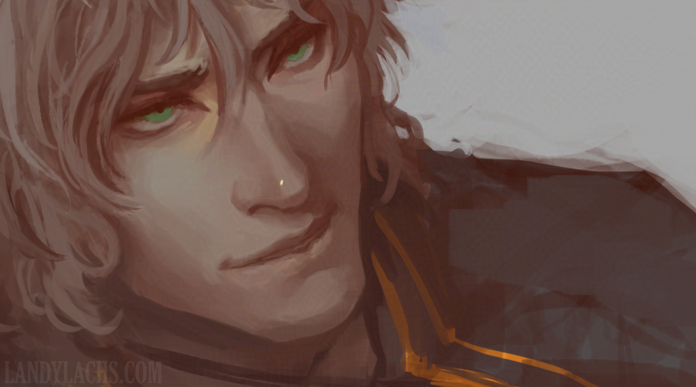
This is practice warm-up I’ve been fiddling with this week. Tried the blue-green eyes here.
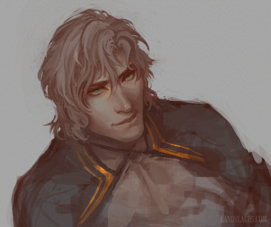
The other thing I felt like practicing with this one was jumping into painting instead of focusing more on the lines first. That’s how I used to draw more, before “rediscovering” how I apparently do enjoy drawing with lines over the past year or two, haha. But sometimes I like to draw with this other method too, and see what results. I started this one on Tuesday, and added more to it this morning as today’s warm-up.
It’s still an enjoyable method to me, but it takes me longer to arrive where I want to (compared with figuring out some of the construction with lines earlier on), and it lacks the personality I think better comes through when I start with a line sketch now.
Even just the expression, his intended personality shows much more clearly in the first sketch at the top of this post, compared with the painting practice. These are both also construction drawing from imagination practices.
Site updates
Also, some site updates! It’s not enough to warrant a full “site updates” post, but I wanted to jot it down somewhere for myself.
It’s mainly typography-related:
Typography update
I’ve been wanting to update the site’s typography for a while now. If I found it difficult to read, I’m sure others experience the same. When I first put together this blog, the reason I went with a less-legible but more “visually appealing” font (for me), is because I wanted the blog’s focus to remain on the visuals – the artwork. I tended to ramble more in past posts, and adding this slight friction for longer passages was a way for me to put a small barrier to those rambles. I figured only people who really wished to read the ramble posts would tolerate the less ideal reading experience.
Nowadays, I still ramble on here, but I try to organize these posts more than before. And some of the posts I do write with the intention of conveying information I hope might be useful for a reader (as opposed to mainly cathartic writing mainly for myself, as in some older posts). With that, I knew eventually I’d need to change the font to something more easily readable at some point.
The hunt for the perfect font
I’ve tried looking up fonts more than once before, but it’s taken until now to finally change it. The problem is I’ve never found a font I find appealing for longer reads like on this sketchblog. The font seems alright for short text – like on my portfolio and comic sites – but for this blog, I always wished I’d found a font that both read legibly, and also looked visually appealing.
It’s not “perfect,” but it’s…
(I realized while typing this is a slight callback to the post from earlier this week, haha.)
After my latest attempt researching fonts on Wednesday, I’ve finally found one acceptable enough to switch the sketchblog over to using. I don’t think I’m fully satisfied with this current font (“Comme”), but I think it’s a good compromise from the previous font (some screenshots in this past site update). At least for the meantime. I’ll jot down the changes below (having these changes documented sometimes proves useful when making site updates in the future):
- October 7, 2026
- Updated sketchblog font to “Comme” (main content area only)
- Decreased size to 1.0 rem from previous 1.1 rem
- Decreased font-weight to 200 from previous 400
- Changed color to #000 from previous default
I still prefer how the blog “looks” with the previous font, but it was undeniably more difficult to read. It’s hopefully a more pleasant reading experience now, but I don’t enjoy the typeface as much.
I’ll keep looking and see if I can find a font that better balances visuals vs readability. For now, “Comme” it is!
Note for myself: Tried “Lato” after writing this post, reverted back to the default settings – promising, but Comme slightly edges Lato for me today.
- October 9, 2026
- Changed current sketchblog font color to #111, because I apparently might never be satisfied with this blog’s typeface.

Email Updates (Mailing List)
Want to stay updated? Not keen on socials? Email Updates are the easiest way to know when there's something new. Check it out below!
New sign-ups currently receive a free PDF for The Harbinger's Path Chapter 1, from my Trahearne & Malyck GW2 fan comic. This version is exclusive to this email list, containing bonus art not currently available anywhere else.
I might change the sign-up bonus in the future, so if you're interested in seeing this PDF, consider joining soon!
You can unsubscribe anytime. Your inbox, your rules!
Or, perhaps RSS is more your style? There exists an RSS for this sketchblog, as well as an RSS for comic projects (currently page updates).
My aim is setting up ways to connect that's more stable than the whims of social platforms. If this interests you, consider signing-up.
Either way, take care and I hope to see you again!
No Comments