Manga Ichiba Circle Cut + Table Info | April 9, 2026

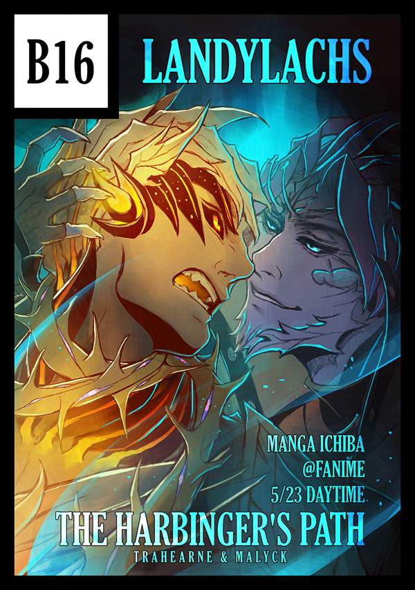
Circle cut showing Trahearne and Malyck from "The Harbinger's Path" fan comic.
Circle cut for Manga Ichiba @Fanime 2026

Finished my circle cut for Manga Ichiba! These are used as a way for the convention organizers to show who the participating doujin tables are. It’s carried over from Comiket (“comic markets”) in Japan. In JP, doujinshi are much more commonly created and shared – compared to here in NA, where we don’t have an established doujin culture (…yet!). 

I spent far too long deliberating on which artwork to use for my circle cut. I tried several, before ending up doing the least efficient option – refining a very messy sketch from this past October. I saved it knowing I’d like to refine it at some point, but hadn’t until now. This isn’t finished – it’s still quite messy in places – but perhaps that is even more appropriate for a circle cut. From my understanding, they are often sketches done for the specific convention (though correct me if I’m mistaken). 

I wanted to do something a little more playful, without being misleading about what the doujin is about. This is what I landed on – hopefully it’s a good compromise! :p 

Date, Time, & Table Number for Manga Ichiba @Fanime

Oh! And as you can read from the image, this also shows info about where and when I will be at the convention. The convention is 3 days, but every doujin table will only be tabling 1 of the 3 days (unlike traditional artist alleys). Below’s the summarized info: 

Table Number: B16
Tabling Date: Saturday May 23, 2026
Time: Day slot, 10 am – 4 pm (“General Audiences”) 

I’ll have with me The Harbinger’s Path, of course! 

The history of Comiket

I saw a very insightful post on Bluesky the other day, linking to resources detailing the history and ethos of how Comikets in Japan were first established. Much is new information to me! I wanted to link it here, both as a reminder to myself to peruse more leisurely when I have a chance, and in case you might also be interested in reading. 

Let me also link directly to the sources, in case Bluesky ever vanishes in the future. Posted originally by the user “saba sabaton” (sabato-n.bsky.social): 

Comiket slide deck presentation from 2007/2008

“Comic Market’s Ideals and Vision” 


May 4, 2026: Slightly updated the the circle cut art! 

The Harbinger’s Path: Art Updates

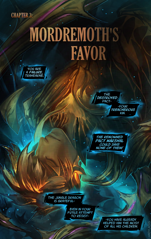
Panel crop from Chapter 3, page 9 of "The Harbinger's Path."


As I prepare The Harbinger’s Path comic for print, I plan to also update the live pages online with their updated versions. While the main revisions for print are layout-related to allocate for trim/margin/bleed, there were a few pages whose art I had an inkling to touch-up. Doing so for the print version is my perfect excuse to! 

I will likely update most of the online pages after the bulk of the work for the print version is finished. But as I edit the print layout, I’ve found myself wanting to push a few updates early. 

Below is a log I started keeping for those – specifically for the comic’s online version. I’ll keep this post updated if/when I add more to this log (keeping track of progress is strangely motivating for me). 

February 19, 2026 

February 21, 2026 

February 22, 2026 

Print Progress + Typography Updates (The Harbinger’s Path) | February 19, 2026

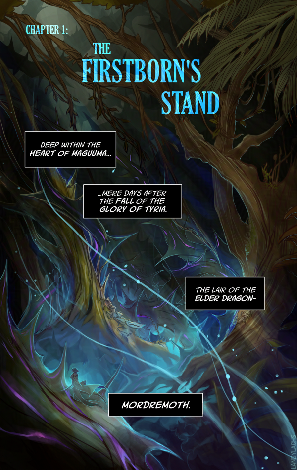
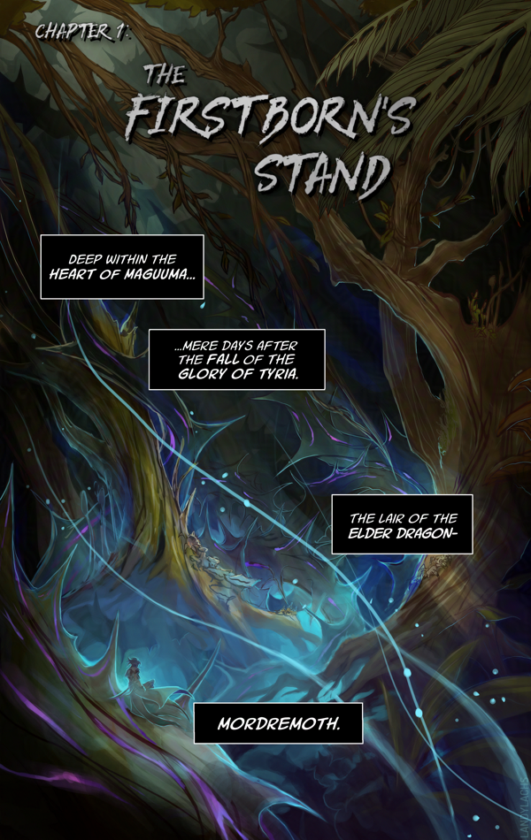
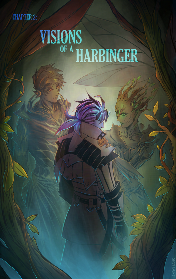
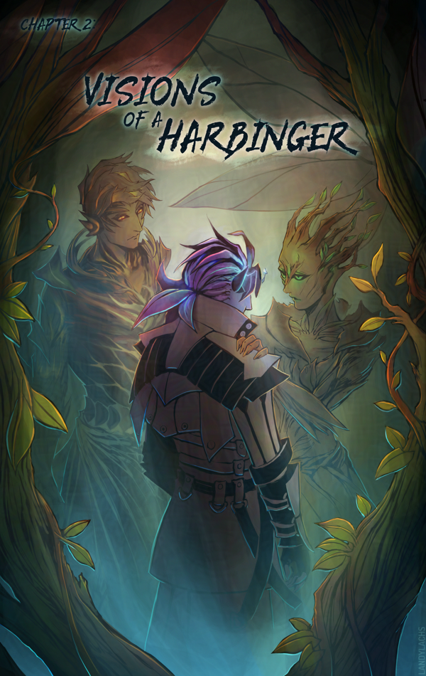
Updated typography | Ch2 Title Page | The Harbinger’s Path
Link to live page here.

I’m here with an update about The Harbinger’s Path print book’s progress!  

As of this writing, I have finished the first edit pass for all of Chapter 1, all of Chapter 2, and I am now up to pages 5-6 in Chapter 3. These edits include adjusting the pages to factor in margin, bleed, and trim, for when the pages are cut for printing. I have also retouched the art for certain pages along the way (one of them might even be live on the site!). 

Book Dimensions and Page Count

I can also share some of the physical attributes of the book. It will be 5.5 x 8.5 inches, which is slightly wider than A4 Correction: A5. (I always mix these two up, forgive me.) This is a standard size for US printers – a size below the standard 6 x 9 in for many US comics. This made figuring out some of the cost logistics easier. The current page count, including the cover, front and back matter, and bonus material, is 84 pages. This version will also be perfect-bound (like a standard book/not like a magazine). 

With the comic pages themselves adding up to 55 pages, this means the remaining pages are bonus material! This page count will likely change as I continue working on the book’s layout, but increasing the page count from the original ~60 to the current 84 had a negligible effect on cost (to my surprise and delight). And, it is giving me an excuse to refine and polish several illustrations of Trahearne and Malyck I’ve started over the years – some I’ve shown before, but a few I never have! 

Typography Updates (Live)

In addition to the above book info, one of the updates I wanted to show are typography updates! 

Below are comparisons of the updated versions with the previous typography, as I’ve updated the title pages for all 3 chapters on the live site now. 

Link to live Chapter 1 title page here. 

Left is the updated version, right is the previous version. 

One of the changes that’s always been in the back of my mind was updating the typography for the chapter title pages. I don’t know why I didn’t think to try this before, but I tried out using the same font I used the the cover (“Gloucester MT Extra Condensed”), and I much prefer the look of this one compared to the previous version. 

I remember I spent a good amount of time with the typography in the original, as I was never quite satisfied with it. I should have realized it was my choice of font face! Once I changed it to this Gloucester font, it fell into place quickly. 

Link to live Chapter 2 title page here. 

I’m fond of that previous edgelord font, but after trying it for 3 chapters, I’ve realized it isn’t the best fit for the tone I want to convey in this comic. I still love the font, but it’s better suited for a different project. 

In addition to font changes in these comparisons, you might also notice the slight adjustments made to account for page trim and bleed. 

Link to live Chapter 3 title page here. 

Additional Notes

Very luckily, it turns out the dimensions I used for the pages spread layout is the exact same ratio as 5.5 x 8.5 in. I am not sure how this happened, because this entire time, I was formatting the pages only with web in mind. I specifically remember originally starting with a 6 x 9 ratio, and then manually adjusting the dimensions to be taller, to fit better for web and mobile. I don’t recall specifically formatting the page dimensions for 5.5 x 8.5, but I either must have and it was so long ago I no longer recall, or this is an incredibly very fortunate coincidence. 

If you’d like to know more about this print version of The Harbinger’s Path, click here or the banner below for January’s announcement post which has more info!