At the tail-end of formatting the Duskbirds zines – indulged briefly earlier with some imagination-drawing anatomy-practice with my sylvari reaper. I think I’m slightly more comfortable drawing torsos from imagination now.
Ended up adding a bit more to this Cerus painting I originally sketched during the launch week for Guild Wars 2: Secrets of the Obscure – which launched on August 23, 2023. According to the filename, I did the original sketch on August 29, 2023. I have a vivid impression of the starting parts of this expansion. There was an introduction scene with Cerus I was particularly enamored with. I was intrigued by the darker direction this expansion began with, and I remember having the immediate urge to draw Cerus’s formidable presence with my reaper main.
That drawing was technically always unfinished. I happened to see it again yesterday, and I was reminded of what I wanted to fix with it at the time. Which I told myself I’d do at a later date.
I ended up painting it a bit yesterday for fun, and I think it is nearing a more finished state. I don’t think I’ve posted the full composition anywhere yet. I want to do so when it is finished. In the meantime, above is a sneak peak crop showing how it’s looking now. While below is the original sketch from during that launch week, in 2023.
Bit of “sketch-painting” I haven’t posted in a while! I wanted to try a few techniques I haven’t used in a while. Mainly just the combination of a very soft and harder brush.
It’s Lorcan, my sylvari druid in his ‘Untamed” elite spec form.
Taller crop (Edit March 12, 2026: Slightly updated version). The full composition is full-body, but this one was fairly unplanned, and I’m not sure the full composition is worth furthering. I titled this post “work-in-progress” as it wouldn’t take me that much longer to refine the smaller crop, but I’m not sure when I’ll be able to do this.
Also, I hope it’s obvious his waist area is covered by foliage. What is the point of my drawing those it if it ends up looking phallic either way! Haha. Well, in any case, I’ve been thinking lately about how artistic nudity used to not be considered so “risqué” as it is today – really old posts on this blog include artistic nudity back when that was widely understood as not titillating.
Slightly earlier version of the taller crop in the full post:
Commission for Skylark finished for this past Valentine’s Day, as a surprise gift for their partner! Above is the mesmer virtuoso, “Tarcisio Chiavetta,” who is Damedarosa’s character! (Names mentioned here with permission.)
Above and below are detail crops.
Process sheets below!
Sketch 01: Initial sketch ideas.
For this piece, we began with a general range for the budget. I was given a fair bit of artistic freedom, and I offered to draw a series of thumbnail during the initial sketches, across a range of complexities within their budget. This way, the client could choose the idea which both appealed to them most, and matched their desired budget. The original sheet lists quotes underneath each thumbnail idea, which I’ve omitted here for the client’s privacy.
Sketch 02: Revised sketch, pose block-out
First-round revision after the sketch idea was chosen.
Sketch 03: Revised sketch, background block-out
Here is blocking out the background more before the painting stage began.
And here is the finished piece once more! This illustration has two versions – a “mesmeric magic” version at the top of the post, and this version above which places the focus more on Tarcisco’s figure.
Thanks so much again to Skylark for this commission!
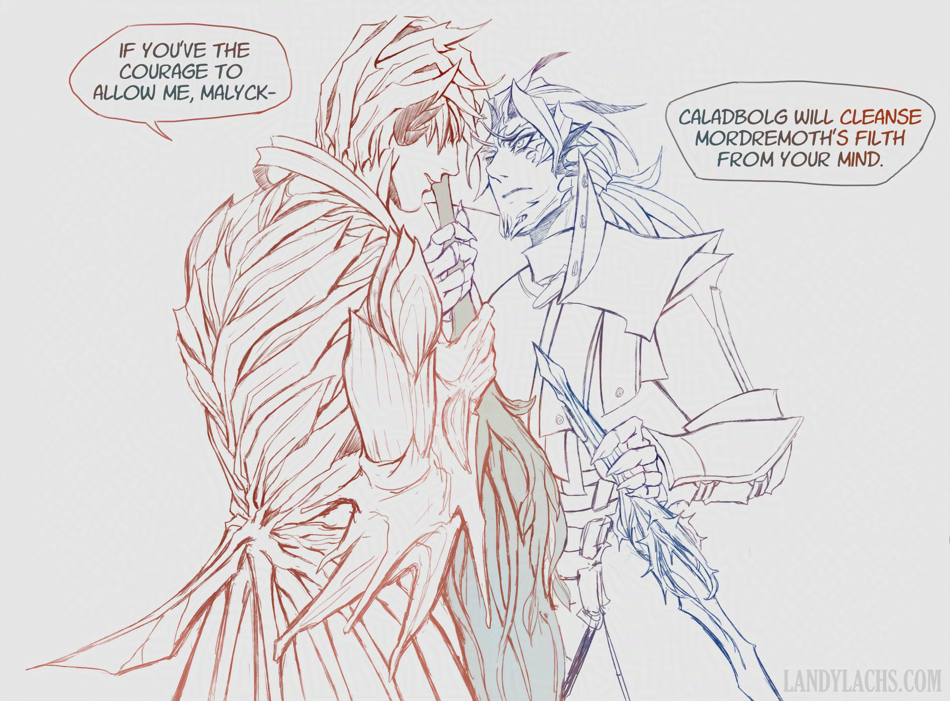
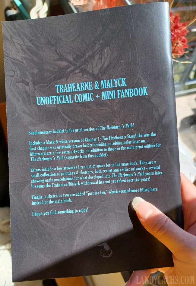
Updated typography | Ch2 Title Page | The Harbinger’s Path Link to live page here.
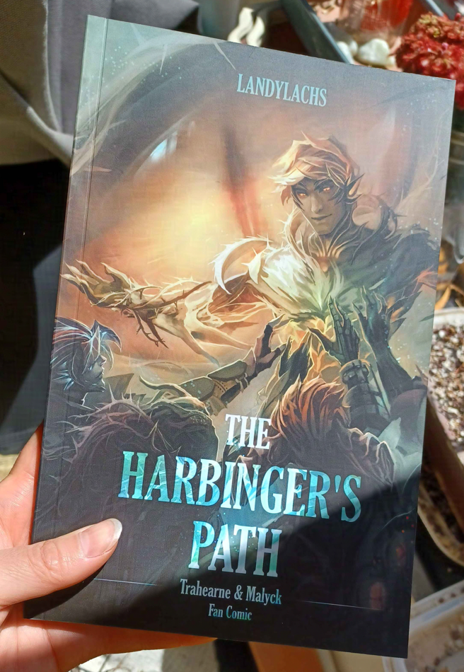
I’m here with an update about The Harbinger’s Pathprint book’s progress!
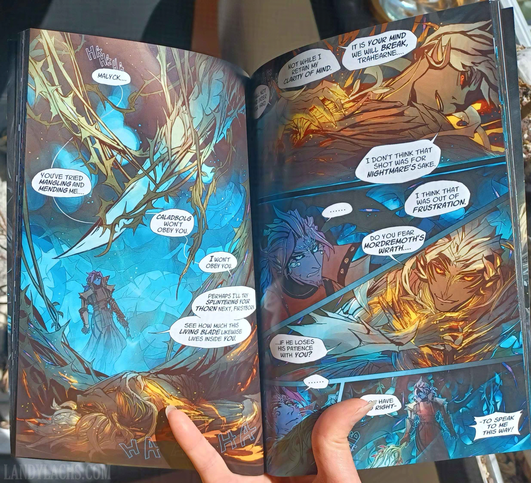
As of this writing, I have finished the first edit pass for all of Chapter 1, all of Chapter 2, and I am now up to pages 5-6 in Chapter 3. These edits include adjusting the pages to factor in margin, bleed, and trim, for when the pages are cut for printing. I have also retouched the art for certain pages along the way (one of them might even be live on the site!).
Book Dimensions and Page Count
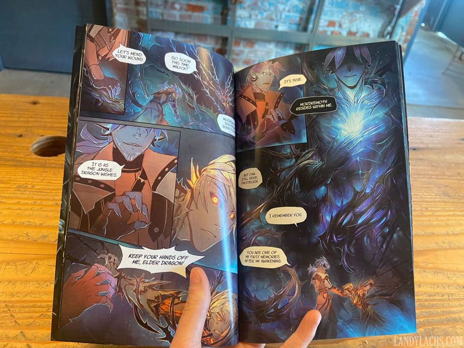
I can also share some of the physical attributes of the book. It will be 5.5 x 8.5 inches, which is slightly wider than A4Correction: A5.(I always mix these two up, forgive me.) This is a standard size for US printers – a size below the standard 6 x 9 in for many US comics. This made figuring out some of the cost logistics easier. The current page count, including the cover, front and back matter, and bonus material, is 84 pages. This version will also be perfect-bound (like a standard book/not like a magazine).
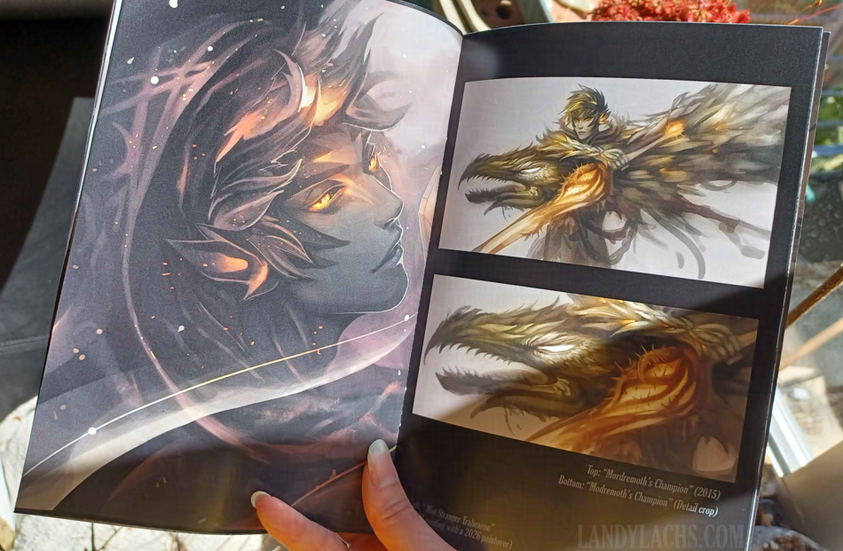
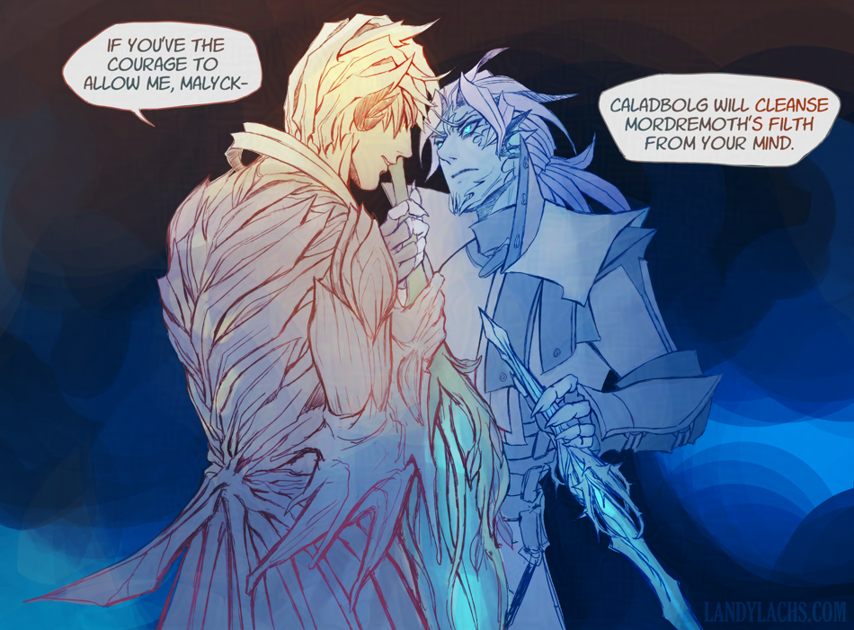
With the comic pages themselves adding up to 55 pages, this means the remaining pages are bonus material! This page count will likely change as I continue working on the book’s layout, but increasing the page count from the original ~60 to the current 84 had a negligible effect on cost (to my surprise and delight). And, it is giving me an excuse to refine and polish several illustrations of Trahearne and Malyck I’ve started over the years – some I’ve shown before, but a few I never have!
Typography Updates (Live)
In addition to the above book info, one of the updates I wanted to show are typography updates!
Below are comparisons of the updated versions with the previous typography, as I’ve updated the title pages for all 3 chapters on the live site now.
Left is the updated version, right is the previous version.
One of the changes that’s always been in the back of my mind was updating the typography for the chapter title pages. I don’t know why I didn’t think to try this before, but I tried out using the same font I used the the cover (“Gloucester MT Extra Condensed”), and I much prefer the look of this one compared to the previous version.
I remember I spent a good amount of time with the typography in the original, as I was never quite satisfied with it. I should have realized it was my choice of font face! Once I changed it to this Gloucester font, it fell into place quickly.
I’m fond of that previous edgelord font, but after trying it for 3 chapters, I’ve realized it isn’t the best fit for the tone I want to convey in this comic. I still love the font, but it’s better suited for a different project.
In addition to font changes in these comparisons, you might also notice the slight adjustments made to account for page trim and bleed.
Very luckily, it turns out the dimensions I used for the pages spread layout is the exact same ratio as 5.5 x 8.5 in. I am not sure how this happened, because this entire time, I was formatting the pages only with web in mind. I specifically remember originally starting with a 6 x 9 ratio, and then manually adjusting the dimensions to be taller, to fit better for web and mobile. I don’t recall specifically formatting the page dimensions for 5.5 x 8.5, but I either must have and it was so long ago I no longer recall, or this is an incredibly very fortunate coincidence.
If you’d like to know more about this print version of The Harbinger’s Path, click here or the banner below for January’s announcement post which has more info!