Print Progress + Typography Updates (The Harbinger’s Path) | February 19, 2026

Updated typography | Ch2 Title Page | The Harbinger’s Path
Link to live page here.

I’m here with an update about The Harbinger’s Path print book’s progress!  

As of this writing, I have finished the first edit pass for all of Chapter 1, all of Chapter 2, and I am now up to pages 5-6 in Chapter 3. These edits include adjusting the pages to factor in margin, bleed, and trim, for when the pages are cut for printing. I have also retouched the art for certain pages along the way (one of them might even be live on the site!). 

Book Dimensions and Page Count

I can also share some of the physical attributes of the book. It will be 5.5 x 8.5 inches, which is slightly wider than A4 Correction: A5. (I always mix these two up, forgive me.) This is a standard size for US printers – a size below the standard 6 x 9 in for many US comics. This made figuring out some of the cost logistics easier. The current page count, including the cover, front and back matter, and bonus material, is 84 pages. This version will also be perfect-bound (like a standard book/not like a magazine). 

With the comic pages themselves adding up to 55 pages, this means the remaining pages are bonus material! This page count will likely change as I continue working on the book’s layout, but increasing the page count from the original ~60 to the current 84 had a negligible effect on cost (to my surprise and delight). And, it is giving me an excuse to refine and polish several illustrations of Trahearne and Malyck I’ve started over the years – some I’ve shown before, but a few I never have! 

Typography Updates (Live)

In addition to the above book info, one of the updates I wanted to show are typography updates! 

Below are comparisons of the updated versions with the previous typography, as I’ve updated the title pages for all 3 chapters on the live site now. 

Link to live Chapter 1 title page here. 

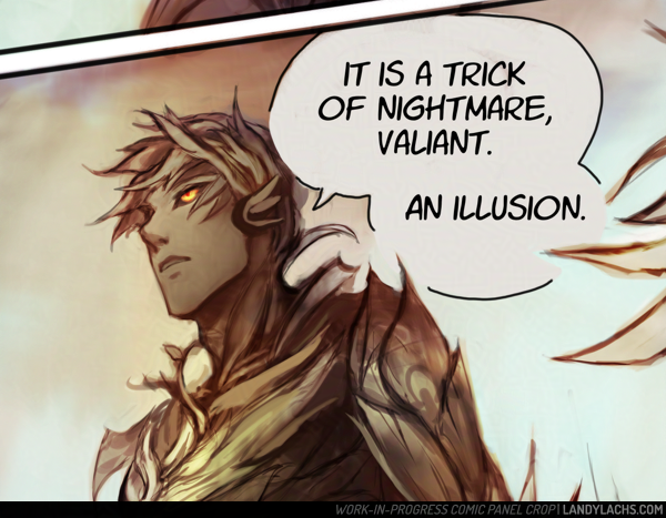
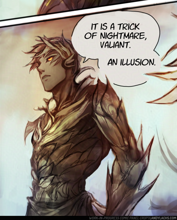
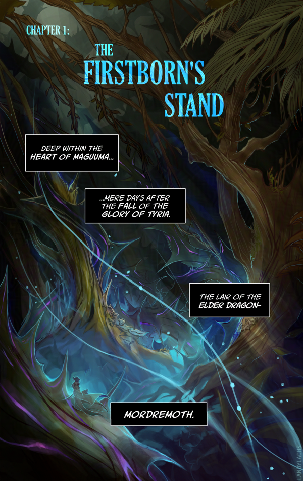
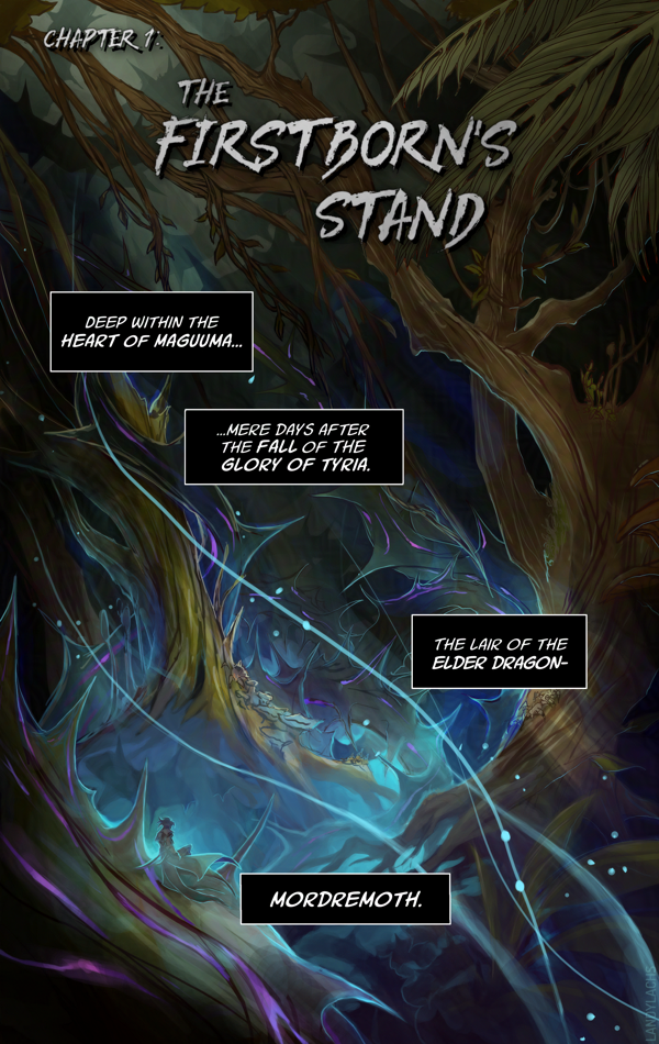
Left is the updated version, right is the previous version. 

One of the changes that’s always been in the back of my mind was updating the typography for the chapter title pages. I don’t know why I didn’t think to try this before, but I tried out using the same font I used the the cover (“Gloucester MT Extra Condensed”), and I much prefer the look of this one compared to the previous version. 

I remember I spent a good amount of time with the typography in the original, as I was never quite satisfied with it. I should have realized it was my choice of font face! Once I changed it to this Gloucester font, it fell into place quickly. 

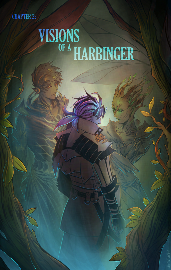
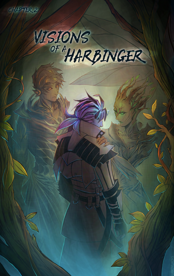
Link to live Chapter 2 title page here. 

I’m fond of that previous edgelord font, but after trying it for 3 chapters, I’ve realized it isn’t the best fit for the tone I want to convey in this comic. I still love the font, but it’s better suited for a different project. 

In addition to font changes in these comparisons, you might also notice the slight adjustments made to account for page trim and bleed. 

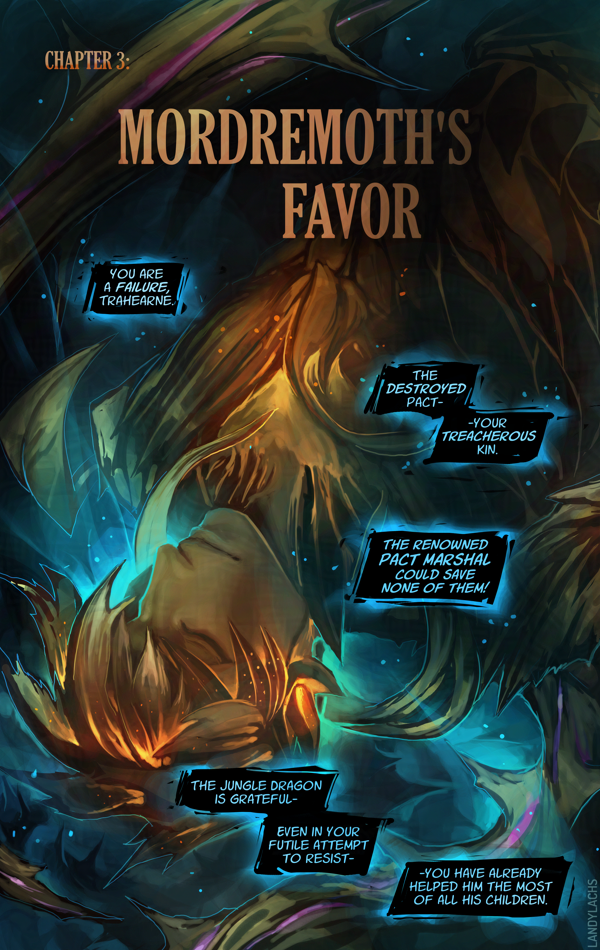
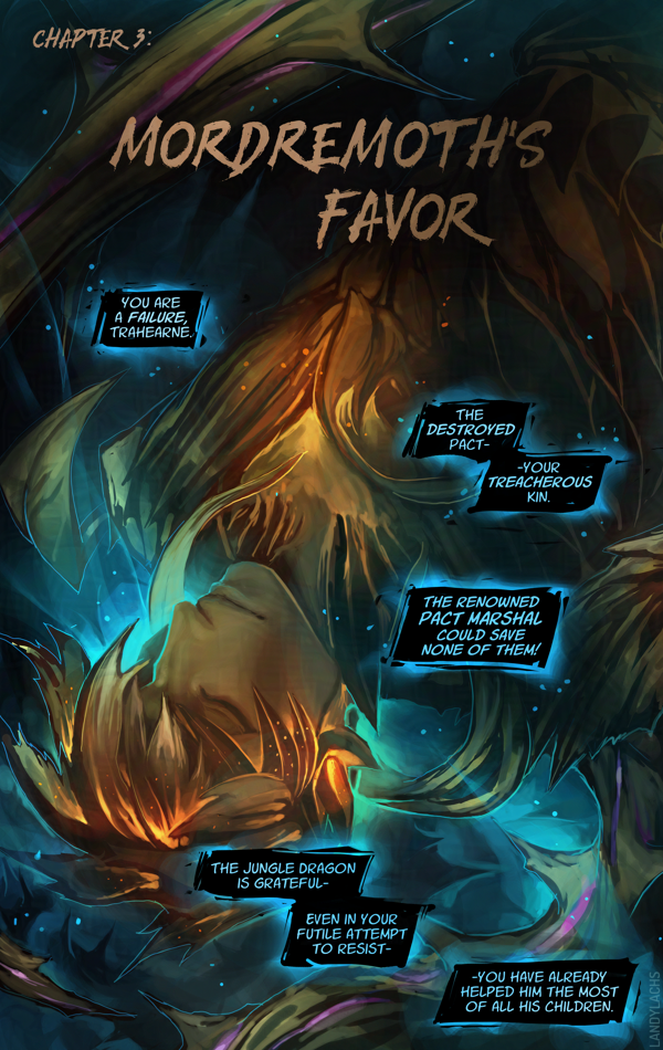
Link to live Chapter 3 title page here. 

Additional Notes

Very luckily, it turns out the dimensions I used for the pages spread layout is the exact same ratio as 5.5 x 8.5 in. I am not sure how this happened, because this entire time, I was formatting the pages only with web in mind. I specifically remember originally starting with a 6 x 9 ratio, and then manually adjusting the dimensions to be taller, to fit better for web and mobile. I don’t recall specifically formatting the page dimensions for 5.5 x 8.5, but I either must have and it was so long ago I no longer recall, or this is an incredibly very fortunate coincidence. 

If you’d like to know more about this print version of The Harbinger’s Path, click here or the banner below for January’s announcement post which has more info! 

Trahearne Detail Crop – The Harbinger’s Path, Ch1 | November 11, 2025

Detail crop showing Trahearne with a malevolent expression.
Detail crop from the final page of Chapter 1 from The Harbinger’s Path | Retouched Version

Detail crop of Trahearne from the finale page for Chapter 1 of The Harbinger’s Path. Always meant to post this at some point, and why not today! 

It’s curious for me looking at this again. At the time of this page’s completion, I was quite pleased with this portion of the page, in particular. Though they’re very loose, it was much more line-focused than I’d done before attempting chapter 1, and this panel was probably the most heavily line-focused drawing in the entire chapter. (And if it is not, it felt this way to me.) 

Before this chapter, I was never very happy with my line drawings – it’s why I almost always added color to drawings before showing them. I didn’t think they looked presentable on their own without some color or value to back up the lines. This drawing was the first one I made in years where I thought it turned out decent even without color or value – I didn’t have to shade this one as much as I normally would for the drawings I was doing at the time. 

Even so, as it tends to happen when doing a longer project like a comic, I can see the way I draw Trahearne now is a little different compared to how I was drawing him in Chapter 1. I’ve been aware that the style in the comic shifts a bit – mostly from chapter to chapter, but even within pages of the same chapter. Some if it is intentional experimentation (I’ve been drawing several expressions for Trahearne on page 15 this week, where he looks a little more “seinen” or older – and I might need to tone this down to not make him look too different from earlier pages), while other times it’s been a natural progression from how I’ve grown to enjoy drawing him. 

But there are a few different stylistic ways I like to draw him – mostly between a little more youthful or “bishounen” and slightly more mature or more “seinen,” let’s be honest, haha. I enjoy drawing him both ways, but I hope it doesn’t look too inconsistent in the comic. At least, not in a way that is distracting while reading. 

Oddly, I think I am more consistent when it comes to Malyck – but I haven’t done a full read-through of the entire comic from page 1 to the current page in a while. I might change my mind if I give that a go sometime. 

Edit: Ironically (or predictably?), right after making this post, it made me want to retouch this drawing. I’ve done so above (and to the live page) – the original will be below in the full post, preserved for comparison! 

Continue Reading

Page Thoughts – The Harbinger’s Path: Ch3, page 5 | October 13, 2025

Chapter 3, page 5 from "The Harbinger's Path" GW2 fan comic.
The Harbinger’s Path | Chapter 3, page 5

This post is adapted from what I originally wrote in the email update for Chapter 3, page 5 of The Harbinger’s Path. I ended up having more thoughts about this page than I expected, and wanted to jot them down somewhere that can be referenced more easily than email. 

I’ve also expanded it in some areas, since I feel less annoying doing that on my blog here – I try not to overly ramble in email updates. ;D 

“Headcanon” Background Info

This page has one of the clearest reminders this is a headcanon story. Malyck’s choice of using “Nightmare Commanders” is an intentional callback to the concept art Carlyn Lim did for three “Nightmare Court Commanders” during Heart of Thorns’ pre-launch development. (You can see her brilliant concept artworks for them here.)

In her concept art for these three, she labels each as:

“Nightmare Commander – Duel Wielder”
“Nightmare Court Commander – Executioner”
“Nightmare Court Commander – Seer”

These, of course, later became the Mordrem Guard Commanders in the expansion’s live release, and canon story. The characters of Blademaster Diarmid, Axemaster Hareth, and Stavemaster Adryn we all know and love.

“Nightmare Court Commanders” 

But how those original descriptions on Carlyn’s concepts stir the imagination! They conjure endless story possibilities. What potential narratives might a “Nightmare Court Commander” have been considered in, during those early Heart of Thorns writing sessions? 

What if Diarmid, Hareth, and Adryn had been part of the Nightmare Court – leaders, even! – instead of a faction entirely separate from it, as they are in the canon story?

What might they have been like, what might their stories have been? I haven’t even touched on what a “Nightmare Court Seer might have implied! Was Adryn possible some type of “Seer of Mordremoth” in his early incarnations? 

How would this have changed their relation to Mordremoth? To the Nightmare Court?

To Faolain? 

It is far too easy to pleasantly ruminate on this!

Page Layout Process

Chapter 3, page 5 is one of the earlier pages I drafted for The Harbinger’s Path. A version of this page has existed, in some form, as early as Chapter 1 of the comic. 

As such, to me, this page’s layout is not as strong as I think I could do now. I’ve hopefully learned some things since Chapter 1, page 1! If I were to do this page again now, I would do several things differently – but I decided to keep the page’s panel compositions relatively the same. For a few reasons – the main one being, when I began this comic, my aim was for this to be practice and a learning experience. It is very easy for me to end up not finishing what I start in my personal art. It is something I have to consciously choose not to do. It is why I have many “works-in-progress” – something I suspect many artists can relate to. 

Additionally, I’ve never managed to draw a “finished” a graphic novel page – not a single one – before starting The Harbinger’s Path. Much less an entire chapter! My initial aim with this project was to finish one, completed chapter. Just one. I did not know if I could do it.

Comic panel crop of Malyck from Guild Wars 2. Portrait crop. As he smirks toward Trahearne off-camera, text reads: "....Have you wondered-" "-why I remain in this form?"
The Harbinger’s Path | Chapter 3, page 5, panel crop

Chapter 3 Layouts

And here we now are on Chapter 3! Much to my amazement and surprise. I am not sure how that happened, but one of the things that helped me enormously was setting personal deadlines. This helps me to continually move forward, and not become too “stuck” on something. Such as continuously redoing an early page (which did happen to some of those pages in chapter 1 – especially earlier on). One of the things I had to practice was being okay with calling a page “finished,” even if it was not what I would consider truly “finished” – which became easier over time. The more pages I complete, the better I understand that comics, more than illustrations, are sums of the whole instead of their parts. Small quibbles on individual pages are not as substantial, if sequences of pages work coherently together – as an interconnected, narrative whole. 

This is an arguably convoluted way of explaining why I did not redo more of chapter 3, page 5’s layout. I could have either done this – which might have made this page stronger, even though it is (hopefully) currently in a presentable state – or I could have dedicated this time to furthering future pages in chapter 3, which were (at the time) not yet drafted. 

I ended up doing the latter, which is partially how chapter 3 gained a few more pages than I had initially planned. i think this time was worth it, and benefits the chapter and overall comic. And, on a personal level, I like seeing the progress of these earlier drafted pages, in comparison to the ones I drafted later – though I do question a bit whether this might be jarring to a reader, who hasn’t seen which pages were drafter more recently, versus earlier. 

Of course, you can be the judge when you see the rest of the chapter. ;D

“Nightmare’s Embrace” WIP Preview | July 25, 2025

Work-in-progress comic panel crop showing Trahearne speaking off-camera. Text reads: "It is a trick of Nightmare, Valiant. An illusion."
“Nightmare’s Embrace” | Work-in-progress panel crop

Small preview from “Nightmare’s Embrace,” my second Guild Wars 2 comic I’ve been chipping away at here and there. This is an early color test from a few months ago. 

Originally, I was planning to start working on “Nightmare’s Embrace” after I’ve finished “The Harbinger’s Path.” I might still do this, but I’m also thinking about perhaps working on them side-by-side – mainly depending on how long Harbinger runs. 

Maybe I’ll do something like, one chapter of The Harbinger’s Path, then one chapter of Nightmare’s Embrace. Still considering which to do. 

Shows more of the previous image, up to Trahearne's waist.
More from the previous panel.

Here’s a fuller shot of the panel – I need to fix the arm proportions in the final. 

The Harbinger’s Path: Ch2, page 2 Process | June 26, 2025

The sylvari Trahearne from Guild Wars 2 entangled in a nest of thorns. Text reading, "I must escape-" and "The Pact-" are written in speech balloons.
The Harbinger’s Path | Chapter 2, page 2, panel crop

This page went through a number of changes and deliberations while I worked on it, and I wanted to share some of the process and thoughts that went into it. 

First, some process steps below! The first 2 are fairly early on in the process, though further along than the “layout” step (which are barely above stick figures). This page’s ideation started with heavy silhouetting. When I initially drafted the layout for this page, Malyck was the only panel on it for a while. I went between leaving the rest of the page with negative space – either empty or filled with black – or with an establishing shot or something involving Trahearne to fill the space. 

My aim was that this part of the page should convey some time has passed since the final scene in Chapter 1. 

I wasn’t decided initially, and left the rest of the page blank and went on to do the rest of Chapter 2’s layouts. When I came back to this page later on, the idea to show Trahearne most appealed to me. It would work both to reorient ourselves with where our main character is now, as well as also serve as a bit of an establishing shot. My hope is this would also convey how the previous page is a memory – though whether by Trahearne, Malyck, or someone else, is left to interpretation. 

My other dilemma with this page involved Trahearne himself. It was important to me to convey his sense of desperation, but also his strength and resolve. The clawing vines are a visual representation of his capture, but I didn’t want to only represent his imprisonment – I want to represent his strength of will. The main question became, should I represent this visually, or through internal thoughts? 

To thought balloon or not to thought balloon

This is an interesting question. My understanding is, displaying internal thoughts for characters is a bit more archaic (at least in western comics). It was very commonplace in the old Stan Lee and Jack Kirby Marvel comics (which of the few I’ve read, I quite adore). I personally really loved the style of those old comics – including the thought balloons. I don’t know if that’s a controversial or unpopular opinion or not, among comic fans today (I am woefully out of the loop). My understanding is this has fallen out of favor with modern comics (at least, again, with more western ones). The preference being to represent character thoughts externally, through visuals, instead of through thought balloons. 

I admire this aspiration. There is incredible merit to it. My favorite webcomic, Unsounded by Ashley Cope (which has, incidentally, just launched the pre-campaign on Kickstarter for the Iron Circus Comics publication of volumes 1 & 2 – which you should very definitely consider checking out & giving the campaign a follow!), adheres to this methodology. I believe I read it in an interview Ashley gave many years ago (or it might have also been a reply to someone on Tumblr), where she explained more about her reasoning behind this. I’m going to paraphrase (forgive me), but the general sentiment I took away from it is that, if you forgo thought balloons, it very often results in much more visually interesting, impactful pages. 

For me, the easiest example to show are pages 16 and 17 from Unsounded’s first chapter. It makes more sense in-context if you read from the beginning of the chapter (which I highly recommend!), but even so, these pages are excellent examples about visually representing the internal turmoil within a character’s thoughts and mind, without any use of thought balloons. I love these pages because of how well the concept is executed here. From what I recall (and again, forgive me if I’m misremembering), Ashley is such a strong proponent of this, that I think she has mentioned before that she doesn’t use thought balloons anywhere in Unsounded – which currently sits at over 2,000+ pages in length! A mightily impressive feat, if you ask me. 

The final version for this page. We see a side-view of Trahearne at the top - his eyes obscured by the glowing leaves of his hair. Text reads: "How many days have passed?" He is encapsulated by vines, which lead the eye down the page, revealing a wider shot showing Trahearne bound in a nest of thorns. Text reads: "I must escape - the Pact-" The bottom panel shows Malyck in a reclined position, resting comfortably on one arm, Caladbolg carelessly held in his other hand. Text reads: "Mordremoth is impressed by your resolve - Pact Marshal."
Ch2, page 2 | Final version of the page

Now, all that said and all my praise for this methodology – why did I decide to use thought balloons, in the end? I also used them in The Harbinger’s Path’s first chapter, also for Trahearne. I’m sorry to say I don’t have a deep reasoning for my decision other than – despite both my awareness and admiration (and enjoyment!) for eschewing thought balloons – it’s a personal preference that I also highly enjoy them. If I had to guess, I think it may be because I grew up reading comics that used them a lot. I read mostly Japanese manga, which makes liberal use of thought balloons (at least, in the ones I read). I enjoy how it can make the character feel closer to the reader, or more intimate. It is true it’s an “easier” technique – it is far more ambitious to represent a character’s thoughts visually, and it is something I would like to attempt in the future. However, I do also think it is a more advanced way of making comics. 

So! With my comic project being a “pilot” project of sorts for helping me learn how to make comics in general – combined with how I personally love the intimacy thought balloons can add – I decided to make use of them in The Harbinger’s Path. Maybe this will change in future pages, but for now, I think this was the right choice for me, and for the pages so far.