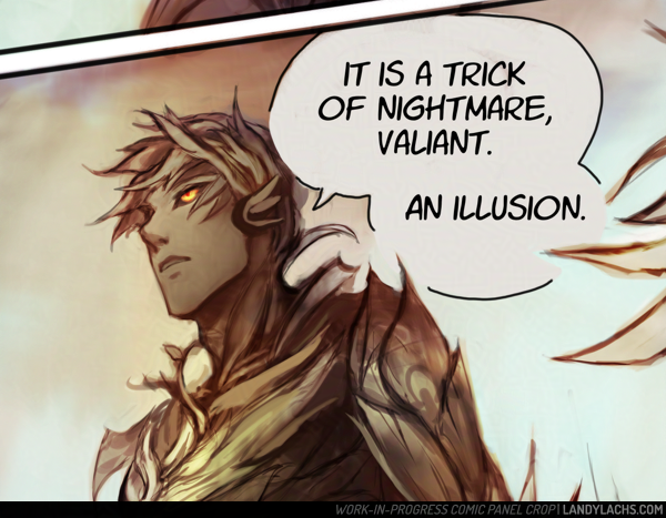
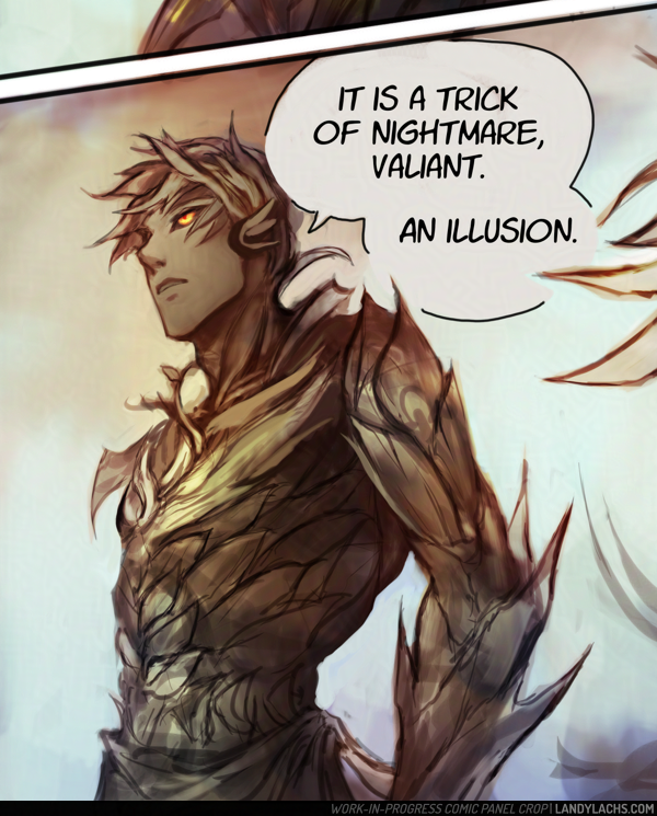
Detail crop from the final page of Chapter 1 from The Harbinger’s Path | Retouched Version
Detail crop of Trahearne from the finale page for Chapter 1 of The Harbinger’s Path. Always meant to post this at some point, and why not today!
It’s curious for me looking at this again. At the time of this page’s completion, I was quite pleased with this portion of the page, in particular. Though they’re very loose, it was much more line-focused than I’d done before attempting chapter 1, and this panel was probably the most heavily line-focused drawing in the entire chapter. (And if it is not, it felt this way to me.)
Before this chapter, I was never very happy with my line drawings – it’s why I almost always added color to drawings before showing them. I didn’t think they looked presentable on their own without some color or value to back up the lines. This drawing was the first one I made in years where I thought it turned out decent even without color or value – I didn’t have to shade this one as much as I normally would for the drawings I was doing at the time.
Even so, as it tends to happen when doing a longer project like a comic, I can see the way I draw Trahearne now is a little different compared to how I was drawing him in Chapter 1. I’ve been aware that the style in the comic shifts a bit – mostly from chapter to chapter, but even within pages of the same chapter. Some if it is intentional experimentation (I’ve been drawing several expressions for Trahearne on page 15 this week, where he looks a little more “seinen” or older – and I might need to tone this down to not make him look too different from earlier pages), while other times it’s been a natural progression from how I’ve grown to enjoy drawing him.
But there are a few different stylistic ways I like to draw him – mostly between a little more youthful or “bishounen” and slightly more mature or more “seinen,” let’s be honest, haha. I enjoy drawing him both ways, but I hope it doesn’t look too inconsistent in the comic. At least, not in a way that is distracting while reading.
Oddly, I think I am more consistent when it comes to Malyck – but I haven’t done a full read-through of the entire comic from page 1 to the current page in a while. I might change my mind if I give that a go sometime.
Edit: Ironically (or predictably?), right after making this post, it made me want to retouch this drawing. I’ve done so above (and to the live page) – the original will be below in the full post, preserved for comparison!
This post is adapted from what I originally wrote in the email update for Chapter 3, page 5 of The Harbinger’s Path. I ended up having more thoughts about this page than I expected, and wanted to jot them down somewhere that can be referenced more easily than email.
I’ve also expanded it in some areas, since I feel less annoying doing that on my blog here – I try not to overly ramble in email updates. ;D
“Headcanon” Background Info
This page has one of the clearest reminders this is a headcanon story. Malyck’s choice of using “Nightmare Commanders” is an intentional callback to the concept art Carlyn Lim did for three “Nightmare Court Commanders” during Heart of Thorns’ pre-launch development. (You can see her brilliant concept artworks for them here.)
In her concept art for these three, she labels each as:
But how those original descriptions on Carlyn’s concepts stir the imagination! They conjure endless story possibilities. What potential narratives might a “Nightmare Court Commander” have been considered in, during those early Heart of Thorns writing sessions?
What if Diarmid, Hareth, and Adryn had been part of the Nightmare Court – leaders, even! – instead of a faction entirely separate from it, as they are in the canon story?
What might they have been like, what might their stories have been? I haven’t even touched on what a “Nightmare Court Seer“ might have implied! Was Adryn possible some type of “Seer of Mordremoth” in his early incarnations?
How would this have changed their relation to Mordremoth? To the Nightmare Court?
To Faolain?
It is far too easy to pleasantly ruminate on this!
Page Layout Process
Chapter 3, page 5 is one of the earlier pages I drafted for The Harbinger’s Path. A version of this page has existed, in some form, as early as Chapter 1 of the comic.
As such, to me, this page’s layout is not as strong as I think I could do now. I’ve hopefully learned some things since Chapter 1, page 1! If I were to do this page again now, I would do several things differently – but I decided to keep the page’s panel compositions relatively the same. For a few reasons – the main one being, when I began this comic, my aim was for this to be practice and a learning experience. It is very easy for me to end up not finishing what I start in my personal art. It is something I have to consciously choose not to do. It is why I have many “works-in-progress” – something I suspect many artists can relate to.
Additionally, I’ve never managed to draw a “finished” a graphic novel page – not a single one – before starting The Harbinger’s Path. Much less an entire chapter! My initial aim with this project was to finish one, completed chapter. Just one. I did not know if I could do it.
The Harbinger’s Path | Chapter 3, page 5, panel crop
Chapter 3 Layouts
And here we now are on Chapter 3! Much to my amazement and surprise. I am not sure how that happened, but one of the things that helped me enormously was setting personal deadlines. This helps me to continually move forward, and not become too “stuck” on something. Such as continuously redoing an early page (which did happen to some of those pages in chapter 1 – especially earlier on). One of the things I had to practice was being okay with calling a page “finished,” even if it was not what I would consider truly “finished” – which became easier over time. The more pages I complete, the better I understand that comics, more than illustrations, are sums of the whole instead of their parts. Small quibbles on individual pages are not as substantial, if sequences of pages work coherently together – as an interconnected, narrative whole.
This is an arguably convoluted way of explaining why I did not redo more of chapter 3, page 5’s layout. I could have either done this – which might have made this page stronger, even though it is (hopefully) currently in a presentable state – or I could have dedicated this time to furthering future pages in chapter 3, which were (at the time) not yet drafted.
I ended up doing the latter, which is partially how chapter 3 gained a few more pages than I had initially planned. i think this time was worth it, and benefits the chapter and overall comic. And, on a personal level, I like seeing the progress of these earlier drafted pages, in comparison to the ones I drafted later – though I do question a bit whether this might be jarring to a reader, who hasn’t seen which pages were drafter more recently, versus earlier.
Of course, you can be the judge when you see the rest of the chapter. ;D
Small preview from “Nightmare’s Embrace,” my second Guild Wars 2 comic I’ve been chipping away at here and there. This is an early color test from a few months ago.
Originally, I was planning to start working on “Nightmare’s Embrace” after I’ve finished “The Harbinger’s Path.” I might still do this, but I’m also thinking about perhaps working on them side-by-side – mainly depending on how long Harbinger runs.
Maybe I’ll do something like, one chapter of The Harbinger’s Path, then one chapter of Nightmare’s Embrace. Still considering which to do.
More from the previous panel.
Here’s a fuller shot of the panel – I need to fix the arm proportions in the final.
The Harbinger’s Path | Chapter 2, page 2, panel crop
This page went through a number of changes and deliberations while I worked on it, and I wanted to share some of the process and thoughts that went into it.
First, some process steps below! The first 2 are fairly early on in the process, though further along than the “layout” step (which are barely above stick figures). This page’s ideation started with heavy silhouetting. When I initially drafted the layout for this page, Malyck was the only panel on it for a while. I went between leaving the rest of the page with negative space – either empty or filled with black – or with an establishing shot or something involving Trahearne to fill the space.
Ch2, page 2 | Early draft
Ch2, page 2 | Starting to refine the draft
My aim was that this part of the page should convey some time has passed since the final scene in Chapter 1.
I wasn’t decided initially, and left the rest of the page blank and went on to do the rest of Chapter 2’s layouts. When I came back to this page later on, the idea to show Trahearne most appealed to me. It would work both to reorient ourselves with where our main character is now, as well as also serve as a bit of an establishing shot. My hope is this would also convey how the previous page is a memory – though whether by Trahearne, Malyck, or someone else, is left to interpretation.
My other dilemma with this page involved Trahearne himself. It was important to me to convey his sense of desperation, but also his strength and resolve. The clawing vines are a visual representation of his capture, but I didn’t want to only represent his imprisonment – I want to represent his strength of will. The main question became, should I represent this visually, or through internal thoughts?
Ch2, page 2 | Test colors (didn’t like this initial test)
Ch2, page 2 | Color scheme chosen – the cooler tones were a better fit.
To thought balloon or not to thought balloon
This is an interesting question. My understanding is, displaying internal thoughts for characters is a bit more archaic (at least in western comics). It was very commonplace in the old Stan Lee and Jack Kirby Marvel comics (which of the few I’ve read, I quite adore). I personally really loved the style of those old comics – including the thought balloons. I don’t know if that’s a controversial or unpopular opinion or not, among comic fans today (I am woefully out of the loop). My understanding is this has fallen out of favor with modern comics (at least, again, with more western ones). The preference being to represent character thoughts externally, through visuals, instead of through thought balloons.
I admire this aspiration. There is incredible merit to it. My favorite webcomic, Unsounded by Ashley Cope (which has, incidentally, just launched the pre-campaign on Kickstarter for the Iron Circus Comics publication of volumes 1 & 2 – which you should very definitely consider checking out & giving the campaign a follow!), adheres to this methodology. I believe I read it in an interview Ashley gave many years ago (or it might have also been a reply to someone on Tumblr), where she explained more about her reasoning behind this. I’m going to paraphrase (forgive me), but the general sentiment I took away from it is that, if you forgo thought balloons, it very often results in much more visually interesting, impactful pages.
For me, the easiest example to show are pages 16 and 17 from Unsounded’s first chapter. It makes more sense in-context if you read from the beginning of the chapter (which I highly recommend!), but even so, these pages are excellent examples about visually representing the internal turmoil within a character’s thoughts and mind, without any use of thought balloons. I love these pages because of how well the concept is executed here. From what I recall (and again, forgive me if I’m misremembering), Ashley is such a strong proponent of this, that I think she has mentioned before that she doesn’t use thought balloons anywhere in Unsounded – which currently sits at over 2,000+ pages in length! A mightily impressive feat, if you ask me.
Ch2, page 2 | Final version of the page
Now, all that said and all my praise for this methodology – why did I decide to use thought balloons, in the end? I also used them in The Harbinger’s Path’s first chapter, also for Trahearne. I’m sorry to say I don’t have a deep reasoning for my decision other than – despite both my awareness and admiration (and enjoyment!) for eschewing thought balloons – it’s a personal preference that I also highly enjoy them. If I had to guess, I think it may be because I grew up reading comics that used them a lot. I read mostly Japanese manga, which makes liberal use of thought balloons (at least, in the ones I read). I enjoy how it can make the character feel closer to the reader, or more intimate. It is true it’s an “easier” technique – it is far more ambitious to represent a character’s thoughts visually, and it is something I would like to attempt in the future. However, I do also think it is a more advanced way of making comics.
So! With my comic project being a “pilot” project of sorts for helping me learn how to make comics in general – combined with how I personally love the intimacy thought balloons can add – I decided to make use of them in The Harbinger’s Path. Maybe this will change in future pages, but for now, I think this was the right choice for me, and for the pages so far.
This was the first page I finished for chapter 2. I finished it a while ago, and have been working on finalizing the rest of chapter 2’s pages since. Because of this (as I should have foresaw) – when I saw the page yesterday, I saw several things I wanted to adjust.
The main things I wanted to change were the colors, values, and contrast – because when I was previewing the page with the final page from chapter 1 yesterday, I thought the color schemes clashed. I suspect the original version might be more pleasant “illustratively,” but I’m fairly certain the revised version flows better visually when these pages are read sequentially.
I’ll post both versions below to compare:
Chapter 2, page 1: Current version.
Chapter 2, page 1: Original version.
If the images look similar, try clicking one and flipping between them a few times – this should make the differences more apparent.
As with the first chapter, I’ll also note down the updates here at the tail end of this post – primarily for myself, as it’s helpful for me to see the sorts of updates I need to plan for when handling the logistics of this type of project. It’s also kind of fun to keep a record to look back on down the line. As well, with how fast-paced (and outlandish) things are nowadays, time has a way of slipping by so quickly. If I don’t note down what I did at the time, the memories of what I was even doing at the time are so easy to pass by, or even forgotten. Pages like this post and the physical notebook are ways to help slow me down, and keep track of how much or how little I’ve been able to do – because when I don’t, it often feels like I’m doing very little,. Or that the amount I’m doing is moving along at this glacial pace. Which is still arguable, but at least when I keep track of it, it helps remind me of the small victories. Like posting this page today. :D
Further Thoughts
Adding a few more thoughts I wanted to note down here later in the day – I think I need to preview how pages look on the website earlier than when I’m ready to post them. Even though I can browse through the pages in my files, flipping through them on the website feels different.
Maybe it will only be for this chapter page – because I hadn’t yet tried paging through Chapter 1’s final page and then to Chapter 2’s first page. In retrospect, this was silly not to do. It made me immediately see a number of things I wasn’t satisfied with in the original version, and know what to change to add cohesion.
As well, I’m doing this with page 2 for Ch2 now – and it helps a lot seeing how it reads when flipping from page 1 to page 2. Maybe this is one downside to working on the pages as spreads – it doesn’t give me that “webcomic” page-by-page experience. Which is important to me that it flows properly, since it’s the primary way (I hope) the comic will be viewed.
Comic & Site Updates Log (Ch2)
June 23, 2025
Chapter 2, page 1 posted.
Slight UI adjustments:
Added a “Latest Updates” anchor link to the page index.
Added additional navigation to chapter 2’s pages.
Reduced the footer font size for all comic pages to be less obtrusive on mobile.
June 25, 2025
Chapter 2, page 2 posted.
June 30, 2025
Chapter 2, page 3 posted.
Adjusted the updates portion of the Harbinger index page layout to improve readability.
Headers are now aligned to the left, instead of centered.
Added “Latest Update” and “Previous Updates” sections.
Moved the “page updates posted on…” section to below the most recent update, instead of at the bottom of the page. This is for improved visibility on mobile. I might move it back down during shorter updates – it was mainly looking a bit messy and confusing having it all the way at the bottom, above the art gallery.
Add-on Updates: June 30, 2025
Slightly updated the art for page 3 (small touch-ups).
Page index UI update:
The “page updates posted on…” section now only shows on mobile! This was my preference as the desktop version has the links on the sidebar – which disappears on mobile, along with those links. Really glad this cleans up the desktop layout, while keeping the functionality on mobile. :) Hopefully I will not forget the links are there on mobile, since I still mainly use the site on desktop (phones are not ergonomic! I don’t understand how people can use them for so long comfortably).
July 7, 2025
Slight updates to the Harbinger index page layout to improve readability.
July 9, 2025
Slight updates to page 6’s art – touched up Malyck’s arm pose to be more correct.