2025 paintover of a 2021 painting | Work-in-progress
I’ve had this drawing of Arquel around for several years, that I first did during one of the days for “Paint-ober” in 2021. This was a daily painting challenge I made up for myself during October of that year (if it existed prior, I don’t think I saw anyone participating that year). I was inspired to try this challenge by the ubiquitous “Inktober” which used to be in vogue years back. Ironically, I decided to do my own, non-ink challenge at the time, because I didn’t have interest in doing line or “ink” drawings back then. Oh, how making comic pages has transformed me! Haha.
I’ll always adore painting, of course – it’s still what I am more comfortable with. Anyway, I always liked the concept behind this Paint-ober Arquel painting – I mainly thought the color palette turned out in a pleasing way. I intended to finish the painting after the month-long challenge, and I did fuss around with it here and there, afterward.
Below are the original and an earlier version:
2023 paintover – this is how the file looked when I opened it today
Original 2021 painting
My dilemma with this painting is it always felt like it was “almost there” to me, but never “there.” I felt that with the original drawing, and also with the 2023 version (this version is how the file looked when I opened it today). This caused me to set this painting aside for long stretches of time, and dabble with it infrequently – with years-long stretches, apparently!
I had the random urge to revisit it again today – from the filename, for the first time since 2023. And now, there’s the current 2025 version, at the top of this post.
I still don’t think it is “quite there,” but each time, I think it’s veering closer. These paintovers are fun for me, though rather self-indulgent, as it would probably make better sense for me to start a new painting of the same idea, at this point. But, I am enjoying fiddling with this painting now and again, because I enjoy seeing what I would do differently each time, compared to the last time I opened the painting. The 2023 version I started approaching faces differently – slightly more defined forms and shadows – which I think is further developed in the 2025 version today. Today’s version also had much higher contrast compared to how it looks now – I might update this post with that version to compare.
And here it is:
2025 paintover, earlier version with higher contrast
There are some things I think might work better in this version, but I’m leaning toward exploring more of the subtler, more atmospheric tone of the one at the top of the post.
Wider crop showing the hat-wearing six-eyed bird, who I think is a crow, though I’m not 100% certain.
Original post below:
Jinu WIP
Jinu sketch
Painting WIP of “Jinu” I may or may not finish. Friends convinced me to watch Kpop Demon Hunters over the weekend, and I didn’t expect to enjoy it as much as I did. Beautiful artistry and quite a wholesome flick. Jinu was my favorite character, and so I shouldn’t have been surprised by what became of him by the end of the movie, haha.
These are 100% zoom crops from a full-body painting, but if I finish it, I’ll probably keep it cropped (though a wider one than this), because this began as an unplanned sketch, and I’m not the biggest fan of the full composition .
Between Trahearne and Jinu, I seem to be partial to amber eyes, haha! Corveil as well, to some extent, though I imagine his eyes being tinted a bit more toward a darker orange than Trahearne’s or Jinu’s (and, I have been recently contemplating changing them).
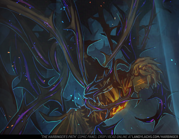
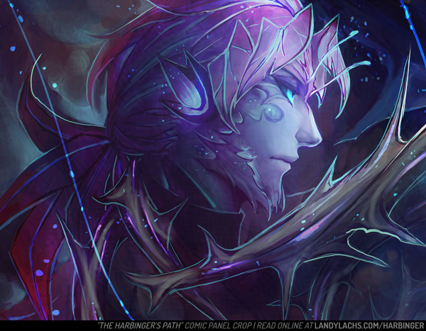
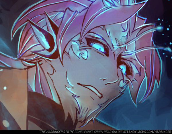
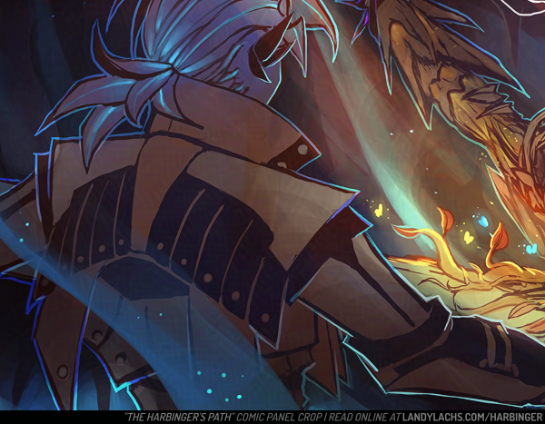
The Harbinger’s Path | Chapter 2, page 2, panel crop
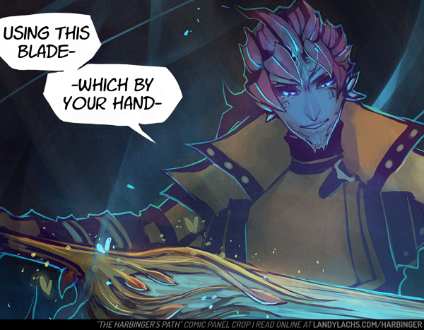
I think I’ll make this post for any page previews I don’t end up making a separate post for – starting with this preview crop from chapter 2, page 3. Will add to this post as needed!
The Harbinger’s Path | Chapter 2, page 3, panel crop
The Harbinger’s Path | Chapter 2, page 2, panel crop
This page went through a number of changes and deliberations while I worked on it, and I wanted to share some of the process and thoughts that went into it.
First, some process steps below! The first 2 are fairly early on in the process, though further along than the “layout” step (which are barely above stick figures). This page’s ideation started with heavy silhouetting. When I initially drafted the layout for this page, Malyck was the only panel on it for a while. I went between leaving the rest of the page with negative space – either empty or filled with black – or with an establishing shot or something involving Trahearne to fill the space.
Ch2, page 2 | Early draft
Ch2, page 2 | Starting to refine the draft
My aim was that this part of the page should convey some time has passed since the final scene in Chapter 1.
I wasn’t decided initially, and left the rest of the page blank and went on to do the rest of Chapter 2’s layouts. When I came back to this page later on, the idea to show Trahearne most appealed to me. It would work both to reorient ourselves with where our main character is now, as well as also serve as a bit of an establishing shot. My hope is this would also convey how the previous page is a memory – though whether by Trahearne, Malyck, or someone else, is left to interpretation.
My other dilemma with this page involved Trahearne himself. It was important to me to convey his sense of desperation, but also his strength and resolve. The clawing vines are a visual representation of his capture, but I didn’t want to only represent his imprisonment – I want to represent his strength of will. The main question became, should I represent this visually, or through internal thoughts?
Ch2, page 2 | Test colors (didn’t like this initial test)
Ch2, page 2 | Color scheme chosen – the cooler tones were a better fit.
To thought balloon or not to thought balloon
This is an interesting question. My understanding is, displaying internal thoughts for characters is a bit more archaic (at least in western comics). It was very commonplace in the old Stan Lee and Jack Kirby Marvel comics (which of the few I’ve read, I quite adore). I personally really loved the style of those old comics – including the thought balloons. I don’t know if that’s a controversial or unpopular opinion or not, among comic fans today (I am woefully out of the loop). My understanding is this has fallen out of favor with modern comics (at least, again, with more western ones). The preference being to represent character thoughts externally, through visuals, instead of through thought balloons.
I admire this aspiration. There is incredible merit to it. My favorite webcomic, Unsounded by Ashley Cope (which has, incidentally, just launched the pre-campaign on Kickstarter for the Iron Circus Comics publication of volumes 1 & 2 – which you should very definitely consider checking out & giving the campaign a follow!), adheres to this methodology. I believe I read it in an interview Ashley gave many years ago (or it might have also been a reply to someone on Tumblr), where she explained more about her reasoning behind this. I’m going to paraphrase (forgive me), but the general sentiment I took away from it is that, if you forgo thought balloons, it very often results in much more visually interesting, impactful pages.
For me, the easiest example to show are pages 16 and 17 from Unsounded’s first chapter. It makes more sense in-context if you read from the beginning of the chapter (which I highly recommend!), but even so, these pages are excellent examples about visually representing the internal turmoil within a character’s thoughts and mind, without any use of thought balloons. I love these pages because of how well the concept is executed here. From what I recall (and again, forgive me if I’m misremembering), Ashley is such a strong proponent of this, that I think she has mentioned before that she doesn’t use thought balloons anywhere in Unsounded – which currently sits at over 2,000+ pages in length! A mightily impressive feat, if you ask me.
Ch2, page 2 | Final version of the page
Now, all that said and all my praise for this methodology – why did I decide to use thought balloons, in the end? I also used them in The Harbinger’s Path’s first chapter, also for Trahearne. I’m sorry to say I don’t have a deep reasoning for my decision other than – despite both my awareness and admiration (and enjoyment!) for eschewing thought balloons – it’s a personal preference that I also highly enjoy them. If I had to guess, I think it may be because I grew up reading comics that used them a lot. I read mostly Japanese manga, which makes liberal use of thought balloons (at least, in the ones I read). I enjoy how it can make the character feel closer to the reader, or more intimate. It is true it’s an “easier” technique – it is far more ambitious to represent a character’s thoughts visually, and it is something I would like to attempt in the future. However, I do also think it is a more advanced way of making comics.
So! With my comic project being a “pilot” project of sorts for helping me learn how to make comics in general – combined with how I personally love the intimacy thought balloons can add – I decided to make use of them in The Harbinger’s Path. Maybe this will change in future pages, but for now, I think this was the right choice for me, and for the pages so far.
This was the first page I finished for chapter 2. I finished it a while ago, and have been working on finalizing the rest of chapter 2’s pages since. Because of this (as I should have foresaw) – when I saw the page yesterday, I saw several things I wanted to adjust.
The main things I wanted to change were the colors, values, and contrast – because when I was previewing the page with the final page from chapter 1 yesterday, I thought the color schemes clashed. I suspect the original version might be more pleasant “illustratively,” but I’m fairly certain the revised version flows better visually when these pages are read sequentially.
I’ll post both versions below to compare:
Chapter 2, page 1: Current version.
Chapter 2, page 1: Original version.
If the images look similar, try clicking one and flipping between them a few times – this should make the differences more apparent.
As with the first chapter, I’ll also note down the updates here at the tail end of this post – primarily for myself, as it’s helpful for me to see the sorts of updates I need to plan for when handling the logistics of this type of project. It’s also kind of fun to keep a record to look back on down the line. As well, with how fast-paced (and outlandish) things are nowadays, time has a way of slipping by so quickly. If I don’t note down what I did at the time, the memories of what I was even doing at the time are so easy to pass by, or even forgotten. Pages like this post and the physical notebook are ways to help slow me down, and keep track of how much or how little I’ve been able to do – because when I don’t, it often feels like I’m doing very little,. Or that the amount I’m doing is moving along at this glacial pace. Which is still arguable, but at least when I keep track of it, it helps remind me of the small victories. Like posting this page today. :D
Further Thoughts
Adding a few more thoughts I wanted to note down here later in the day – I think I need to preview how pages look on the website earlier than when I’m ready to post them. Even though I can browse through the pages in my files, flipping through them on the website feels different.
Maybe it will only be for this chapter page – because I hadn’t yet tried paging through Chapter 1’s final page and then to Chapter 2’s first page. In retrospect, this was silly not to do. It made me immediately see a number of things I wasn’t satisfied with in the original version, and know what to change to add cohesion.
As well, I’m doing this with page 2 for Ch2 now – and it helps a lot seeing how it reads when flipping from page 1 to page 2. Maybe this is one downside to working on the pages as spreads – it doesn’t give me that “webcomic” page-by-page experience. Which is important to me that it flows properly, since it’s the primary way (I hope) the comic will be viewed.
Comic & Site Updates Log (Ch2)
June 23, 2025
Chapter 2, page 1 posted.
Slight UI adjustments:
Added a “Latest Updates” anchor link to the page index.
Added additional navigation to chapter 2’s pages.
Reduced the footer font size for all comic pages to be less obtrusive on mobile.
June 25, 2025
Chapter 2, page 2 posted.
June 30, 2025
Chapter 2, page 3 posted.
Adjusted the updates portion of the Harbinger index page layout to improve readability.
Headers are now aligned to the left, instead of centered.
Added “Latest Update” and “Previous Updates” sections.
Moved the “page updates posted on…” section to below the most recent update, instead of at the bottom of the page. This is for improved visibility on mobile. I might move it back down during shorter updates – it was mainly looking a bit messy and confusing having it all the way at the bottom, above the art gallery.
Add-on Updates: June 30, 2025
Slightly updated the art for page 3 (small touch-ups).
Page index UI update:
The “page updates posted on…” section now only shows on mobile! This was my preference as the desktop version has the links on the sidebar – which disappears on mobile, along with those links. Really glad this cleans up the desktop layout, while keeping the functionality on mobile. :) Hopefully I will not forget the links are there on mobile, since I still mainly use the site on desktop (phones are not ergonomic! I don’t understand how people can use them for so long comfortably).
July 7, 2025
Slight updates to the Harbinger index page layout to improve readability.
July 9, 2025
Slight updates to page 6’s art – touched up Malyck’s arm pose to be more correct.