Commission for Skylark finished for this past Valentine’s Day, as a surprise gift for their partner! Above is the mesmer virtuoso, “Tarcisio Chiavetta,” who is Damedarosa’s character! (Names mentioned here with permission.)
Above and below are detail crops.
Process sheets below!
Sketch 01: Initial sketch ideas.
For this piece, we began with a general range for the budget. I was given a fair bit of artistic freedom, and I offered to draw a series of thumbnail during the initial sketches, across a range of complexities within their budget. This way, the client could choose the idea which both appealed to them most, and matched their desired budget. The original sheet lists quotes underneath each thumbnail idea, which I’ve omitted here for the client’s privacy.
Sketch 02: Revised sketch, pose block-out
First-round revision after the sketch idea was chosen.
Sketch 03: Revised sketch, background block-out
Here is blocking out the background more before the painting stage began.
And here is the finished piece once more! This illustration has two versions – a “mesmeric magic” version at the top of the post, and this version above which places the focus more on Tarcisco’s figure.
Thanks so much again to Skylark for this commission!
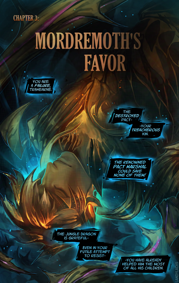
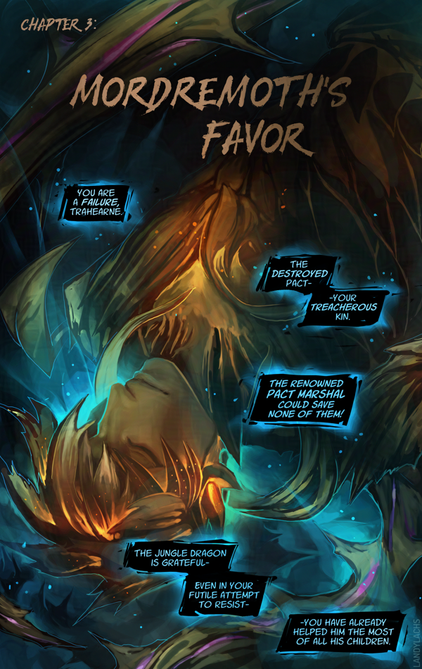
Updated typography | Ch2 Title Page | The Harbinger’s Path Link to live page here.
I’m here with an update about The Harbinger’s Pathprint book’s progress!
As of this writing, I have finished the first edit pass for all of Chapter 1, all of Chapter 2, and I am now up to pages 5-6 in Chapter 3. These edits include adjusting the pages to factor in margin, bleed, and trim, for when the pages are cut for printing. I have also retouched the art for certain pages along the way (one of them might even be live on the site!).
Book Dimensions and Page Count
I can also share some of the physical attributes of the book. It will be 5.5 x 8.5 inches, which is slightly wider than A4Correction: A5.(I always mix these two up, forgive me.) This is a standard size for US printers – a size below the standard 6 x 9 in for many US comics. This made figuring out some of the cost logistics easier. The current page count, including the cover, front and back matter, and bonus material, is 84 pages. This version will also be perfect-bound (like a standard book/not like a magazine).
With the comic pages themselves adding up to 55 pages, this means the remaining pages are bonus material! This page count will likely change as I continue working on the book’s layout, but increasing the page count from the original ~60 to the current 84 had a negligible effect on cost (to my surprise and delight). And, it is giving me an excuse to refine and polish several illustrations of Trahearne and Malyck I’ve started over the years – some I’ve shown before, but a few I never have!
Typography Updates (Live)
In addition to the above book info, one of the updates I wanted to show are typography updates!
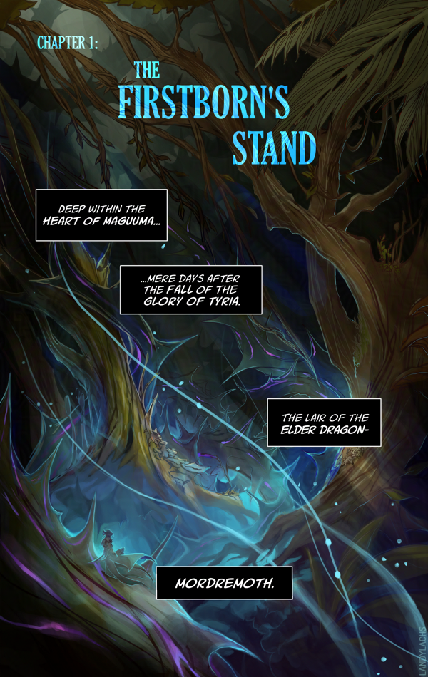
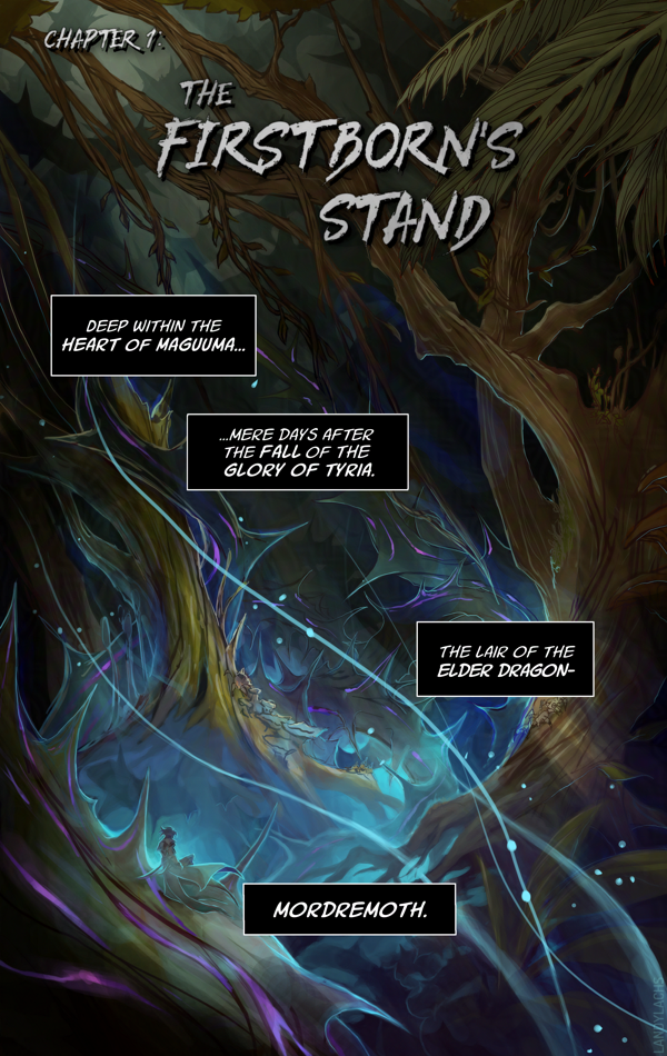
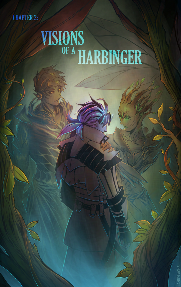
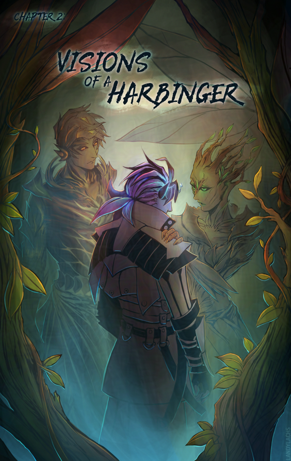
Below are comparisons of the updated versions with the previous typography, as I’ve updated the title pages for all 3 chapters on the live site now.
Left is the updated version, right is the previous version.
One of the changes that’s always been in the back of my mind was updating the typography for the chapter title pages. I don’t know why I didn’t think to try this before, but I tried out using the same font I used the the cover (“Gloucester MT Extra Condensed”), and I much prefer the look of this one compared to the previous version.
I remember I spent a good amount of time with the typography in the original, as I was never quite satisfied with it. I should have realized it was my choice of font face! Once I changed it to this Gloucester font, it fell into place quickly.
I’m fond of that previous edgelord font, but after trying it for 3 chapters, I’ve realized it isn’t the best fit for the tone I want to convey in this comic. I still love the font, but it’s better suited for a different project.
In addition to font changes in these comparisons, you might also notice the slight adjustments made to account for page trim and bleed.
Very luckily, it turns out the dimensions I used for the pages spread layout is the exact same ratio as 5.5 x 8.5 in. I am not sure how this happened, because this entire time, I was formatting the pages only with web in mind. I specifically remember originally starting with a 6 x 9 ratio, and then manually adjusting the dimensions to be taller, to fit better for web and mobile. I don’t recall specifically formatting the page dimensions for 5.5 x 8.5, but I either must have and it was so long ago I no longer recall, or this is an incredibly very fortunate coincidence.
If you’d like to know more about this print version of The Harbinger’s Path, click here or the banner below for January’s announcement post which has more info!
Spent some hours last night seeing how much I could add to this small animation practice!
I did the early draft for this one at the end of January. I had a vague notion of potentially finishing it for Valentine’s Day for fun, but before I knew it, the day was upon us! Yesterday became practice to see how much I could add, or how presentable I could make it, by today.
The version all the way at the end of this post is how the file looked when I opened it yesterday. I wasn’t sure whether I’d add color – I could have spent much more time on the lines – but I learned a lot in this one from how I added the color this time.
Lines only.
I have to confess I’ve always not understood cell-shading well. But I am quickly growing an appreciation for it after trying it out here.
Early “keyframe” draft.
One thing I noticed recently is there’s a “messy” stage when going from the early “keyframe” draft to adding the in-between “breakdown” frames (below). It’s a bit counterintuitive for me, because when adding the breakdown frames, it almost looks like the animation is reversing its progress – at the same time, I can start to see more of how the final motion might look. And seeing that potential is what makes adding these breakdown frames so invigorating to draw!
Version when I opened the file yesterday, where I had started adding the “breakdown” frames.
I was reminded of the forum avatar projects I was part of back when I was an ArenaNet Creative Partner for Guild Wars 2. It reminded me that I don’t think I’ve ever shown the original batch of avatars I drew.
Much of these are older artworks – especially the ones before 2022. I remember this was a really fun project for us to work on as fans of the game. I’m still sentimental over a few of these because of this, despite some of them showing their age!
I’ve shown the second and third batches on socials before (but i think this is the first time for this blog, now that I’m using it again :D ) – the first and second rows in the image above. I remember posting those, and the original batch (2018’s) was so long ago, that I thought I had only done these 6. I only remembered I had drawn 3 additional avatars during the first time they ran this project, which I think I was only reminded of when I happened to see them being used on their official forums some time after.
The three forum avatars from 2018, including an extra alternate version which was unused in favor of the live version.
I don’t have the original files for the 2018 batch (at least not on my current PC), and found these when searching through my emails for when I submitted the files to ArenaNet. I completely forgot I had drawn two versions of Cadeyrn – which according to the email I wrote at the time, I apparently drew both because I couldn’t decide which to go with. The top version is the one which is used on the forums now, which I’m glad about as it’s clearly stronger as a sized-down avatar compared to the alternate option.
I do love Cadeyrn as a character, and since I didn’t remember I drew this at all, it was fun to see a new artwork of him I had forgotten about!
As of this post, these avatars are still live on their official forums. I still get a kick when I see them being used!
Happy New Year! I hope your year is starting off well.
I have exciting news! Earlier this month, I learned I was accepted into Manga Ichiba at Fanime this year, the first-ever doujinshi-focused (“indie fan comics”) event for NA.
I applied with The Harbinger’s Path, and I’m pleased to announce I will be self-publishing a very limited print run of my “Trahearne-Malyck doujinshi” comic for this event. It will include all 3 completed chapters (50+ pages), and I hope to also add some bonus material for this print version. (More about this to come.)
If you’d like to learn more, I’ll be sharing more info through email updates. You can receive them by joining here.
Below is an overview:
What is Manga Ichiba?
This is an event officially affiliated with FanimeCon, specifically designed to encourage NA-made indie fan comics (or “doujinshi”).
Fanime’s official description:
“A brand new event is coming to FanimeCon this year! Manga Ichiba is America’s first original English-language doujinshi market.”
Fanime is one of North America’s largest anime conventions – I remember first hearing about it from the artists I followed tabling at it. I was able to visit for the first time a few years ago as an attendee! They have a plethora of events going on, and I had a wonderful time with people I met there. It takes place during May in Northern California for a few days over a weekend.
How is this different from an Artist Alley?
One reason I’m excited about this event is because it aims to be distinct from Fanime’s existing “Artist Alleys.” Today’s Artist Alleys – in general, not only at Fanime – tend to focus primarily on selling commercially. These is nothing wrong with this, but commercial incentivizes tend to push artists toward selling prints and merchandise over doujinshi comics. Doujinshi both take more time to make, and tend to have smaller potential audiences.
Doujinshi has a well-established community in Japan, while this type of community hasn’t historically been as nurtured for NA-made doujin comics. Manga Ichiba hopes this might begin changing this!
Manga Ichiba aims to cultivate more of a doujinshi community in NA by shifting the focus less on commercial selling, and more on encouraging artists who are creating doujinshi comics primarily out of their love for their fandoms.
What is “Doujinshi?”
You might have seen me refer to “The Harbinger’s Path” as my “Trahearne-Malyck doujinshi” in places since starting this project. Doujinshi is a Japanese term which refers to self-published comics, especially fan comics (but it can also refer to original works).
I have always thought of The Harbinger’s Path this way, but I wasn’t sure how widely-known this term was to western/GW2 audiences. I started also calling it my “fan comic,” in case this was more clear.
Final Note
Quick reminder that this project is entirely fan-made and unofficial, and not sponsored by ArenaNet. If you are affiliated with ArenaNet and have questions or suggestions about The Harbinger’s Path, you are always welcome to reach out!