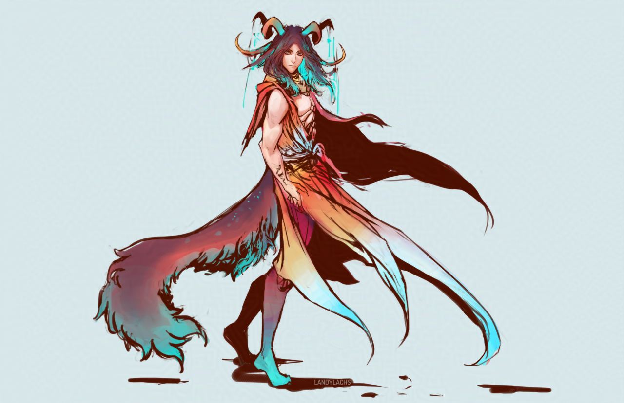
“Avatar of Mordremoth” Concept (GW2 Fan Art) | September 14, 2025

Concept drawing of a fan-design for the "Avatar of Mordremoth" from Guild Wars 2.I meant to post this at some point, and why not now. This is one of the concept drawings I did for the “Avatar of Mordremoth” we see in Chapter 1 of “The Harbinger’s Path” GW2 fan comic, seen most prominently on page 13 in Chapter 1: The Firstborn’s Stand. I drew one or two concept designs before this, and remember not being satisfied with those earlier attempts, until drawing this one. 

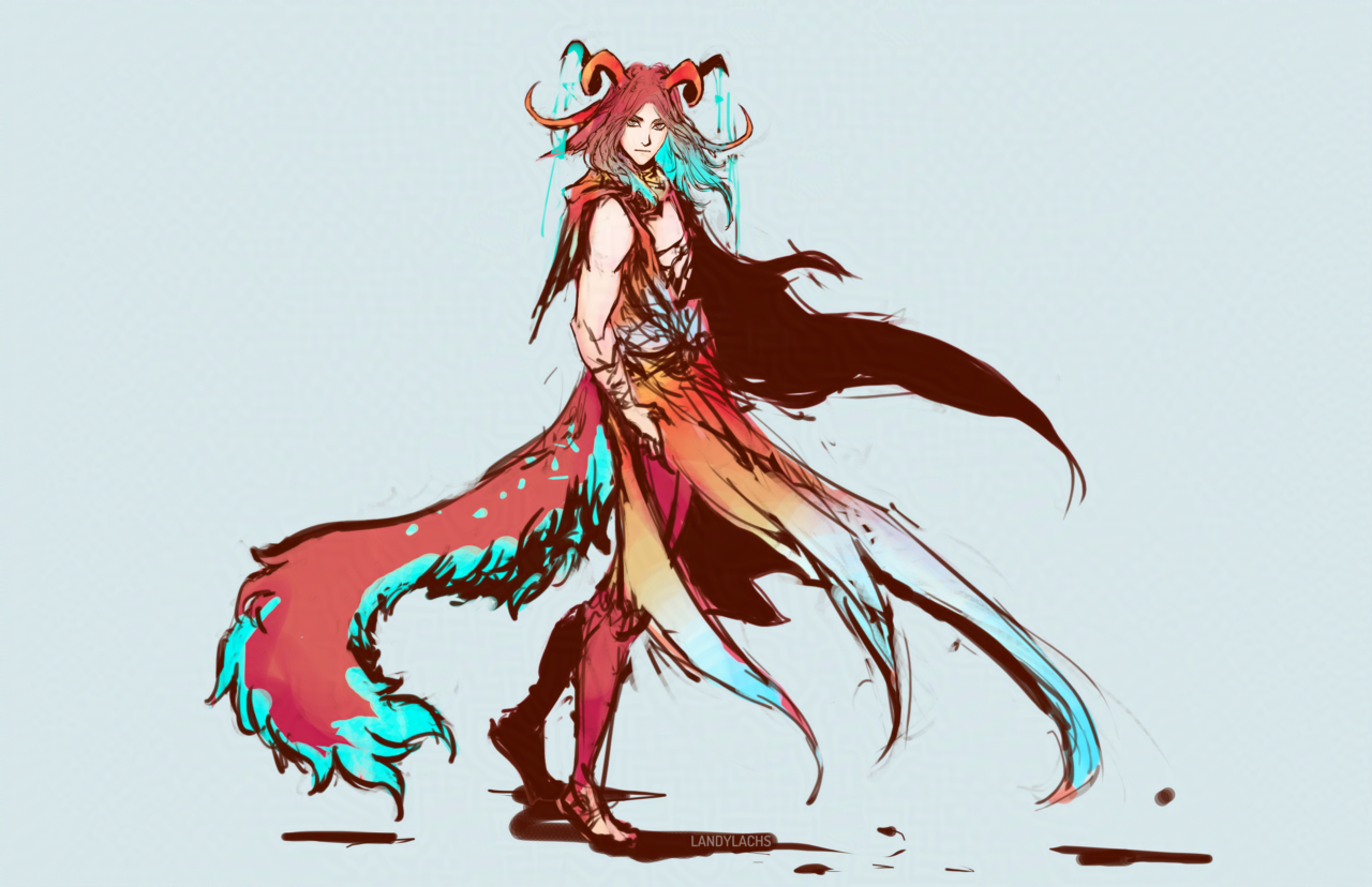
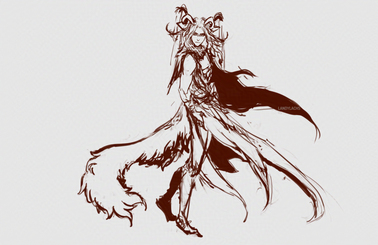
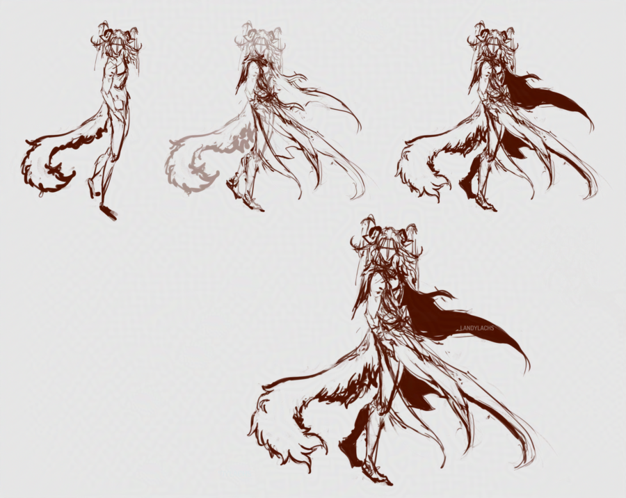
I sketched the pages for chapter 1 first, and did placeholder drawings for my fan-version of the “Avatar of Mordremoth” in the early drafts. I believe I tried to figure out a design on the page initially, but wasn’t pleased with the results I was drawing. This caused me to try concepting some ideas for how this “mind-avatar” for Mordremoth might look like in the comic. 

I knew I wanted him to be a foil for the Pale Tree – who Mordremoth initially impersonates during his infiltration into Trahearne’s mind in my comic. I am also partial to the idea – inspired by the Mordremoth canon design that Mordremoth “is the jungle” – that Mordremoth might take different forms for his “mind-avatar.” This is why I wanted him to first appear to Trahearne as the “Pale Tree” – as a way to try and weaken Trahearne’s resolve, by wearing the image of what is almost a deity figure for the sylvari people. This is also why, to me, my design for this version of the “Avatar of Mordremoth” is not necessarily the “final” or “true” form of him (within the lore of my fan comic). 

This form, since I wanted to try a version which is more directly opposed to the Pale Tree design-wise, clearly takes much of its inspiration from the Pale Tree’s design herself. Many aspects are similar. I tried to add more malevolent features, influenced from Carlyn Lim’s Mordrem Commander concept designs, as well (mentioned in this post from last month). I will admit some of my drive to try this design is also because I found the canon design for the “Avatar of Mordremoth” in-game to be somewhat comical, haha, and always thought it would be fun to see different takes on this design that are a bit less goofy, and have a bit more of that dark fantasy visual flavor that I love so much in Carlyn’s Mordrem concepts. 

Geissler Concepts (In-progress) | March 11, 2025

Geissler design concept. A male kemonomimi character stands in a display pose. His color scheme is light browns, orange, and teals.
Geissler design concept.

I’ve been meaning to try some different designs for Geissler for a while – here’s a recent attempt! I’m not sure if I’ll finish this one, but it felt good to draw him again. The “in-progress” of the title refers to the design – he’s meant to have an accessory by his wrist, and probably sandals with some sort of leg wraps. But, since I’m not certain whether I’ll finish this drawing or do another one with the design, I wanted to post it as-is for now! 

Flat colors.

Geissler’s previous design was much more monochrome – essentially dark hair, dark or gray eyes, pale skin. I have a lot of characters with darker-toned hair – including the character Geissler is meant to foil – which is another reason why I wanted to explore a potential redesign. So, here I tried adding more color to him. In the image at the top of the post, I brought back some of that monochrome aspect, by darkening his hair and subduing the color contrast – which I’m not sure whether I like yet or not. Hopefully seeing it here on the blog will help me with deciding which fits him best!

Looking at him now, I sort of lean toward going with the lighter/redder tones.

Recent Sketches + Vaknaa Design Concepts

Happy Thanksgiving! We are likely cooking up a storm in the kitchen right now, but let’s cross-celebrate with a compilation post with a few recent sketches.

Above is a profile sketch practice of Corveil. I was mainly imagining a slightly different shape for the tip and bridge of his nose. Also, his hair was originally toned a bluer hue, but became more grey as the painting progressed. I think I still slightly prefer the bluer tone, but the more monochrome look seems fun to potentially explore.

I do have a story-based reason for tinting his hair more toward blue (it’s probably not too difficult to guess), but still experimenting to see if I like where it goes visually.

This was an Arquel practice painting that was really fun to draw. It didn’t quite turn out the way I was imagining, but it’s closer than past attempts of a similar idea I’ve had for him.

I’ve been experimenting more with Vaknaa’s design, and redesigning her to be slightly more practical. Oh, why don’t I post the very rough sketch sheet I made for her a while back: Main changes are making the head crest feathers more balanced proportionally, reducing their overall size. Same with the horns, and also adjusting their angle to not compete with the crest feathers. I also tried out a few different horn shapes, and this was the one I liked best so far. The most recent painting above deviates from the ref sheet, because I’m still continually adjusting her design to see which works best.

I’ll post a few of the other thumbnail concepts below:

I did an array of sketches, and these were the ones I narrowed them down to.

Here’s the full page of concepts. Not compiled neatly, because I wasn’t intending to show these. But since it’s my blog, I figure why not! My idea for Vaknaa that I’ve been toying with is that I want her & her species to have crests of head feathers, ideally visually identifiable as “feather crests” instead of “head wings.”

I was browsing some old files a few days ago, and nearly forgot that in her very old design, she had outright head wings. Which is a very cool and fun design feature that I always love seeing on characters, but I wanted to see if I could come up with with something that is still distinctly feathery, but more evocative of the crests you see on real birds. I was curious to see if I might be able to come up with a design like this that worked well with the humanoid skull shape.

It’s still an ongoing process that I don’t think completely works yet, but I think I’m getting closer to something I like for her!

Close-up of the painting from further up in the post.

concept sketches

More random designs! These are relaxing to do at the end of the day.

This brush is very fun! A little hard to control, but think I’m getting a feel for it.