
Warm-up sketch. He has clothes now!
A very loose, additional paper sketch in the full post:

Corveil from a painting I’ve been knocking around on the side! Another construction practice from imagination from a bit ago – last month, to be precise. This might be a potential WIP (the full composition is full body), but I’m undecided yet on whether I’d take this further or not.

Detail crop of Trahearne from the finale page for Chapter 1 of The Harbinger’s Path. Always meant to post this at some point, and why not today!
It’s curious for me looking at this again. At the time of this page’s completion, I was quite pleased with this portion of the page, in particular. Though they’re very loose, it was much more line-focused than I’d done before attempting chapter 1, and this panel was probably the most heavily line-focused drawing in the entire chapter. (And if it is not, it felt this way to me.)
Before this chapter, I was never very happy with my line drawings – it’s why I almost always added color to drawings before showing them. I didn’t think they looked presentable on their own without some color or value to back up the lines. This drawing was the first one I made in years where I thought it turned out decent even without color or value – I didn’t have to shade this one as much as I normally would for the drawings I was doing at the time.
Even so, as it tends to happen when doing a longer project like a comic, I can see the way I draw Trahearne now is a little different compared to how I was drawing him in Chapter 1. I’ve been aware that the style in the comic shifts a bit – mostly from chapter to chapter, but even within pages of the same chapter. Some if it is intentional experimentation (I’ve been drawing several expressions for Trahearne on page 15 this week, where he looks a little more “seinen” or older – and I might need to tone this down to not make him look too different from earlier pages), while other times it’s been a natural progression from how I’ve grown to enjoy drawing him.
But there are a few different stylistic ways I like to draw him – mostly between a little more youthful or “bishounen” and slightly more mature or more “seinen,” let’s be honest, haha. I enjoy drawing him both ways, but I hope it doesn’t look too inconsistent in the comic. At least, not in a way that is distracting while reading.
Oddly, I think I am more consistent when it comes to Malyck – but I haven’t done a full read-through of the entire comic from page 1 to the current page in a while. I might change my mind if I give that a go sometime.
Edit: Ironically (or predictably?), right after making this post, it made me want to retouch this drawing. I’ve done so above (and to the live page) – the original will be below in the full post, preserved for comparison!

In addition to the Trahearne and Malyck practice animation I made for Heart of Thorns’ 10th anniversary last month, a much smaller thing I also finished by that day was adding a bit of animation to chapter 2’s finale page. This version of the page has been live since the, and you can view it here!

It’s likely obvious, but this page was not drawn with the intention of animating it from the start. I tend to save several steps of the process in the comic page files, as I have the habit of duplicating layers and working on the duplicate when I want to make a larger change or know I will be progressing the page more. This makes my file files larger than they need to be, but on the plus side, I like being able to go back into the file and see how the page progressed over time.
My first attempt to animate this page was all the way back in August – which I just remembered, I even posted that test panel here. This test is what lead to the practice animation from last month. Even though this page’s animation is both much simpler and rougher than last month’s animation, I still have a little sentimental feelings over it, since dabbling with this page was what really lead to all the animation practices afterward (and I have more I want to do in the future!).
So! That’s why I wanted to have a version of this page up, even if it is rough around the edges. It is cleaned up from the August test – the page now is rebuilt completely from scratch from the August version, using 3 layers from the comic file itself. While it is not intended to be super-smooth (which I hope is clear – it is keyframed and not tweened), I hope the cadence feels intentional.
Does it add a little flavor to the page, or does it distract? Feel free to let me know anywhere, as I’m biased toward it, but I would definitely like to know if anyone preferred the previous static page instead of this animated version!
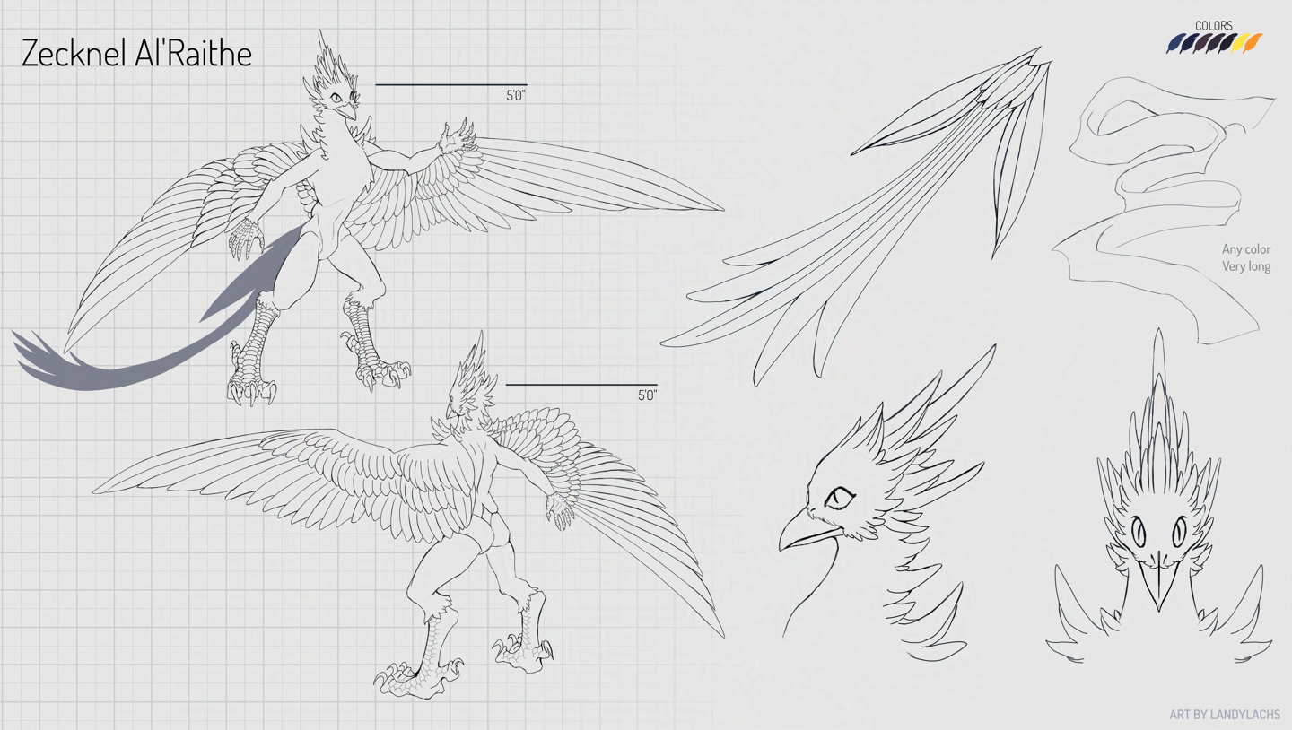
Recently finished ref sheet commission! I’m so humbled when I’m asked to do a ref sheet commission, because it isn’t something I formally list anywhere that I do, but the ones I’ve done have been very enjoyable. Many thanks to Zecknel for this one, in particular, because when first asked to do this, I let Zecknel know that I would use a looser line style. I say this for all the ref sheets I’ve done, because before this year, I wouldn’t say I work with clean lines.
Serendipitously, between the time Zecknel approached me with this project (an updated ref sheet for his character, the original itself a ref sheet I made for them a few years back) and the project’s start date, I began drawing more with line as I drew The Harbinger’s Path webcomic. By the time the start date for this commission approached, I was fairly confident I could do this reference sheet with cleaner lines than for any ref sheet I’ve drawn before. I would still consider these lines more on the looser side, and not “true” lineart – but they’re much cleaner than “lines” I’ve drawn before this year – especially on commission.
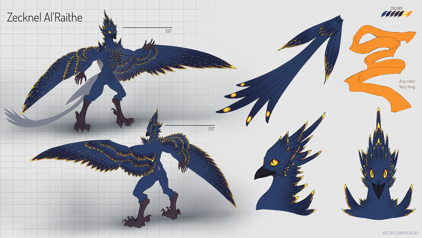
Zecknel has such a cool concept for their character, especially once you add color. The vibrancy of their character’s feather patterns have a visual spark, I think! I’m also excited about this ref sheet, because it will be used to create a costume (or “fursuit”) Zecknel is commissioning from a specialized crafter. I’ve known Zecknel’s character for a few years now, and I’m really looking forward to seeing a physical manifestation of their character! I’ve always had a lot of admiration for the craftsmanship behind fursuit crafters – the technical skill to bring these imagination creations into physical form is this wonderful representation of passion and creativity. I’ve seen some truly incredible instances of artisan craftsmanship that rival what you see on stage or in films. I just love seeing people expressing what they love, especially the more indie types!
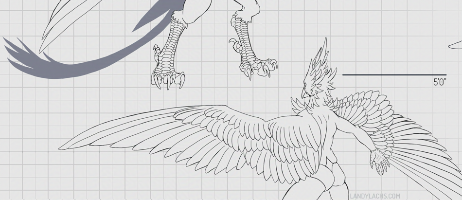
Edit Nov 5, 2025: I don’t know what it is about posting that makes my eye notice things, but I noticed the angle for the far wing was inaccurate! I’ve revised the above refs, and the earlier versions are in the full post below: