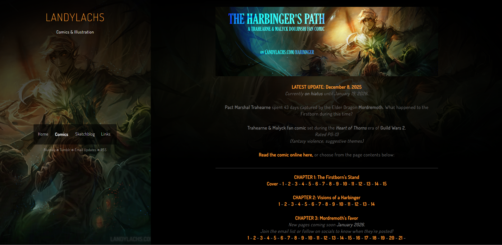
I’ve been meaning to update The Harbinger Path index page with a banner header for a while, and finally had a chance to today!
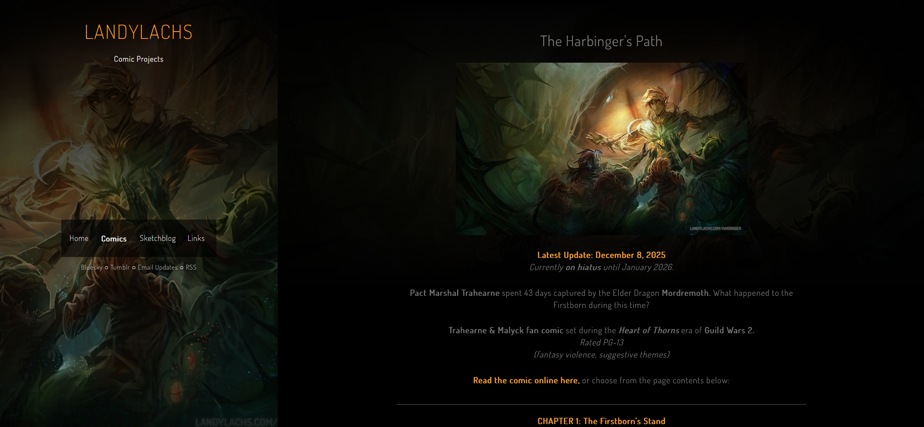
I mainly wanted to change it because I always thought the full cover wrap-around looked a bit clunky in this screen format (my mind envisioned it as a wallpaper or book cover). The banner version also frees up some of the vertical space, to show the chapters and pages closer to the top.
I also wanted to document the change here. Below is the original version:
 You might also notice I added the “doujinshi” description to the subheading – this will be relevant in a future post I plan to make soon. :p
Other small changes are I added the January 19th date underneath the top updates, and changed the sidebar “Comic Projects” description to “Comics & Illustration.” The site will still mainly be for comic projects, I’m mainly trying this out since I did end up using the “Landylachs” watermark for my personal art last year, even for illustrations.
As always, this is all a work in progress, and we’ll iterate as we go!
Edit: I also wanted to document the changes for mobile!
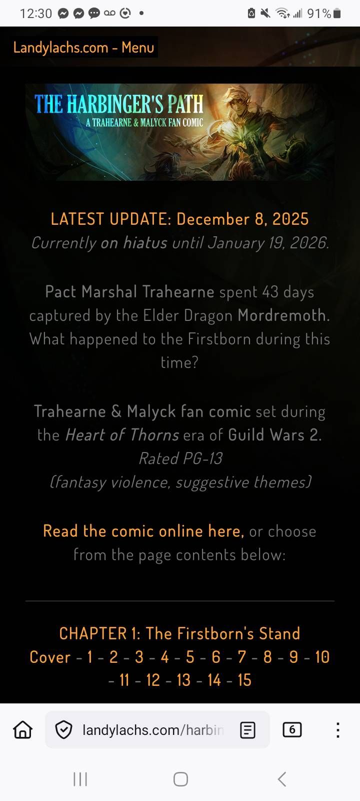
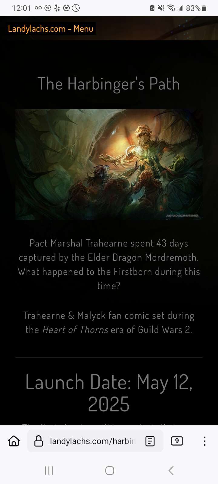
I unfortunately didn’t take a screencap of the previous version on mobile, but I did find this screenshot I saved from the version I had during the comic’s pre-launch. But, I think the main thing you can see is that the pages should hopefully now show to the user at first glance when browsing on mobile. While before, the user might have had to scroll down before the page numbers became visible.
Subsequent updates in the full post:
January 11, 2026
- Added custom headers for desktop and mobile view (I remembered I could do this!).
- The header text is larger on mobile for increased legibility, while the desktop header has slightly more text, and shows more of the cover art.
- Updated the desktop image in this post to the current live version.