Updating art for contact cards + New Pen Holders! | April 2, 2026

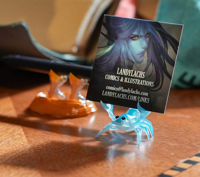
Photo showing Landy's contact card held by a light blue shrimp pen holder. In the back, a pen is held by a pen holder shaped like two hungry hatchling birds.
Updated art of Arquel being held up by a new shrimp buddy!
Photo credit: Juan Arzola (@ancientbuho)

In preparing for the convention this Saturday, an unexpected thing I realized is it gave me the perfect excuse to update a few artworks I’ve been meaning to eventually do, but haven’t had the opportunity to get around to before now. 

You might have seen the above artwork of Arquel here and there. I’ve posted a crop of it before, and I use it as a profile photo for some of my socials. I quite like this painting of him, but it’s been unfinished for a while. Other projects have arrested my time. While still not entirely finished, entirely because of this convention, I refined it to the point where I was comfortable printing it for a contact card. Especially since these are small by definition (for scale, look to the pen in the background in the above photo).
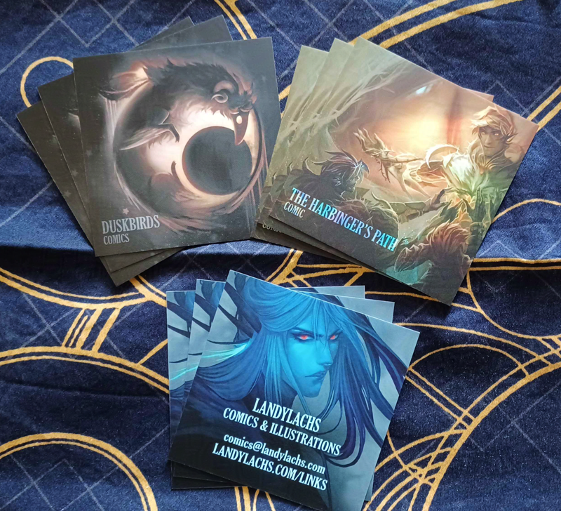
Photo of contact cards themed around Duskbirds Comics, The Harbinger's Path comic, and an original character by Landylachs.
Contact cards art! Bottom with Arquel shows the front on all cards, top with Duskbirds & Harbinger show 2 variations for the backs. 

Here are the 3 artworks I chose for these contact cards! I’m sorry for the photo quality – unlike the gorgeous photo at the top of this post, which was taken by my skilled photographer friend (thanks again, Juan!), the rest of these photos were taken with phones by me or my partner, haha. (With permission, I also slightly edited Juan’s photo to a closer crop and adjusted the contrast, since in the photo the card is backlit/in shadow.) But, this one here was taken in more neutral lighting (the photo at the top of this post was during a time of glorious sunlight), and is more color-accurate to how Arquel printed (the blues!). The side with Arquel (with contact info) is on the front for all cards, while the backs have 2 variations showing either Duskbirds or The Harbinger’s Path. These cards are for the convention this Saturday. I decided to print these because originally, I thought I would only have 1 Duskbirds Comics zine to show. I was thinking of ways to have my table look potentially less sparse, haha. 

My first and easiest thought I had were contact cards (or “business cards” – though it feels funny calling them that since these are intended for art conventions). Business cards are easy to print, and I’m always very happy with the quality from the printer I use for them (it’s Moo!). I haven’t printed their square business cards before, and was a bit curious about them. This seemed like the perfect opportunity, because aside from contact info, I was interested in the backs potentially being good mini-art samples I could show. Especially for the side with The Harbinger’s Path cover on it, since Harbinger’s print version will be finished for May’s convention, and not this April one. 
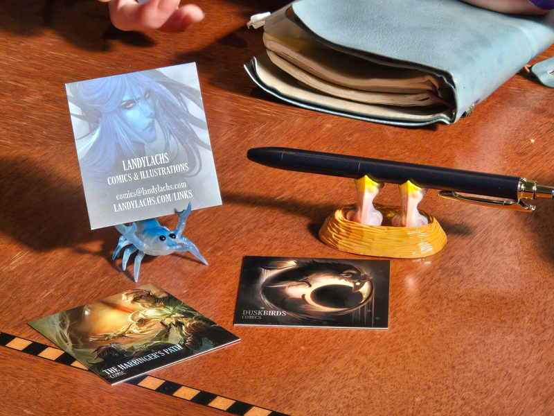
Photo showing the blue shrimp pen holder with a clearer view of the hatchling birds pen holder. Surrounded by the contact cards!
Photo from the stationary show during a moment of downtime – and a better view of the amazing hatchling chicks holder! 

I was prepared for the colors to be potentially off, but I’ve been learning about CMYK color profiles before this (which I hadn’t done for past business cards), and I think learning more about file settings was worth it – I’m a bit shocked by how much I love how these printed. They are very close to what I see when I work on the artworks on my monitor. The colors are so much more vibrant than I was expecting for CMYK. 

Additionally, the photos taken in the sun in this post are from a recent stationary show a friend organized us all to attend. It was a very wholesome event, filled to the brim with crowds gathering round table after table of stationary treasures! I walked into the show fully intending only to browse, and ended up walking out with these two delightful pen holders. An exceedingly cheerful blue shrimp, and a pair of hungry hatchling chicks. Each are eager to hold up a pen (or business card, in the case of the shrimp).  
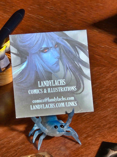
Behold the blue shrimp!

This ended up being fortuitous, because while I was mostly settled on my table’s setup, I was still deliberating over how to display the contact cards. I originally wanted some type of fun container to hold them in. If I didn’t find one, I was going to just have them in a stack on the table. My plan now is to have the little shrimp holding one card, and then a stack of cards beside it for people to take. 

There’s a slightly funny story behind these pen holders. I saw the shrimp when I did my first pass around the venue, near the end. It jumped out at me, because it was the only blue shrimp left on the table. I tried my card out on him a few times, and thought the colors matched Arquel very well. I deliberated a bit, but wasn’t set on whether to buy him or not. My partner then found me and highly encouraged me to buy him, which was the tipping point I needed, haha. We then met up with the rest of our group (this was an exceedingly crowded venue, and we peeled off and met up again a few times to explore), and after we did a second pass, I wasn’t planning to stop by this table again because it was a bit out of the way. 

Then, I hear my partner come up behind us and tell me, “The pen holder table has birds now!” I laughed and thought he was joking, because when I browsed the table earlier, their pen holders were overwhelmingly sea creature-themed (shrimp, crab, cuttlefish, nautilus). But he confirmed they really did have one! I’m fond of birds, and he told me this knowing full well I would be very tempted. I made my way over, and just look at them! I’ve never seen such funny pen holders. Our friends followed after us, and then started saying how it’s on-theme for Duskbirds, how well it will match being beside the table next to the zines. It didn’t take long to convince me, haha. 
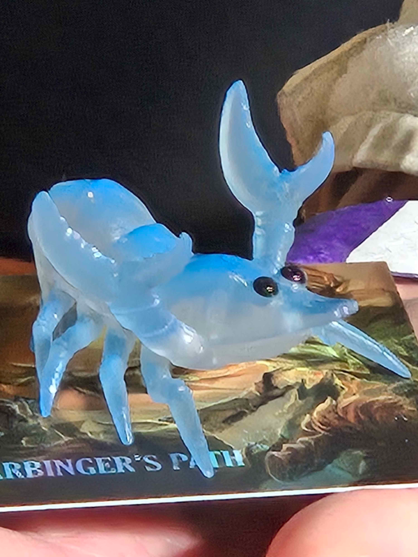
Photo of the blue shrimp pen holder standing atop contact card showing The Harbinger's Path cover.
BEHOLD HIM!

In addition to these contact cards, luckily my printer for The Harbinger’s Path was running a general sale last month. I was able to place an order of postcards at a very reasonable rate, which gave me the dual benefit of having another item to show for the con, and providing an early print test for how The Harbinger’s Path will look in print. I’ll show photos of the postcards sometime next week or so – I want to show them through the print book email updates first! 

For now, I’m bringing these postcards to this weekend’s con to try and let hopefully more people learn about the webcomic! And, as detailed in the previous post, I ended up splitting Duskbirds Comics zines into 2 volumes, because they worked better this way thematically. 

This makes my convention “stock” for this Saturday Duskbirds Comics Vol. 1 & 2, The Harbinger’s Path giveaway postcards, and these little contact cards. While this would be sparse for an artist alley table, this Saturday’s convention isn’t an artist alley. My impression of PLCAF is more of a small, books-focused indie comics con. This also fits the theme for Manga Ichiba at Fanime later this May, as they specifically did not want us to set up artist alley tables. This is part of the reason I decided to apply to both PLCAF and Manga Ichiba – I don’t really have interest in setting up artist alley tables both because they are so daunting, and also because I have never been able to become excited about making merch (only personal preference – I admire those who are able to be passionate about it!).

But books? Now, books I am excited to make. Very excited indeed! 


April 3, 2026: Added a few more anecdotes from the stationary show. 
Duskbirds Comics in Print! | Photos + About the Zines | April 1, 2026

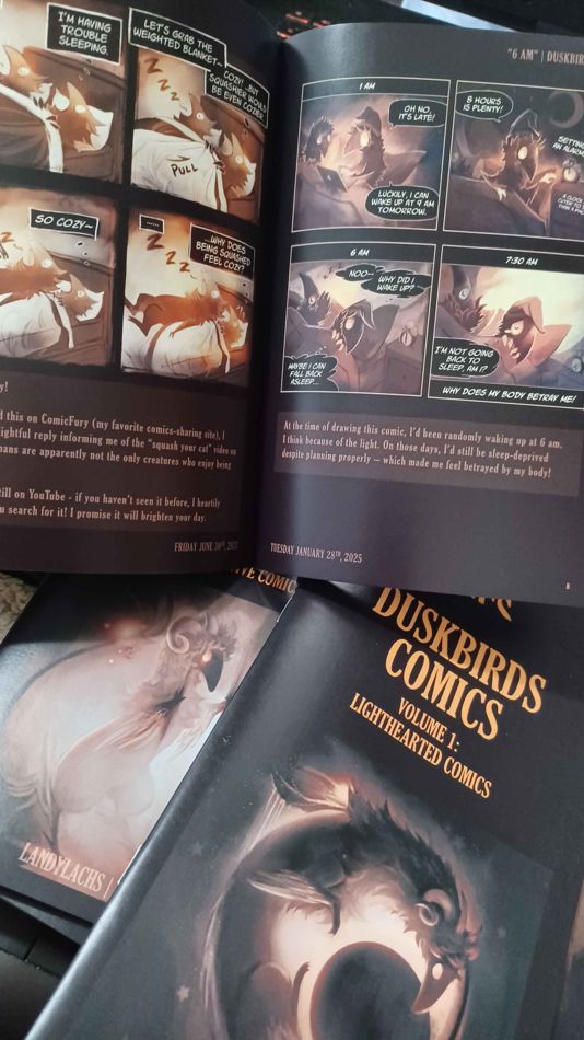
Photograph of printed Duskbirds Comics zines.
Duskbirds Comics in print!
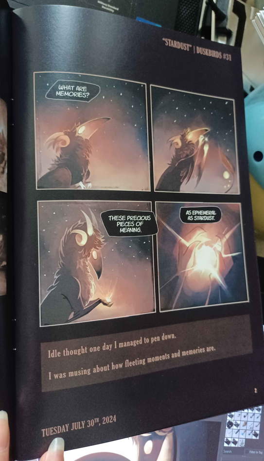
Print version of Duskbirds Comics showing the comics "Pourover" and "Stardust"
Duskbirds Comics Vol. 2, pages 1-2 | Left: “Loved” (#1); Right: “Stardust” (#31) 

Wanted to write a quick post about the printed Duskbirds Comics zines! 

Let’s start with book specs: 

Zine specs: 

  • Duskbirds Vol. 1: “Lighthearted Comics” 
    • Size: 5.5 x 8.5 inches (slightly wider than A5)
    • Page count: 28 pages 
    • Comic count: 23 individual Duskbirds Comics 
    • Extras: Bonus Duskbirds illustrations and sketches in print for the first time (4 artworks) 
    • Binding: Saddle-stitch zines
  • Duskbirds Vol. 2: “Introspective Comics” 
    • Size: 5.5 x 8.5 inches (slightly wider than A5)
    • Page count: 20 pages
    • Comic count: 14 individual Duskbirds Comics 
    • Extras: Same 4 artworks from vol 1., plus 3 extra artworks at the very end of the zine. 
    • Binding: Saddle-stitch zines

And a few photos! 


Photos of Duskbirds Comics pages

Print version of Duskbirds Comics showing comic #31, "Stardust"
Duskbirds #31, “Stardust”

Formatting Duskbirds for Print

For the printed version of Duskbirds Comics, I updated many of the comics to have them work in print. This mainly meant adjusting text formatting in earlier comics to be legible when printed, since they were originally drawn for web resolution (and before I figured out which text style fit Duskbirds). This also helped unify the zine visually, this way all the comics use the same type and typography settings more recent comics are drawn in. 

While doing this, I also retouched the art for several of the comics – again, mainly the older ones. Many early comics are quite rough, and giving them a little polish after seeing them again after some time ended up being very satisfying!  

At the end of this post, I’ll add some comparisons between the print versions and the original online versions, to give you a sense for how the updated comics look! 

Print version of Duskbirds Comics showing comic #16, "Pourover"
Duskbirds #16, “Pourover”

Figuring out a layout for the printed zines

I originally planned for these zines have a horizontal layout. I thought this would work because early Duskbirds comics had a rectangular layout, and the comics now being square should work either horizontally or vertically. Once I discovered horizontal printing would have added quite a lot to the cost, I scrapped this idea. Now that the zines had to be in portrait orientation, this left me with needing to figure out what to do with the extra space.. 

For rectangular comics, I could fit both on a single page. For square comics, however, I could only fit one per page if I wanted them to be legible with my chosen text size. I decided the extra space might be a good place to add some context behind the comics. Most of these are transcribed from the original posts when added to Duskbirds.com, while others are brand-new written earlier this month while I was putting together the layouts for both volumes. 

Print version of Duskbirds Comics showing comic #23, "Dishes"
Duskbirds #23, “Dishes”

Duskbirds is printed! 

I went into this in more detail in the previous post about Duskbirds Comics print zines, about how I had to put together the layouts for these books quickly to have them ready in time for this Saturday’s convention. In my notes, from the day I began the layouts to the day I submitted the print order was only 6 days! It was a good crash-course on formatting a comic book from start to finish. It ended up being a really nice project because it gave me a miniature sense for how formatting a longer book, like The Harbinger’s Path comic, will be. There were a number of things I was very glad I learned during this smaller-scale book, instead of a longer one like Harbinger. 

There are also things I would do differently if I had more time, and that I will be able to do for Harbinger, Mainly, I think some of the editing for Duskbirds suffered due to lack of time. I was mortified to find two typos – though thankfully, they are small and in the descriptions, and not the comics themselves. (This isn’t too surprising, as I typed many of the descriptions for the first time right in the publishing software.) This is one of the reasons I’m emphasizing that unlike the print version for Harbinger, which I can devote much more time to – Duskbirds Comics are “zines” – they are bespoke “first editions”! Any errors are charming remnants of the author’s inaugural attempt at printing a comic! Or so I tell myself as my mind internally berates me. 

Print Quality! 

I am so, so happy with how Duskbirds Comics printed! In my opinion, they look better in print than their digital versions. I’ll show a few comparisons at the end of this post. The colors turned out rich and vibrant, the darks are even and have depth, the text is crisp. It’s everything I could have hoped for! 

While the books were being printed but before my printer shipped them to me, I was concerned about how the darks might turn out. As well as the text! My biggest concerns were that the darks would print darker than intended, text would turn out blurry and illegible, or that the dark areas would print unevenly, since the comic borders and zine pages are both dark. To my shock, everything flows together smoothly. When I first saw the books, it was such a relief seeing they printed well – and then it was exciting seeing how well they printed! 


Index and Introduction Pages

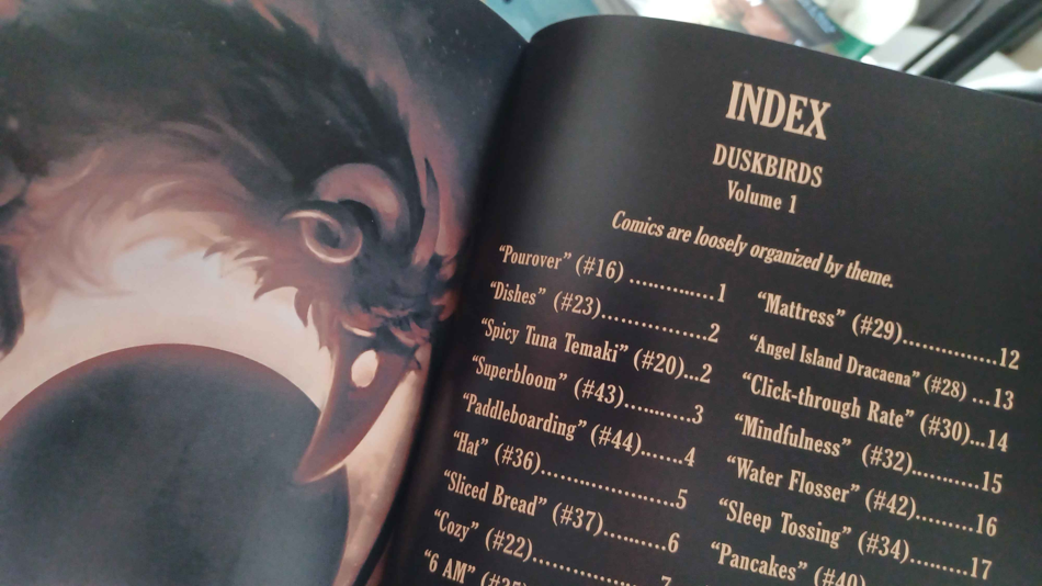
Index for Duskbirds Comics Vol. 1

Comics included in the zines 

I wanted to put together an index page for both zine volumes. I mainly thought it would be neat to see all the comics stacked up at the front there. I didn’t include every comic due to time – many of the earliest comics are quite rough, and I wanted to only include the comics I felt were presentable as-is. Or, that I could touch-up and make presentable within the these time constraints. When i began the zine’s layout, there were 42 Duskbirds Comics posted – the last one being #42, “Pancakes,” all the way back from last year! (I hadn’t posted one since then because I spent last year drawing The Harbinger’s Path comic). 

When looking through my files, I saw I had drafts for comics #43 (“Superbloom”) and #44 (“Paddleboarding”) drafted, and near completion. It was ambitious (for me) given the tight deadline, but I decided to see if I could finish both #43 and #44 to include in this print volume. I especially wanted to include these two, because I tried using color for both. Which is something I’ve only done once before (in #28, “Angel Island Dracaena”) – and which I think turned out much better than that earlier attempt. 

Index for Duskbirds Comics Vol. 2

Print comic count

I somehow managed to finish both comics during this 6-day-portion, where I was also coming up with the zines’ layouts, and touching up the art for several of the already-existing comics. Finishing those 2 made the final printed comic total 37 comics out of the currently drawn (as of this writing) 44 comics. A decent spread, I hope! 

Layouting 

One thing I hadn’t expected while putting together Duskbirds Comics zine layouts was how much I ended up enjoying figuring out the design for the books. I haven’t formatted a book before, and the most experience I have is The Harbinger’s Path layout, which has mainly been making sure the margins are correct (at least so far – once I start formatting the bonus material, I’ll probably have more in-depth layouting awaiting me). 

It ended up being very fun figuring out how to present the context for each comic (because of that additional space I had to figure out how to use – since I again had to go with portrait orientation, instead of landscape). I began having more ideas for little touches I wanted to add. One being those index pages above, and then I also found myself wishing to add an introduction page. 

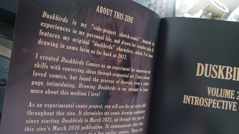
Introduction page for Duskbirds Comics Vol. 2 (same introduction for both zines).

Introduction to Duskbirds 

I started a draft based on Duskbirds Comics “About” page. I then ended up expanding on it more, as I reflected back on this project I began on a whim in March 2021. I had no idea how to draw comics when I began Duskbirds, and those early comics are rather messy and rough. My original idea was to sketch these at the beginning of the day, and then post them however they looked after a time limit. I later decided I wanted to take the time to refine the comics more. Even so, I still think many Duskbirds Comics are rough, though each and every one taught me something that made it possible to later draw The Harbinger’s Path. I love having Duskbirds Comics as my “experimental side-project” to play around with. Duskbirds is largely to thank for giving me that practice to attempt something like The Harbinger’s Path, which I consider my first “real” comic due to the longer-form style, and because it was planned in advance. 


Back Cover of Volume 2


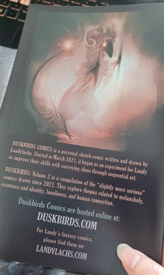
Duskbirds Comics Vol. 2 Back Cover. Last paragraph reads: "Duskbirds: Volume 2 is a compilation of the "slightly more serious" comics drawn since 2021. They explore themes related to melancholy, existence and identity, loneliness, and human connection."
Duskbirds Comics Vol. 2 Back Cover

Cover Layouts + Comic Description

Another thing I found unexpectedly fun was deciding how I wanted the front and back covers to look. With the back covers, I decided to include a little blurb about the comics. It’s both based on the start of Duskbirds.com’s “About” page, and then I thought up a description for how I would describe these comics. Before putting these zines together, I hadn’t described Duskbirds like this before, and it made me reflective about what the comics mean to me and why I drew them. 

I hope they will be meaningful to the next person who reads them! 


Where to find Duskbirds Print Zines

If you’d like to see Duskbirds Comics in print yourself, they will currently only be available at PLCAF this Saturday, April 4th, 2026. Similar to Manga Ichiba at Fanime, I will be tabling this event in-person!

More info about the event is on their website here. Below is the main info you need to know:

Date: Saturday April 4, 2026
Time: 10 am – 4 pm
Location: South San Francisco Library and Parks & Recreation Center
Address: 901 Civic Campus Way, South San Francisco, CA 94080

If you’re in the area, stop by and say hello! I’d love to see you!


Additional Zine Photos + Print Comparisons

Additional photos of the zines in the full post! Along with comparisons between the updated print versions with their original online versions: 

Continue Reading